

Ah, the early 2000s — a time of flip phones, frosted tips, and the unmistakable charm of Y2K aesthetics. As we move deeper into the 2020s, designers are looking back at this era for inspiration, embracing the bold, chaotic, and sometimes downright bizarre designs that defined it. If you’re a designer craving that nostalgic edge, you’re in the right place. Below are 12 must-have Y2K fonts — from pixel and cyber styles to grungy display faces — that work for vibrant web pages, edgy posters, magazine layouts, and anything in between.
All of these live in the full Y2K fonts collection, alongside 500+ other typefaces from the 2000s revival.
Why Y2K Fonts Matter Now
You might be wondering, why revisit Y2K fonts in 2025? Design is cyclical. Trends from the past resurface, and right now we’re in a resurgence of maximalism, bold typography, and a love for all things retro. Y2K typography blends nostalgia with a rebellion against minimalist design trends. It invites experimentation — a chance to break traditional design rules and embrace imperfection, which is what we’re all about at Studio 2am.
The Y2K look isn’t one single style either. It spans glossy chrome futurism, lo-fi pixel and ASCII fonts, grungy ink-bleed display faces, and playful bubbly headlines. The list below covers that full range, so you can pick the right font for the exact 2000s mood you’re after.
1. Dreamer TM by Type Mania

2. Aürix by Züli

Sleek and fluid, this Y2K-inspired typeface embodies the futuristic optimism of the early 2000s. With its bold, aerodynamic letterforms and smooth curves, Aürix feels straight out of a tech startup logo or a retro-futuristic ad. Designed exclusively in uppercase, it drops into any layout with that glossy, high-speed aesthetic and no adjustments needed.
3. FBS Doms by Febspace Studio

Bold and built for impact, this heavyweight display typeface commands attention with its blocky, high-contrast letterforms. Whether in its clean Regular style, softened for a smoother look, or roughed up with its Rugged version, FBS DOMS is made for statement-making designs. It suits posters, album covers, and streetwear branding, channeling a raw, rebellious energy straight from the Y2K era.
4. Kraft by HVNTER

5. Basic TM by Type Mania

6. Mason by HVNTER

7. Goblin by Type Mania

8. Malbo by HVNTER

9. Digi Decay by Softulka

10. Anero Mecha by Font For Zula

Sharp, angular, and built for the future, this high-tech typeface fuses mecha-inspired geometry with a digital-age aesthetic. Anero Mecha features bold, modular letterforms that feel straight out of a cybernetic interface or a sci-fi battle mech blueprint. With 58 alternates and a bonus monospace version, it offers plenty of range for futuristic Y2K branding, game design, and experimental typography.
11. Powerpuff by Daniel Chapman

Bold, bubbly, and bursting with 90s energy, this playful display font brings back the fun of early Y2K aesthetics. Powerpuff balances thick, high-impact letterforms with a soft, rounded edge, making it one of the cuter Y2K fonts for nostalgic branding, sticker-style graphics, and eye-catching headlines. Whether used for retro-inspired merch or vibrant social media posts, it radiates pure throwback charm.
12. Arcade by FREND.

Retro with a twist, this vintage-inspired typeface blends nostalgia with playful energy. Arcade features wavy, hand-drawn letterforms that feel straight out of a faded 70s poster or a dreamy VHS-era title card. With three variations to mix and match, it suits bold, character-driven designs that lean into warm, Y2K-era aesthetics.
Y2K Font Styles Explained: Pixel, Cyber, Serif, and More
The Y2K aesthetic pulls from several distinct typographic moods, and knowing them helps you pick the right face fast:
- Pixel and ASCII fonts — lo-fi, grid-based letterforms that echo early computer displays. Basic TM and Digi Decay live here.
- Cyber and futurism fonts — glossy, aerodynamic, chrome-optimistic type built for tech logos and sci-fi interfaces. Aürix and Anero Mecha carry this look.
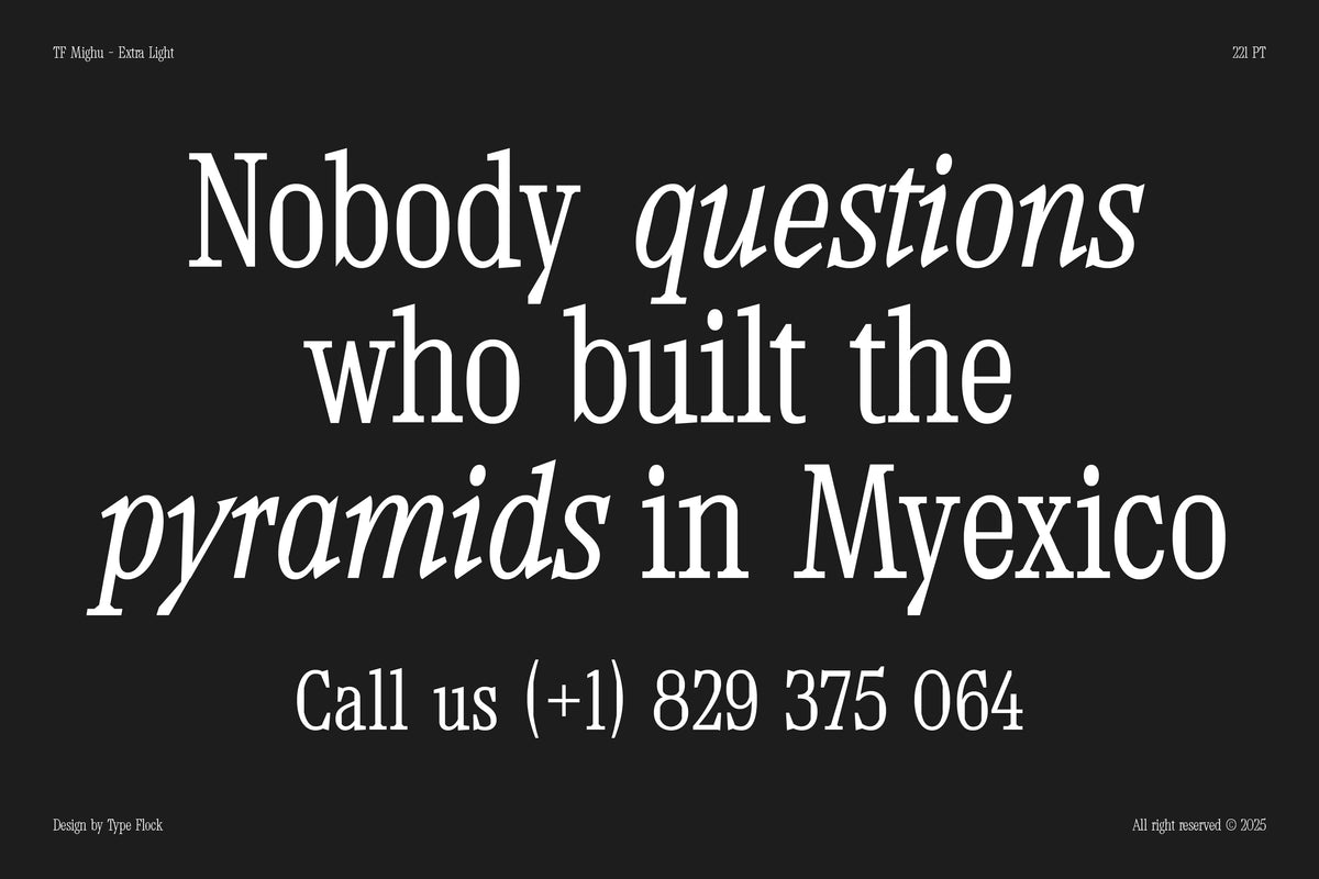
- Y2K serif fonts — traditional serif structure warped with glitch and digital decay, like Dreamer TM.
- Grunge and ink-bleed display — warped, melting, hand-drawn faces such as Mason, Malbo, and Goblin TM.
- Magazine and poster display — heavyweight, high-contrast type made for headlines and covers, like FBS DOMS and Kraft.
- Cute and bubbly — soft, rounded, playful headlines such as Powerpuff.
Match the mood to the message: a cyber font reads clean and forward-looking, while a grunge or pixel font leans chaotic and underground.
How to Incorporate Y2K Fonts into Your Designs
When using these fonts, consider the overall aesthetic you want to achieve. Mixing and matching different styles can create interesting juxtapositions. For instance, pair a bold font like Dummy TM by Type Mania with a softer one like Altotype by HVNTER for a striking, balanced composition.
Experimenting with color is also key. Bright, saturated colors were a hallmark of Y2K design, so don’t shy away from a neon palette to bring your typography to life. Aim to evoke that retro vibe while keeping it fresh and relevant for today’s audience.
You can also explore different formats. Use layering, distortion, or glitch effects to push the rebellious spirit of Y2K design further.
What to Remember
The early 2000s were a time of experimentation and bold choices. By adding these 12 must-have Y2K fonts to your design toolkit — across pixel, cyber, serif, grunge, and magazine styles — you can break free from traditional confines and create work that is both nostalgic and contemporary. Whether you’re designing for a client or your own personal projects, these fonts capture the essence of a dynamic era that continues to inspire designers today.