There's a difference between a design that's finished and one that feels like it exists somewhere physical. Effects are how you close that gap. Not Instagram filters, not one-click presets that flatten everything to the same aesthetic. These are tools with specific visual logic, each one doing something distinct: analogue wear, scan-line interference, stipple texture, blotter perforation, screen-print misregistration. The kind of thing that makes a poster look like it was pulled from a box in someone's garage rather than exported from a template.
Here are eight worth having in your toolkit.
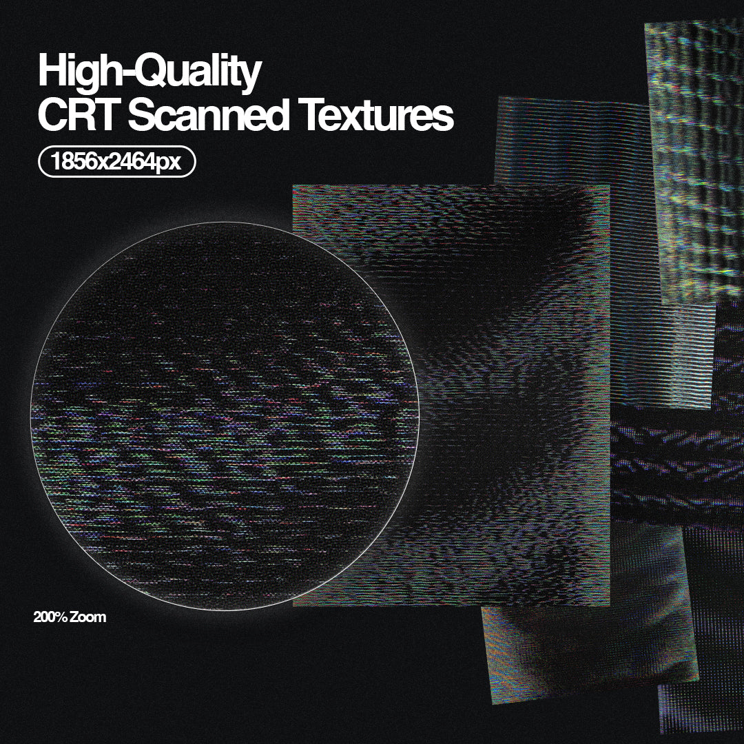
VHS Machine Retro Effect by Divided.co

Drop your artwork into this Smart Object and it comes back looking like it's bleeding off a cathode ray tube at two in the morning. The scan-line interference, colour bleed, and tracking distortion are all baked in with enough visual accuracy that it reads as genuinely analogue rather than digitally approximated. At 3508x2480px, it holds up for print as well as social, which makes it more useful than most effects in this space.
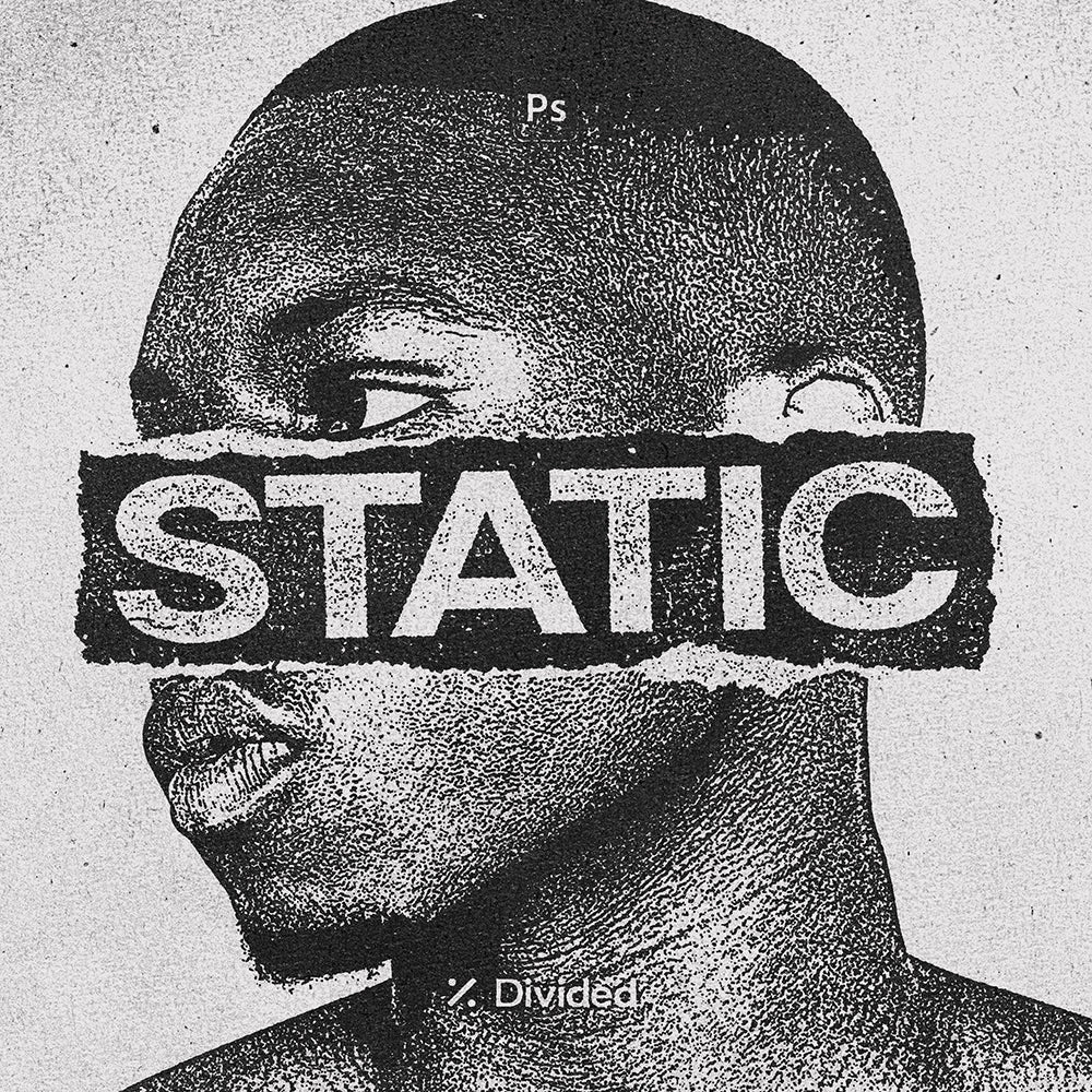
Static Distortion Effect by Divided.co

Where most grunge effects reach for scratched textures and ink bleed, Static does something more interesting: it breaks your image into a stippled field of dots that sits somewhere between photocopy noise and hand-drawn stipple illustration. The result has a tactile weight that works particularly well over photography, pulling portraits and product shots into something that feels closer to a silk-screened tour poster than a digital composite. Built on a Smart Object at 4000x3500px, so you're not sacrificing resolution for character.
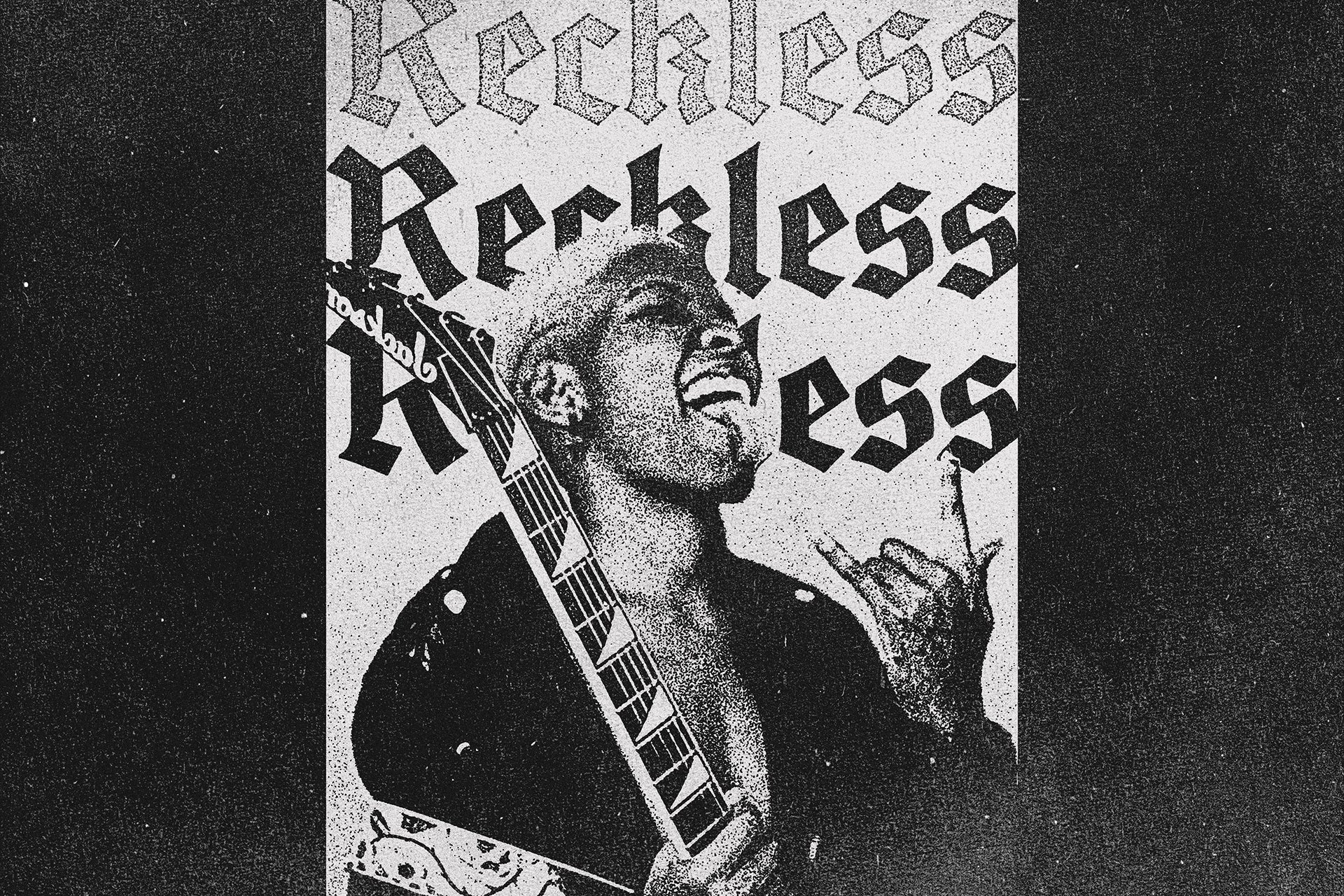
Distress by Studio 2am

Text distressing is one of those things that gets done badly more often than not. Either it's too subtle to read, or it's so heavy it just looks dirty. Distress solves this by giving you three calibrated levels of damage, light, medium, and heavy, all inside a single PSD at 6000x4000px. The grain, halftone, and distortion work together rather than stacking awkwardly, and the result looks like type that's actually been through something rather than type with a filter applied to it.
Blotter by Studio 2am

Blotter paper as a design surface has had a serious run in merch, packaging, and album artwork lately, and this is the cleanest execution of it available. The blotter paper itself was scanned at 600dpi, which means the perforation detail and paper texture hold at full resolution without looking synthetic. At 4000x4000px with fully layered PSD, it's built for actual production work: merchandise drops, art prints, packaging inserts, zine covers.
Retro Misprint Design Effect by Pixelbuddha
Mid-century screen printing had a particular kind of failure mode: colours that didn't quite register, ink that spread unevenly, paper that absorbed inconsistently. This effect reconstructs that failure with real precision. The Smart Object layers give you full control over your source artwork, and the misregistration and ink bleed land in a way that reads as era-accurate rather than decorative. Comes in both landscape and portrait PSD files, which is a small thing but makes it genuinely easier to use across formats.
Stitch Fabric Photo Effect by Pixelbuddha
The woven textile aesthetic has been doing real work in merch and poster design, and this is a more considered take on it than most. The thread grid is tight enough to read as believably woven, the ink scatter at the edges adds roughness without looking like a generic grunge overlay, and the aged fade across highlights and shadows keeps the whole thing feeling like a worn piece of fabric rather than a Photoshop filter. Works across portraits, type-heavy layouts, and photography, which is rarer than it sounds for an effect this specific.
Grunge Effects for Photoshop by hvnter

Twenty effects across two PSD files is a lot, and the temptation with packs like this is to assume they're padded out with variations on the same thing. These aren't. hvnter's grunge toolkit covers genuine range: dirty surface treatments, distressed overlays, and degraded print looks that each sit in a slightly different register. The Smart Object workflow is fast enough to use iteratively across a project, which is what actually matters when you're trying variations at speed on a streetwear or merch brief. If you're after more distortion effects worth working through, there's plenty to dig into beyond this one.
Grunge Halftone Photo Effect by Pixelbuddha
Coarse halftone dots, heavy black areas, worn paper texture: this one is built for work that needs to look like it came out of a photocopier that's seen better days. Small details break into grain and ink noise, contrast gets pushed hard, and the overall frame picks up the kind of rough, photocopied character that zine culture and independent music print have been trading on for decades. The two PSD files at 4500x3000px and 3000x4500px cover both orientations, and the results are consistent across both.
These aren't interchangeable. Each one does a specific thing well, and the best use of them is knowing which visual register your project actually needs rather than defaulting to the same effect every time. A merch drop that needs blotter paper character is a different brief to a poster that needs scan-line static, even if both live under the broad umbrella of "retro." The specificity is the point. If you want to keep exploring, there are plenty more effects worth a look across the catalogue.