Y2K graphic design is not peaking. What's changed is the quality of the work. The early revival wave, roughly 2021 to 2023, was largely about surface recall: chrome gradients, butterfly clips, early-internet kitsch. What's happening now is different. Designers aren't referencing Y2K anymore. They're fluent in it.
The 2026 version is not the same aesthetic
The first wave was recognisable mostly by its props: the holographic stickers, the lens flare, the Bratz-coded colour palette. It worked as cultural shorthand but often lacked structural logic. The 2026 version of Y2K design is operating at a different level. Maximalism is being treated as a system, not a mood. Pixel and dither work is being used as a texture philosophy, a deliberate push against the smooth, AI-generated aesthetic that's flooded feeds. Chrome and holographic surfaces are being handled as a material language, with weight and behaviour, not as a filter applied at the end.
A significant driver here is the anti-AI provenance movement. As AI image generation has made certain kinds of slick, seamless output feel generic, designers are actively reaching for aesthetics that signal human origin: hand-drawn pixel grids, analogue screen simulation, deliberately degraded type. Y2K design, with its inherent noisiness and physicality, lands in exactly that space. The pixelation and glitch aren't accidents to be cleaned up. They're the point.
The toolkit: what designers are actually working with
The current Y2K toolkit breaks down into a few distinct registers. Pixel and dither work sits at one end, rooted in the visual language of early digital graphics, low-resolution screens, and the kind of 8-bit rendering that predates anti-aliasing. Chrome type and holographic surface treatments occupy another lane, pulling from the physical material culture of the era: CD-ROMs, foil packaging, iridescent plastics. Warped and glitchy text brings in the instability of early compression artefacts and screen damage. And organic, bubble-shaped letterforms carry the softer, more tactile side of Y2K, the inflated, rubbery quality that showed up in everything from gaming interfaces to toy packaging.
What separates the designers working well in this space is an understanding of how these registers interact. You can combine dither textures with chrome type because both are rooted in the same underlying logic: the gap between what early digital tools wanted to render and what they could actually produce. The aesthetic tension is structural, not decorative.
Where Y2K design is actually landing
Independent streetwear is the most visible current home for Y2K graphic design. Labels operating in the space that Palace and Corteiz have mapped out, irreverent, referential, graphics-heavy, are pulling heavily from the toolkit. The pixel work and warped type translate well to screen printing and embroidery, and the maximalist composition logic suits the kind of drop-format product that lives on social before it hits a physical rack.
Music packaging, particularly in independent and electronic music, has absorbed Y2K design as a primary visual language. It fits the release culture: short-run physical, digital single artwork, the kind of visual identity that needs to function across a Bandcamp page, a 1x1 social tile, and a 12-inch sleeve simultaneously. The dither and pixel work reads as tactile and considered in a way that smooth, vector-clean design often doesn't at small sizes.
DTC brands targeting Gen Z audiences are using the aesthetic more selectively but with increasing sophistication. It shows up in packaging details, campaign type treatments, and social content. The holographic and chrome elements in particular have become shorthand for a certain kind of confident, slightly chaotic brand personality that's useful for youth-facing products.
The products worth knowing about
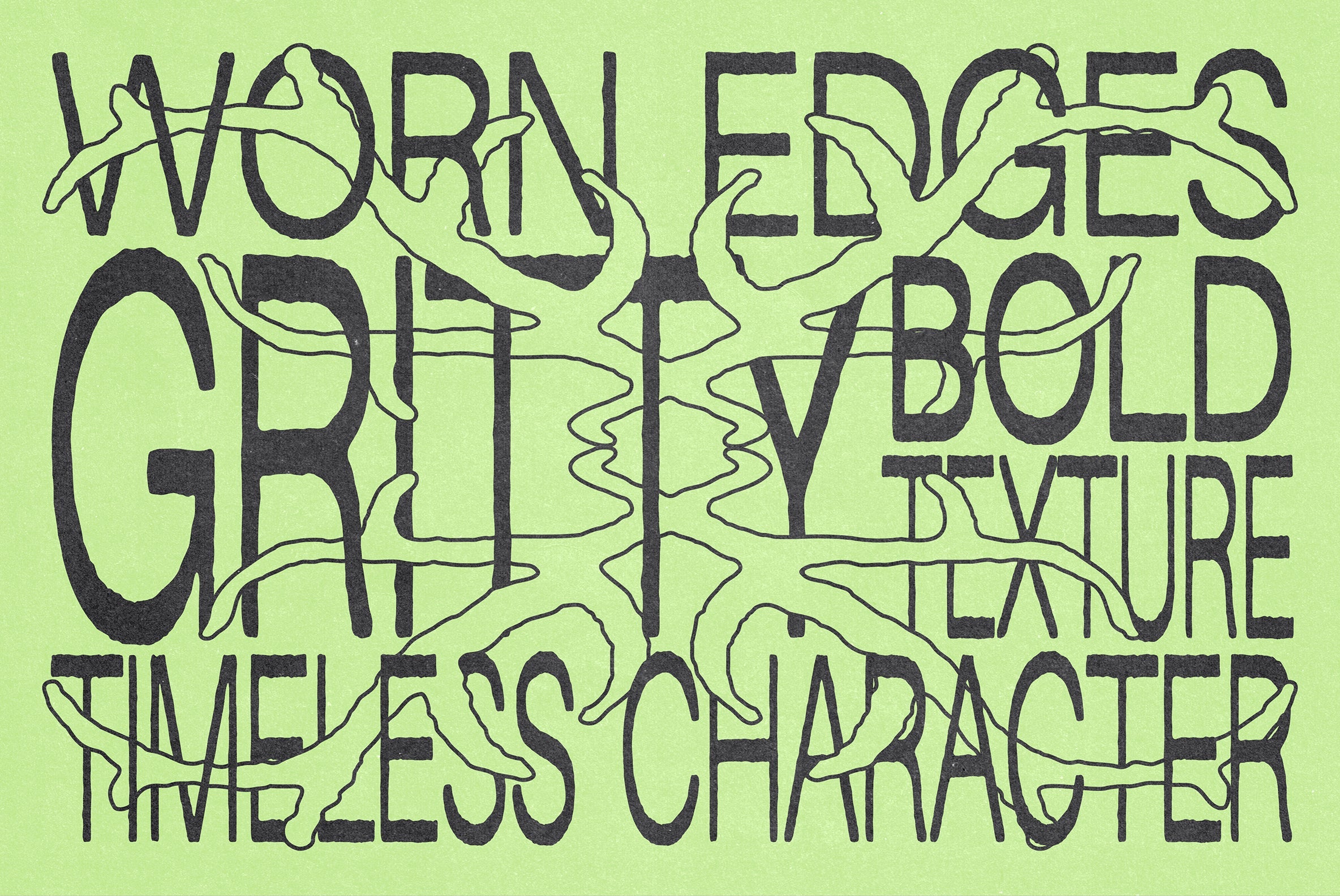
For type, züli's ink©t is doing something more interesting than most Y2K fonts. It combines the ink-on-paper irregularity of analogue lettering with Y2K's structural boldness, which puts it in useful territory for poster work, album art, and branding that needs grit without going full grunge. It doesn't feel like a costume. It feels like it was designed with a specific use context in mind.
Vanzyst's 250 UltraVibe Graphic Pack is the pixel/dither toolkit that actually covers the ground. 250 assets across pixelated objects, dither patterns, brutalist graphic forms, and retro-geometric shapes. For streetwear designers and poster makers who want to build compositions with depth rather than just drop in a single element, this is the pack to build from.

145 vector shapes from MiksKS in Vector Shapes Volume I handles the geometric/cyber register. These are the compositional building blocks for Y2K layouts: the kind of hard-edged, angular forms that show up in HUD graphics, early gaming interfaces, and the sci-fi design language that fed into the era's visual culture. They're scalable, combinable, and genuinely versatile across poster, album cover, and branding contexts.

Where things get more specific: Vanzyst's Pixel Artefact Color Edition operates at the intersection of pixel art and glitch aesthetics, with colour-treated, fragmented vector elements that feel more chaotic and expressive than a standard pixel pack. These are the kind of assets that work in collage-heavy layouts and maximalist compositions, where the visual noise is doing structural work, not just filling space.
The Retro Phone Screen Effect by MiksKS is one of the more technically specific tools in the Y2K arsenal. It's a Photoshop PSD that simulates the LCD rendering of early 2000s mobile phone screens, applying the characteristic pixel grid and colour compression of that display technology to any artwork dropped into it. For branding, social content, and any project where the medium-as-message logic of Y2K is relevant, this is a precise and useful effect.

Distorted type is doing a lot of work in the current Y2K moment, and Divided.co's Aura Text Effect handles the softer end of that register. Drop a logo or type treatment into the smart object and the effect applies liquid, blur-heavy distortion that sits somewhere between vaporwave glow and early-digital compression artefact. It's particularly strong for album art and poster work where the type needs to feel like it's being viewed through something.

Harder and more industrial in feel, Divided.co's X-Ray Text Distortion pulls from a grittier reference point. The effect simulates scanner-and-grain distortion, giving type a physical weight that reads more cyberpunk and less dreamy than the Aura treatment. For designers working in the darker, more abrasive end of Y2K design, or who need a text treatment that can carry poster work without competing with a busy background, this is the one. There's more glitch-treated type and graphics worth digging through if you're working in this space.

Pixelbuddha's Dark Aesthetic Dithering Graphic Bundle closes the loop on the gothic/occult register that's threading through a lot of current Y2K work. 240 elements pulling from deathmetal mythology, horror, and the grimmer corners of 8-bit and 16-bit visual culture. The dithering technique grounds it in the craft tradition while the subject matter pushes into territory that's genuinely useful for merch, album art, and poster work in harder music spaces. If the maximalism-as-system argument needed evidence, this is it: the bundle has compositional logic, not just a mood. There's more in the cyberpunk and cyber-adjacent graphic space if this direction is where you're working.
![]()
What this means for your work
The designers getting the most out of Y2K design right now are the ones treating the toolkit as a grammar rather than a costume. That means understanding which elements belong to which register, how pixel/dither work relates to the anti-AI craft signal, why chrome and holographic materials carry specific cultural weight, and how warped type connects to the compression aesthetics of early digital media. The surface choices follow from that understanding. Get the logic right and the aesthetic takes care of itself.