
Open Instagram or flip through any editorial spread landing right now and you'll see the same move: a headline that looks assembled instead of set. Mismatched typefaces jammed against each other at fighting scales. A scrap of engraved ornament balanced on top of scanned grain. Letters that lean and crowd and refuse to sit in a tidy row. A poster that reads as glued together on purpose looks nothing like one that reads as glued together by accident, and the gap between them comes down to about four decisions.
Every major trend report for 2026 has named this. Kittl calls it Type Collage. Zeka Design files it under Typography Collage. Vistaprint's 99designs team named a version "Distorted Cut," Canva branded a zine-forward strain "Zinegeist," and Envato tucked a cousin of it into their "chaos packaging" write-up. They all agree on the same shape: dense canvas, clashing type, analog debris, DIY energy, a lineage running back to Dada and punk. And every one of them describes the look and then stops. Fill the frame. Mix your fonts. Embrace the mess. None of them tell you the order things go in, which is the whole problem, because thrown-together and built-to-look-thrown-together are two different crafts.
Four layers doing four jobs
Start with an anchor. One face carries the loudest single message at the biggest scale, and everything else in the composition answers to it. This is the word your eye lands on first, and it needs enough presence to hold the centre of gravity while chaos happens around it. Get this wrong and the whole thing floats.
Then bring in a contrast face that argues with the anchor. The argument is the point. It should clash in era, in weight, or in rhythm, so a heavy brush script gets a spindly gothic reply, or a 90s marker tag gets answered by something engraved and formal. When two faces politely match, you get a font pairing. When they disagree, you get tension, and tension is what makes a collage feel alive.
Third layer is analog debris. Cut ephemera, engraved ornament, stamped figures, occult woodcuts, anything that behaves like torn paper. The debris has to look pulled from somewhere real, with rough edges and printing-press detail, because its job is to suggest a history the rest of the piece can lean on.
Last, one unifying grain laid over everything. A single scan or paper texture pulls five unrelated files into one artifact, so the composition reads as a single photographed or printed piece. Skip this and your careful mess looks like a mess.
None of this is new. Dada and Futurism were fragmenting and angling type for emotional force a century ago. Constructivist posters treated type as architecture. Swiss designers spent decades building the grid so a later generation could break it on purpose. Punk zines cut letters out of magazines and photocopied them into visual noise. What's changed is scale and access: the same instinct that once ran through a scalpel and a photocopier now runs through a phone and a laptop. The method is old. The reach is new.
Why an algorithm can't fake this
AI collage generators are being built to do the exact wrong thing. The Lummi roundup notes them approvingly, tools that blend photos, illustrations and textures into something smooth and merged. Blend and smooth are the enemy here. The appeal of type collage is provenance, the evidence that a human hand made specific choices about what clashes and what doesn't. A real cut edge has a burr on it. A brush letter has ink bleed where the stroke slowed down. A blackletter drop cap carries the weight of the person who first drew it. An algorithm optimised for symmetry and safety sands all of that off, and once it's gone the piece stops rewarding a second look.
The tell is repetition. Lazy hand-lettering and AI output share the same weakness: identical letterforms. Two o's that are pixel-for-pixel the same, an e that repeats without variation. Real assets solve this with hand-drawn irregularity, alternate glyphs, scanner dust that never falls the same way twice. This trend is running alongside a broad backlash against hi-tech aesthetics that Adobe flagged directly, warmer, more human, more visibly made by a person. Canva reported searches for bold type and DIY layouts up 77% year over year on their platform; Envato clocked "modern bold fonts" up 65.7% and "collage art" up 18.9% on theirs. People are reaching for the human-made look because the machine-made one is everywhere and it's boring.
The anchor: Nukami
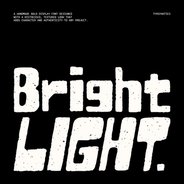
For the loudest word on the page, Nukami by Sundaylab hits hard. It's a bold brush display face built from dynamic strokes and sharp brush endings, with irregular letterforms that carry the movement of real hand-painted lettering. There's street energy in it and a Japanese-influenced edge, and it was designed to feel painted, so the imperfections read as intent. Drop it at the largest scale and let everything else react to it.

A second candidate for the anchor role, or a strong contrast face depending on how the piece flows, is Permanent Park by Wingsart Studio. It's a 100% hand-drawn marker font with a 90s hip hop tag aesthetic, and it comes packed with alternate characters for a specific reason: so your double o's, your repeated e's and l's don't come out identical. That's the exact failure that gives away lazy hand-lettering, and this face is built to dodge it. If you're chasing that lineage further, our rundown of graffiti fonts from screen-legible to full wildstyle is worth a read.

The contrast: Lyveros and Onehart
Put a brush or marker anchor next to a blackletter and the disagreement writes itself. Lyveros by Rvandtype comes out of medieval calligraphy refined with a modern hand, gothic and mystical and heavy with history. Its era argues with a streetwear anchor across five centuries; its weight argues at the level of the stroke. That distance is precisely what you want from a contrast face. If dark, archival type is your thing, we've written more about the dark academia aesthetic and occult ephemera that lives in the same neighbourhood.

Sometimes the argument gets designed by one person, both halves at once. Onehart Script & Sans by The Branded Quotes is a two-font system where the script runs on emotional, ink-blotted strokes with inconsistent line weight, and the sans is drawn with looser line gaps to balance those random blots. It's a clear example of a face and its counter-face built to hold each other in tension on purpose. If you want more on assembling type systems that work together, we've got a piece on font bundles worth buying when you need a full system.

The debris: Medieval Vectors and Occult Drawings
Ornament is where a lot of collages go soft, because generic clip art has no history in it and the eye knows immediately. Medieval Vectors by MiksKS avoids that with 432 elements pulled from historical and museum sources spanning the medieval era through the 19th century, ornamental flourishes, architectural drawings, figures, all cleaned up and vectorised to keep their detail. A lot of them come with silhouette backgrounds you can recolour independently from the linework, which is handy when you're fitting debris into a specific palette.

For something with more menace, Occult Drawings by secret-cache sources every image from real occult tomes, historical documents and wood carvings from the 1500s to the 1800s, with the originals vectorised directly. That distinction matters. You're placing genuine historical artifacts on the page, and that provenance is exactly the quality a blend algorithm can't reproduce.

The grain: Tortured Paper and Dirty Scanner
Everything above stays five separate files until you unify it. Tortured Paper by Textexp is 30 textures of deliberately degraded paper, made over two months of experimentation with materials including acetone and candles, delivered at 1200 ppi and 4000x4000px. That's real, physical damage captured at high resolution, the kind of surface you can't dial up from a slider.

Or reach for Dirty Scanner by Studio 2am, 30 ultra-high-resolution scanner textures, 26 grainy scan overlays plus 4 dust overlays, at 5000x7000px and 600 DPI. They're built to sit over a finished composition on Screen blend mode and pull the whole thing into a single scanned artifact.

Precision Is the Trend
The designers doing this well are making hard calls constantly: which typefaces are allowed to fight and which would just cancel each other out, which piece of ornament earns its place and which is filler, how much grain reads as texture and how much reads as dirt on your screen. Every clash is a decision. Chaos as a visual outcome is easy; chaos that holds together across a dense canvas takes a lot of small, deliberate rulings about balance and weight. That's taste at work, and taste is the one thing the smoothing tools were never going to have. If this is the direction 2026 is pulling you, the rough edges are the whole value, so keep them sharp and keep them yours.