Big-brand week. Apple loosened its collar, McLaren tiptoed past the smoking crater Jaguar left in the ground, and Pentagram gave an AI ad-tech company a warm human face right as a new report said AI is hollowing out human judgement inside brand teams. Then, off to the side, three studios reminded everyone what craft-first identity work looks like. Let's get into it.
Apple Music ditches minimalism for a cassette-insert wordmark
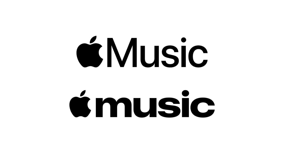
Apple has redrawn the Apple Music logo for the first time since 2015, and it's a proper handbrake turn. Out goes the clean San Francisco lettering; in comes a bold, lowercase wordmark with a retro warmth to it. It landed alongside Apple Music Hall, a 600-capacity venue inside Battersea Power Station in London. One Reddit read called it something you'd find on a music magazine cover or a cassette insert, and that's spot on. As Creative Bloq points out, Apple killed skeuomorphism in 2013 and just spawned a thousand Liquid Glass clones. When Apple pivots, the industry follows. This is a company rediscovering fun after a decade of restraint, and the ripple will be everywhere by summer.

McLaren rebrands like a fashion house and just about pulls it off
McLaren Automotive has a new global identity ahead of its move into SUVs, built around a light modern sans-serif wordmark with a subtle underscore beneath the lowercase "c". The look is drawn from the sign above the McLaren family's original Auckland service station, a nod that dates back to the 1920s. The old speedmark survives on the golf and racing sub-brands. Chief creative officer David Woodhouse calls it "the beginning of a new chapter," while over at Creative Bloq the comparison to a luxury fashion label is the whole point. Car rebrands are a minefield right now, and everyone in the room was thinking about Jaguar. McLaren played it safe with heritage and restraint, and safe was the correct call here.

Pentagram gives Moloco's AI a face you can trust
Moloco, an AI-native ad company going since 2013, has a new global identity from Pentagram: three circles standing for lens, light and refraction. The metaphor is a wide, scattered field of data pulled into sharp focus, mirroring its CARA platform. It takes aim at AI's black-box reputation, built on the idea of a lens that brings scattered information into a single sharp decision. Partner Natasha Jen, speaking via MediaPost, described the system as "precise and dynamic, but also surprisingly human." CMO Paul D'Arcy called Moloco "one of the biggest ad businesses people have never heard of." It's a sharp, confident system. The word doing the heavy lifting is "human," and it's worth holding that thought for the next story.

What a new report says AI is exposing in brand teams
A fresh report from MikeTeevee surveyed in-house creative leaders on what AI is doing to their departments, and the findings are less shiny than the sales pitch. The recurring line is AI "lowering the floor and raising the ceiling at the same time," widening the gap between average and exceptional. Writing at Creative Boom, the piece names decision paralysis, lost creative conviction and a vanishing junior pipeline as the real symptoms, with James Hurst pushing back on the tidy version of the story. The argument that lands: these cracks were brewing long before the tools showed up. AI is a spotlight on structural rot that was already there. Read this straight after the Moloco piece and the friction does its own talking.

Templo builds an identity out of real sign language motion
DeafCity Hub is a purpose-built cultural space designed to platform and empower the Deaf community, and London studio Templo gave it an identity that puts Deaf culture at the centre of the system. The system is built from creative coding, British Sign Language and gestural motion capture: the branding shifts with hand positioning and movement, using motion-tracking to record real human hand movement as raw data, gesture by gesture. Every bit of motion in the identity comes from a real hand moving, a detail confirmed by It's Nice That. Plenty of studios would have faked the gestures in After Effects and called it a day. Building the language into the tooling is a different order of care.

Studio Blackburn turns Culture House into Sunderland's living room
Sunderland has opened Culture House, a four-floor art and culture space with a 360-degree immersive gallery and a rooftop sky garden, part of the wider Riverside Sunderland regeneration and now home to the National Centre for Creative Smart Cities. London agency Studio Blackburn, a long-term partner of the city council, folded the letters "C" and "H" into a house symbol, with the guiding idea that the venue becomes a shared "living room" for the region. Covered by Creative Boom, it's civic identity done with warmth. A monogram-into-symbol move is a well-worn brief, but tying it to a domestic, come-in-and-sit-down feeling gives the mark somewhere real to live.

Menslies marks ten years of China's club poster archive
2026 is ten years of Menslies, the joint practice of Haojun Pan and Yenk, who met over a shared love of club music, illustration and design. The decade since has produced a deep archive of gig and event posters for China's club and electronic scene, made to capture, in Haojun's words, "the true feeling of the sound and the event." The posters ditch conventional grids and look purposely worn-in, matching the raw energy of the rooms they document from the inside. A retrospective runs at WarmUp gallery in Kyoto until 27 September, flagged by It's Nice That. In a week of corporate polish, deliberately grubby, grid-free work built from real scene knowledge is the palate cleanser.

So: Apple wants to have fun again, McLaren survived the tightrope, and two AI stories sat side by side arguing with each other. The work that stuck was the human stuff at the bottom. If corporate rebrand week has you itching to make something warmer, we've got plenty of branding tools worth a dig. See you next week.