Something shifted. After years of smooth gradients, soft UI, and the relentless polish of tech-adjacent minimalism, designers collectively decided they'd had enough of surfaces that looked like they'd never been touched by human hands. What's emerging in 2026 is a visual language that leans hard into tension, material weight, and deliberate imperfection. This isn't nostalgia for its own sake, and it's not contrarianism either. It's a response to oversaturation. When everything looks frictionless, friction becomes interesting. When every interface is optimised into oblivion, rawness reads as authentic. The tools designers are reaching for now reflect this shift, and the pattern is consistent enough to be worth paying close attention to.
Type That Takes Up Space
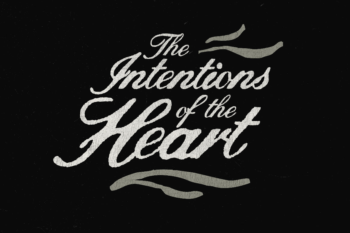
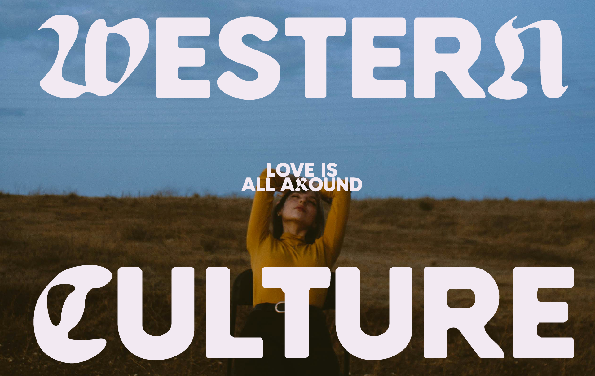
There's a strain of typography running through design right now that refuses to apologise for itself. Heavy, condensed, high-contrast letterforms built on strict geometric frameworks, the kind that feel like they were carved rather than drawn. This isn't about decorative flair. It's about presence. These typefaces work because they carry structural authority; they suggest something institutional, something that's been around and intends to stay that way.

GODROP by Razetype sits squarely in this territory. It's a condensed display face with the kind of visual mass that commands editorial layouts and poster work. The geometry is tight and deliberate, the contrast between thick and thin strokes is high, and it lands somewhere between mid-century Swiss rigour and the forward-leaning energy of contemporary brand identity work. It doesn't whisper. In a landscape where brands are trying to differentiate through personality rather than polish, type that occupies space confidently is increasingly the move.
The demand for this kind of typeface is being driven partly by a broader cultural appetite for directness. Consumers are more sceptical of overly curated aesthetics, and brands are adjusting. Bold, structural type signals conviction rather than curation.
The Material Turn: Industrial Texture as Visual Argument
If the defining look of the mid-2010s was flat, clean, and frictionless, the defining look of the mid-2020s is acquiring weight. Designers are reaching for textures that suggest physical processes: pressed metal, coarse grain, scanned paper, ink saturation. The impulse here is partly about tactility in a medium that has none, and partly about signalling craft in an era when AI-generated images have made seamless output almost valueless.
![]()
Take Silver Plate Text Effect by Pixelbuddha. What it does is replicate the look of typography pressed into an industrial surface, using light and shadow to define letterforms as though they've been physically embossed into metal. Fine grain and subtle noise complete the effect. Used in branding or packaging work, it communicates durability and materiality without a word of copy. The visual argument is: this thing exists in the world.

Then there's the Scanz. Texture Pack by Discount Desires, which offers more than 200 high-resolution scanned textures at print-ready resolution. Scanned textures carry something AI-generated noise never quite captures: the actual residue of physical surfaces. Stone, paper, abstract organic marks. These aren't simulations of texture; they're documentation of it. That distinction matters more than it used to.
The material turn is fuelled by a simple paradox: the more digital production tools improve, the more designers seek evidence of the hand, the press, the physical process.
Printed Matter Nostalgia, Recontextualised
There's a specific strain of reference running through a lot of design work right now that points back to an era of print production where things went slightly wrong in interesting ways. Colour misregistration on newsprint. Halftone dot patterns visible to the naked eye. Ink that bled at the edges. These were once problems to be engineered out; now they're being engineered back in, deliberately and with considerable skill.
![]()
The Halftone Print Photo Effect by Pixelbuddha captures this precisely. It applies visible dot patterns, slight colour misregistration, and coarse magazine-style grain to photographs, producing something that feels like it was pulled off a press in a hurry. The contrast stays strong, the edges stay crisp, but the surface tells a story about process. For poster work, editorial layouts, and social content that needs to stand out against algorithmically smooth feeds, this kind of visual texture functions as a signal of intentionality.

Similarly, the Overprint Text Effect by Matsero layers offset colours and rough ink textures in a way that evokes experimental screen printing and vintage poster production. The chromatic splitting, the rough surface, the sense that this was made by a person rather than rendered by a machine: all of it registers as authentic in a media environment saturated with synthetic imagery. If you're into halftone techniques and print-adjacent aesthetics, there's more worth a look here.
This trend is partly about generational memory and partly about credibility. Print imperfection has become a visual shorthand for the real.
Institutional Rawness: Archive Aesthetics in Contemporary Presentation
A subtler thread running through all of this is what might be called institutional rawness: the visual language of documents, systems, and archives stripped of consumer-facing gloss. Think technical drawings, functional packaging, materials left intentionally unpretty. This aesthetic has been building in brand identity and editorial design for a few years, but it's now showing up clearly in the design asset space itself.

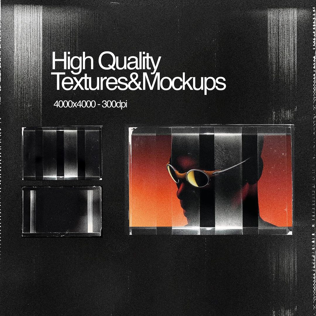
Consider the framing of PAPER_ARCHIVES_MOCKUP_V.01 by Moduclave Studio. Its very naming convention signals the aesthetic: underscores, version numbers, functional labelling. The mockup itself features stacked paper in a plastic archive sleeve, the kind of object you'd find in a storage room rather than a photo studio. The resolution is high, the execution is precise, but the reference point is deliberately unglamorous. For branding presentations, particularly in architecture, publishing, and independent label work, this reads as a serious aesthetic choice rather than an absence of one.
What's driving this is a broader rejection of the aspirational gloss that dominated brand presentation through the last decade. There's a growing appetite for work that looks like it's built to last rather than built to impress on a screen for thirty seconds. The archive aesthetic says: this is a system, not a moment.

The handdrawn end of this spectrum is equally relevant. WODIEN by Enxyclo Studio applies a similar logic to type: gritty, uneven strokes with the kind of natural variation that comes from a brush or marker rather than a bezier curve. It's rough in a way that takes real skill to execute convincingly, and it sits naturally alongside institutional rawness because it implies a person made a mark, not a system generated a form. If you want to explore further in this direction, there are more recently released assets worth digging into.
What to Watch
The rawness trend has enough momentum that its next phase will likely involve tension: between rawness as genuine philosophy and rawness as another surface to apply. The designers doing the most interesting work right now are those who understand why these visual choices carry meaning, not just what they look like. Watch for the aesthetic moving further into motion and UI contexts, where its disruptive logic has the most still to offer. The question for 2026 and beyond is whether grit becomes another form of gloss.