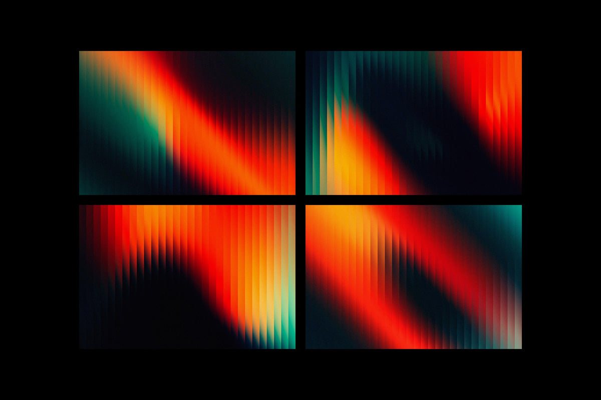

A gradient can be perfect and still look wrong. Smooth, mathematically even, not a single flaw in it, and the second you drop type on top, it reads as generated. Nobody made that. There's no hand in it, no press, no scanner bed. That's the problem flat digital work runs into constantly, and it's why grain has become the fastest fix in the kit. Not because texture is trendy, though it is, but because it's the cheapest way to put evidence of a physical process back into something that was born entirely in RGB.
This is also why "paper texture" is one of the most searched terms in the asset space, across every discipline from packaging to type design to motion graphics. It's not a niche request. It's the most universal one there is. But most roundups treat it as one mood: distressed, brown-edged, coffee-stained. That's a fraction of what paper actually does. Real paper degrades in specific ways, ink bleeds unevenly, water leaves tide marks, glue dries in ridges, and clean uncoated stock has its own quiet grain even when nothing has happened to it at all. The range matters. Here's the fuller spread, from wrecked to barely-there.
Bad Archive Printed Inks Texture, for the washed-out record sleeve look

Think of a photo that's been sitting in a filing cabinet since 1968, half-forgotten, ink slightly lifted from the paper, colour gone cool and thin. That's the register this pack works in. Textexp has pulled these from actual archival ink prints on archival paper, and the wear reads as chemical rather than cosmetic, the kind of degradation that happens to a print over decades rather than something applied in five minutes with a filter. It's suited to music covers and gig posters specifically, anything trying to sound like it came from a crate rather than a folder. Lay it over a modern photo shoot and the cool, muted cast does most of the ageing work without needing a colour grade underneath it.
Water Damaged Scans, when the story is the damage itself

Seventy scans, water damaged for real rather than digitally faked, and the difference shows. Real water damage on paper is unpredictable in a way that's hard to fabricate convincingly. Tide lines don't sit where you'd expect. Fibres swell and buckle unevenly. h0vado's set captures that chaos with a cool, dark undertone that leans closer to found-document horror than rustic charm, which makes it a strong match for anything wanting a mysterious or unsettling edge rather than straightforward nostalgia. Album art that wants to feel like evidence rather than decoration. Branding for something that wants to feel unearthed rather than designed.
Glued Papers Textures, the sound of a wheatpasted wall

Afterimagine's pack captures the specific mess of pasted-paper build-up: torn edges, overlapping layers, the ridged texture glue leaves once it's dried and been rained on a few times. This is street-poster language, the visual grammar of zine culture and flyposting, and it's one of the harder textures to fake convincingly because the layering has to look accidental. Use it on anything that wants the energy of a wall in an inner-city laneway rather than a print shop. Editorial spreads with a punk or DIY sensibility. Album covers that want a lived-in, plastered-over feel rather than a clean print finish.
Vintage Paper Textures, the reliable 200-piece workhorse

MiksKS built this from old books, aged documents and weathered paper stock, and the sheer range, 200 textures at 300ppi, 4000 pixels wide, means it covers more ground than a single mood board usually needs. Warm, analogous tones throughout, the kind of colour cast that reads as sun and age rather than damage. This is the set to reach for when a brand wants warmth without shouting about it: a heritage food label, an editorial feature on a slow, considered subject, packaging for something handmade. It doesn't scream vintage, it suggests the object has history, which is usually the more convincing move anyway.
Paper Vol. 1, Studio 2am's own answer to "give me everything"

This is our in-house set, and it exists because we kept needing one pack that covered stained, creased and folded paper without having to stitch together three different purchases. Over 200 high-quality textures spanning mid-century warmth through to more contemporary, neutral tones. If you're doing branding work that needs to shift between a soft vintage feel and something more current within the same project, this is built for that flexibility. Editorial layouts benefit particularly, since a spread often needs three or four different paper moods across a single issue and having them all shot and processed consistently saves a lot of colour-matching down the line.
Raw Paper Textures, for when the paper itself is the whole point

No ageing, no damage, no story. Just eight high-resolution scans of genuine paper stock, 5400 by 3600 pixels, capturing grain and surface detail with nothing added. Gromov Design's approach here is closer to material photography than texture design, which is why it works for packaging and branding that wants to feel tactile without feeling retro. A neutral, monochrome palette that sits under almost any colour treatment without fighting it. This is the set for a brand that wants to feel considered and honest rather than nostalgic, the difference between a recycled kraft box and a distressed one.
White Paper Overlay Textures, the quietest option in the pack

Some jobs don't want texture to be noticed at all. They want depth that reads as intention rather than effect, the kind of thing a viewer feels before they can identify it. Gromov Design's white paper overlays deliver exactly that: delicate fibre detail, natural grain, a cool and controlled palette that adds tactility without adding visual noise. This is the set for minimal editorial design, for branding that leans restrained rather than expressive, for any layout where the paper needs to feel real but never wants to be the subject. Subtlety here is the entire feature, not a limitation of the set.
Free Textures Sampler, for testing the waters

Twenty-five textures mixing paper, plastic and grunge overlays, and a solid starting point if you're not yet sure what kind of physical texture a project needs. It leans grittier and more industrial than some of the other sets here, closer to a nineties or Y2K print aesthetic than a polished archival feel, which makes it useful for social content and poster work that wants some edge without committing to a full paid pack. A reasonable way to test whether texture layering is even the right move for a project before going deeper into more paper-specific options.
Restraint is the actual skill
Every texture on this list can ruin a design if it's used the way most beginners use it, which is as the whole point rather than a layer. The trick worth learning from print history is that ink bleed, foxing, water staining and halftone grain were never decorative choices in the original context. They were the side effects of a physical process, and they read as authentic precisely because nobody was trying to make them look good. The moment a texture calls attention to itself, it stops doing its job. Drop the opacity lower than feels right. Mask it so it only touches the parts of the composition that need weight. Let it sit under the type, not fight with it. If you're chasing that print-era noise specifically, there's more where that came from, but the same rule applies there too: a texture's best work is usually invisible until someone looks closely enough to wonder why the design feels so right.