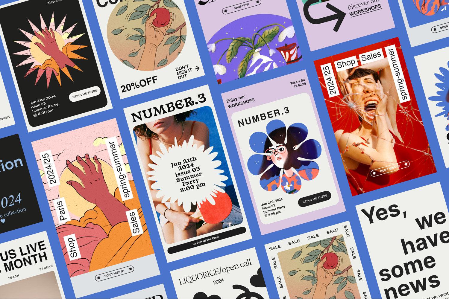
The stigma around templates in design circles is mostly performative. Ask any working designer what their actual process looks like and you'll find a folder full of structural shortcuts, reused grids, saved colour swatches, and baseline documents they tweak per project. Templates are just the formalised version of that. The real skill has never been whether you use them; it's knowing which parts to honour and which parts to discard.
Start by breaking the typography
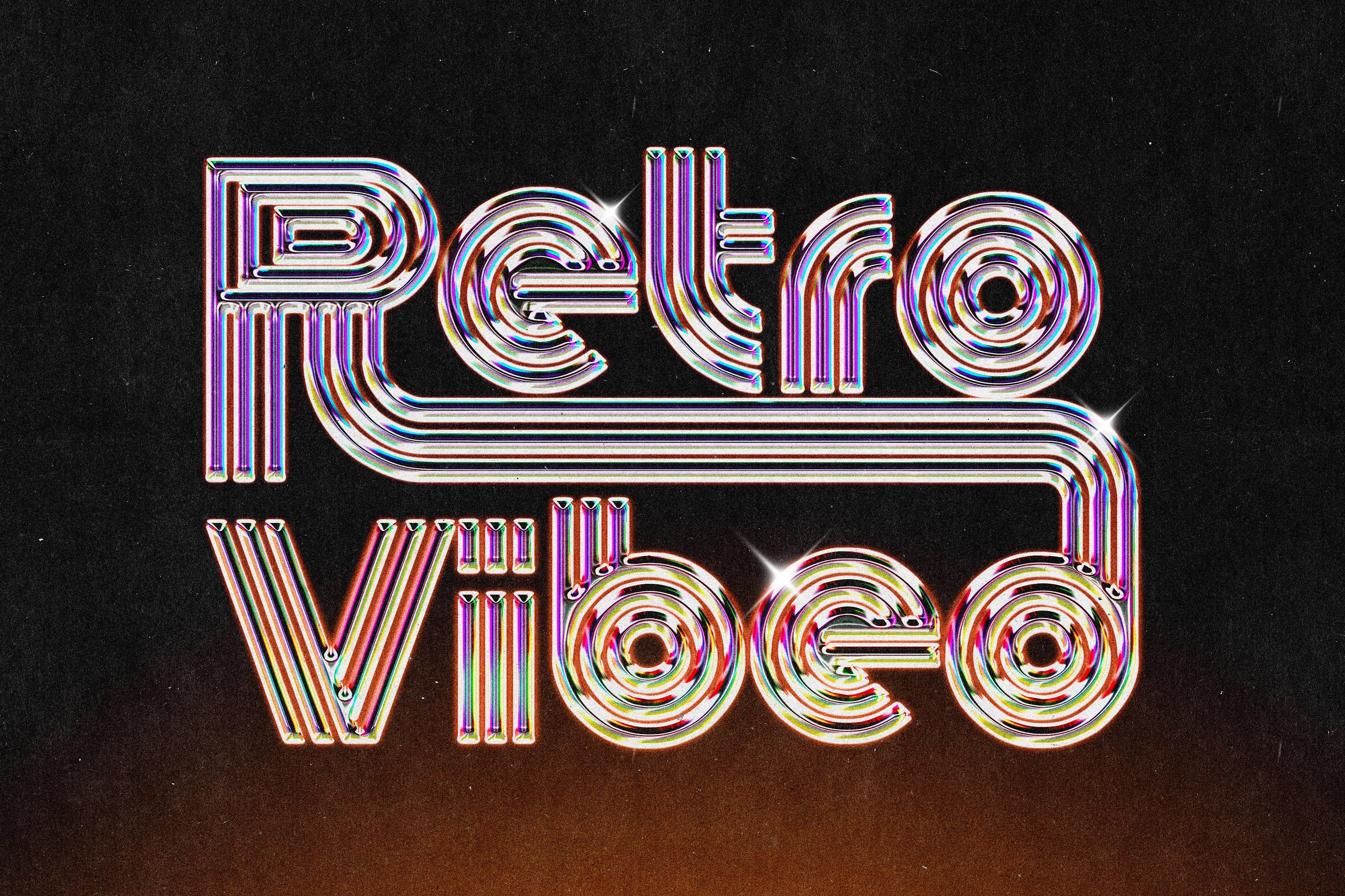
Fonts are the fastest leverage point you have. Before you touch a single colour, before you move a single element, swap the font family. Every template ships with a default typeface that the designer chose for their portfolio, not for your client. The moment you replace it with something that fits your project's personality, the template stops looking like a template. A grotesque swapped for a condensed serif, or a neutral sans replaced with something with actual character, changes the entire visual register in seconds. Everything else stays the same but it already reads differently. Do this first, every time, without exception.
The colour palette is the second lever
Colour does more emotional work than almost any other design decision, which is exactly why leaving the template's default palette in place is such a mistake. A dark, fully saturated rework of a pastel template is essentially unrecognisable. The shapes, the layout, the hierarchy remain intact but the mood shifts completely. This is also where you can push against genre. Take a corporate-leaning layout into something more editorial by stripping back to two tones. Pull a clean, airy template into something more grounded and tactile with deeper, earthier choices. The structure does its job; the colour makes it yours.
Know which elements to strip out entirely
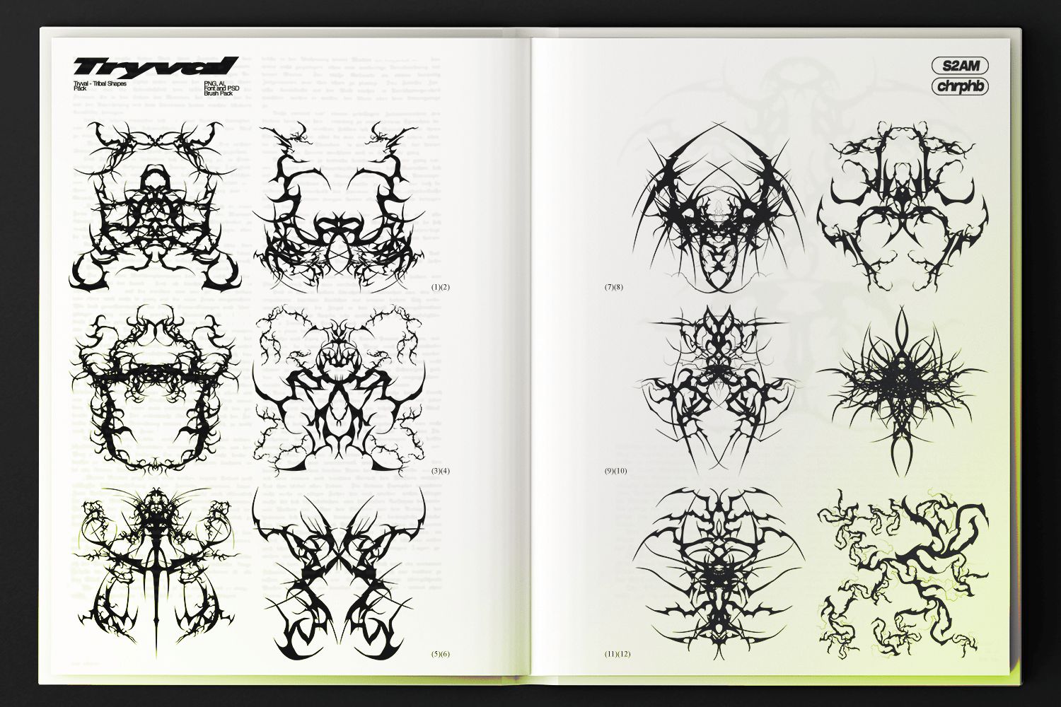
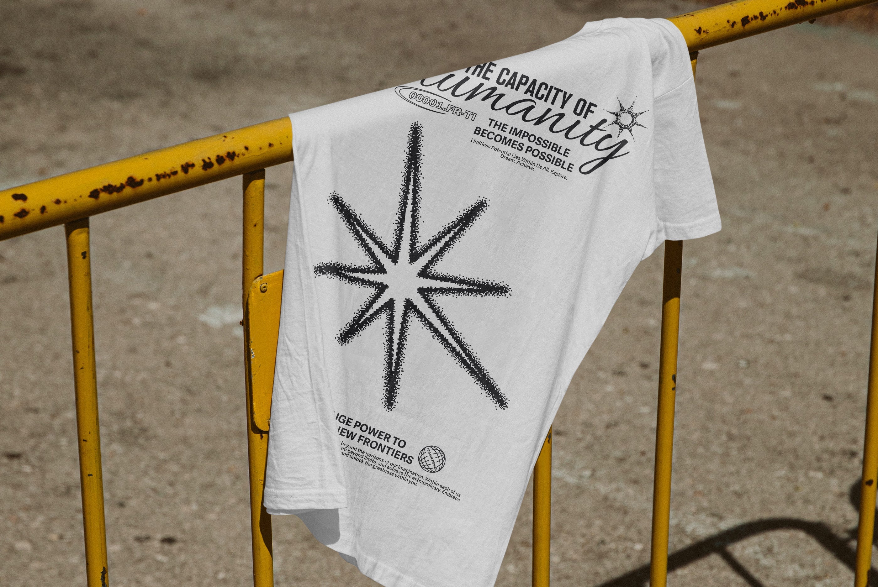
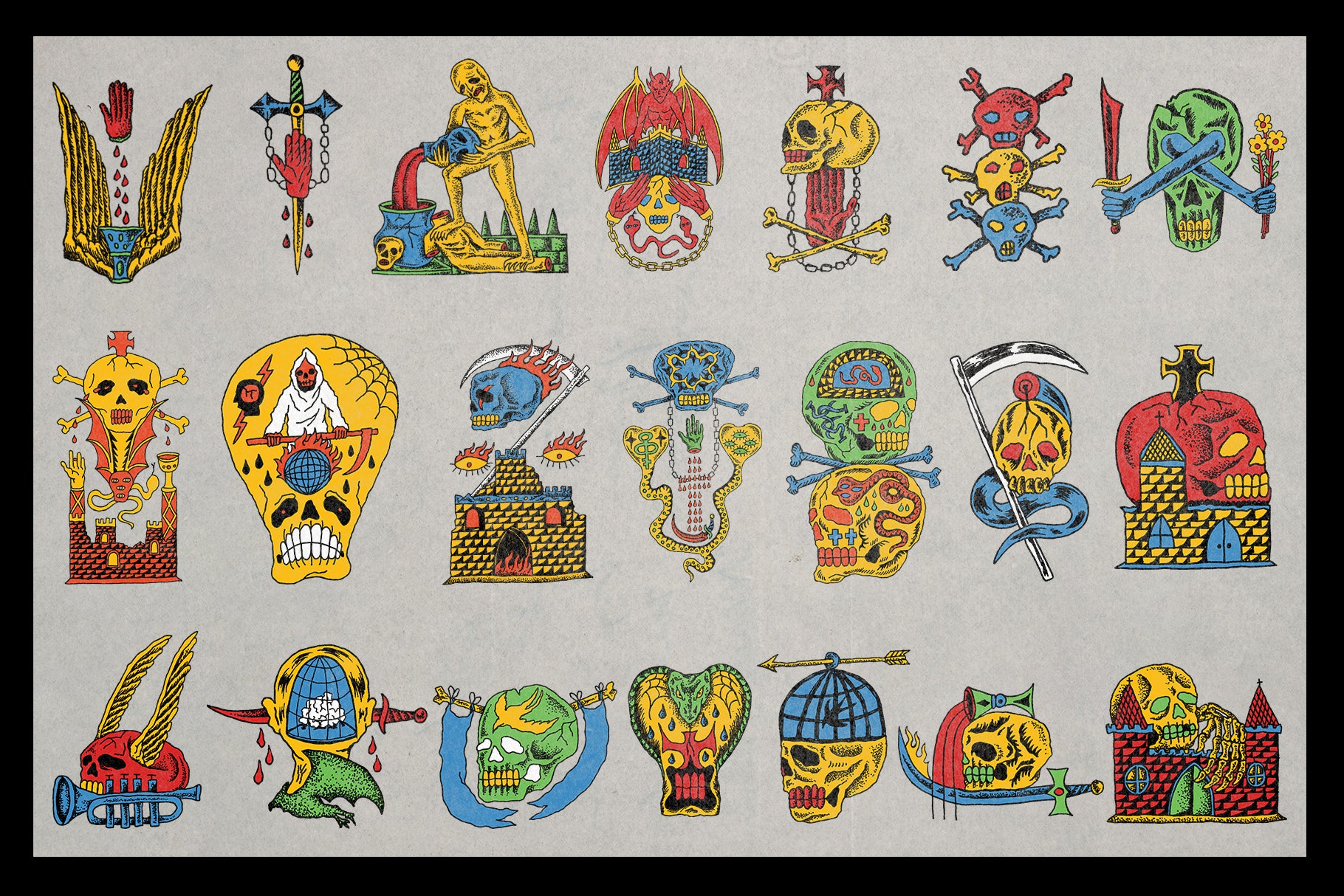
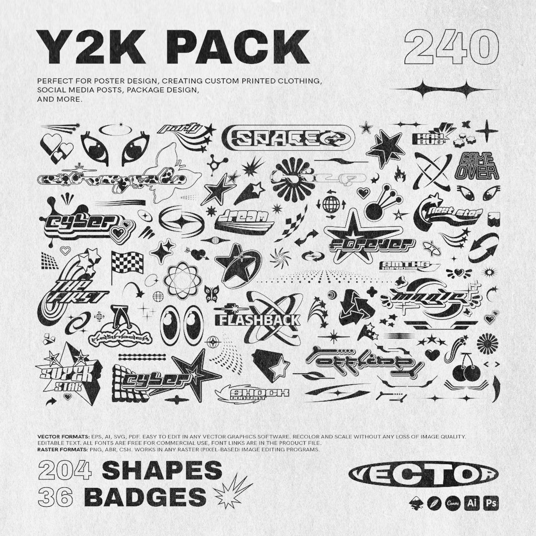
Most templates include decorative elements that were there to make the preview look appealing. Star bursts, ornamental dividers, generic icon sets, placeholder badge graphics; these are default filler and they're usually the first thing that dates a piece. Identify them early and remove them before you do anything else. The gap they leave is an opportunity. Replace them with something specific to your project: a photograph, a custom mark, a type treatment, a texture. The best use of a template is to let it handle the parts of the job that don't require creative decisions, so you can spend your time on the parts that do.
Texture and layer work
This is where template work actually gets interesting. A single well-chosen texture layer dropped over a clean template at the right opacity does more to eliminate the manufactured feel than any other technique. Grain, paper, noise, halftone, fabric; whatever suits the project's world. Most templates are built on clean digital surfaces because they have to be broadly appealing. That cleanliness is also what makes them feel generic. Adding your own texture layer is essentially overriding the template's emotional fingerprint with your own. It's the difference between a finished piece and something that looks like it came out of a builder. If you're doing this regularly and want material to work with, there's a solid amount of texture-forward template work worth digging into when you need a base that's already halfway there.
Where templates genuinely shine
Fast social content is the obvious one. When you're producing ten posts a week for a brand, a solid structural template keeps things consistent without requiring you to build from scratch every time. Music video title cards are another legitimate use case; the pacing and format are fairly standardised, so the creative energy should go into typography and treatment, not layout construction. Editorial social content, particularly anything in the fashion or music space, benefits from templates that already carry a strong aesthetic point of view. Newsletter layouts are a strong fit too, given that the structural demands are significant and the design decisions are mostly typographic and tonal. And cinematic poster work, where the compositional logic is well-established, is a category where a good template is genuinely hard to distinguish from a custom build once you've applied your own photography and type.
The tools worth using
Built for motion and still work simultaneously, the Music Video Title Templates by Blaine Pate Studio cover both After Effects and Photoshop across fifteen-plus designs. The typographic approach is heavy and high-contrast, closer to streetwear editorial than broadcast default. For anyone producing content in the music or creative culture space, these give you a starting point with actual visual weight rather than the neutral, safe-for-everything title cards that fill most motion template packs.

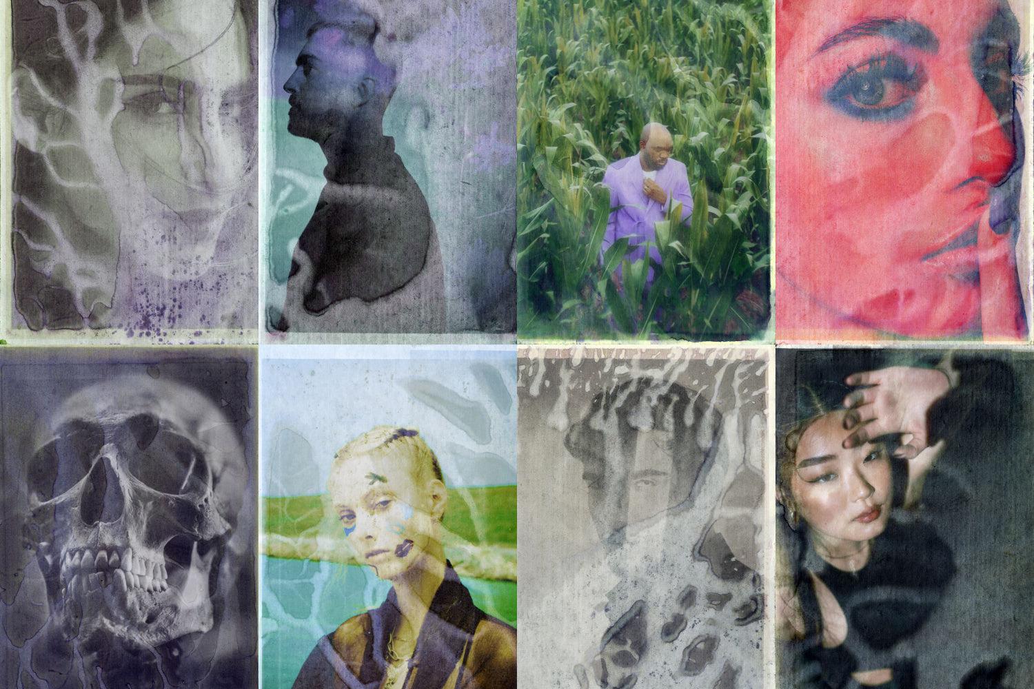
Fifty layered PSDs built from real folded paper and soft analogue textures: that's the FOLDED MEMORY Retro PSD Kit by angelainthefields. The smart object workflow means your images drop straight in and the fold reads as physical. This is the kind of kit that earns its place in album art, editorial collage work, and mood-driven social content where the lo-fi aesthetic is intentional rather than accidental. The texture is already embedded in the structure, which means you can skip the layer-stacking stage and move straight into composition.

Studio Dusk's Movie Poster Templates are fifteen cinematic PSDs built around the compositional conventions of actual film and documentary poster work. The typography and layout logic is already doing the heavy lifting; you're swapping in your own photography via smart objects and adjusting from there. Every typeface in the pack is freely available, so there are no licence complications when the work goes to print or client delivery. For short film, documentary, or narrative content work, these are a faster route to a professional result than building from a blank canvas.

The Cyber Posters by Studio Dusk sit at the heavier end of the aesthetic spectrum: eight large-format PSDs built around neon, glitch, and futuristic visual language at a resolution that works for both print and digital output. The cyberpunk genre has enough visual clichés that it's easy to produce something derivative, but the structural decisions here leave enough room to push the work in a distinct direction. Change the photography, adjust the palette, replace the type, and the genre markers become reference points rather than constraints.

Sparrow's Liquorice Newsletter Templates solve a genuinely tedious problem: building newsletter layouts that hold up visually across multiple email marketing platforms. Twenty templates with sixty-plus sections across Canva, Photoshop, and Adobe XD means you can work in whatever environment your client is already using. The image-based approach sidesteps the rendering inconsistencies that make native email builders frustrating to work in. The visual language is energetic and bold, which suits brands that want their newsletters to feel like content rather than correspondence.

Where Liquorice is expressive, Sage by Sparrow is restrained. Thirty-five templates across the same multi-platform setup, but the aesthetic sits in warmer, quieter territory; editorial minimalism with enough structural variety to cover a serious publishing or content brand operation. If you're designing for a client whose tone is considered and whose audience expects a degree of polish, Sage is the more appropriate starting point. The Canva compatibility makes it accessible for clients who want to manage their own content once the system is established.

Parisa-Artstudio's 8 Modern Grunge Social Posts are built around collage logic: layered textures, torn paper elements, tape effects, and strong typographic framing drawn from street and urban fashion culture. The grunge aesthetic in social content has had a long run precisely because it resists the over-polished look that most brand accounts default to. These templates give you the structural collage work pre-built so your energy goes into the imagery and type choices that make the post specific to your project rather than generic to the genre. There's more work in this vein worth looking at if this is a direction you're developing for a client.

Pixelbuddha's Postmarked Fashion Instagram Templates are built around the visual language of print culture: postage stamps, embossed card details, archival layout structures, and tactile paper references brought into a digital Instagram system. Twenty-four templates across Canva, PSD, and InDesign that function as a coherent visual identity rather than a loose pack of individual posts. For fashion clients, editorial brands, or anyone building a feed that needs to communicate heritage and considered taste, the structural logic here is already doing the aesthetic positioning for you.
![]()
The bottom line
A good template in the hands of a designer who understands what they're doing produces work faster and at higher quality than starting from scratch every time. The structural decisions are pre-solved; the creative decisions are yours. The designers who look down on templates are usually the ones spending four hours building a newsletter layout that already exists, or recreating a poster grid that anyone could have grabbed in ten minutes. Use what works. Make it yours.