

A brand with three typefaces and no plan for how they relate is not a type system. It's three fonts fighting for the same job. Most font-pairing advice stops at two faces that look fine sitting side by side in a mockup, and then it leaves you alone the moment that pairing has to survive a logo lockup, a slide deck, a product label and an Instagram grid in the same week. A pairing that "looks nice" is a screenshot. A hierarchy is a system that holds its shape no matter what size, surface or context you throw at it.
The strongest principle floating around in the generic pairing guides is a decent one: contrast beats similarity. Two near-identical faces clash in a way that reads as a mistake; two clearly distinct faces read as a decision. True, and nowhere near enough. Contrast tells you two fonts won't fight. It doesn't tell you who does what. For that you need roles. Here's the model I build every client system on: Anchor, Structure, Voice. Three typefaces, three jobs, and each one stays in its lane.
The three-tier model
The Anchor is the loudest face in the system. It carries recognition, the wordmark, the hero headline, the packaging type people photograph. It has the most personality and, counterintuitively, it gets used the least. The rule that saves you: a system can only afford one loud face. If a typeface has swashes, heavy ligatures, a distressed texture or a silhouette you'd recognise from across a room, it's your Anchor by default. Treat it like a signature, not a sentence.
The Structure is the workhorse, and it does more labour than the other two combined. Subheads, body-adjacent headlines, UI, captions, the fine print on a label, the running text in a deck. It has to flex from a near-Anchor intensity down to something quiet enough to disappear into a paragraph, which is why a real weight range matters more on a Structure face than how it looks solo. A variable font or a proper multi-weight family is the difference between one face that covers an entire brand and a face that only works at one size.
The Voice is the accent. A script, a handwritten face, something with a human hand in it, used for a signature line, a pull quote, a tagline, a flourish on packaging. Restraint is the whole job here. Give a Voice face more than a line or two and it stops reading as a human touch and starts behaving like a second Anchor, muscling in on a slot that's already taken. Voice is spice. You don't build the meal out of it.
Three mechanics that make or break a pairing
Weight contrast. Never let two tiers sit at the same optical weight doing different jobs. If your Anchor is running hot and your Structure headline is sitting at a similar density right next to it, the eye has no idea where to land. The Anchor's intensity needs somewhere to come down to, and that descent lives inside the Structure face's weight range. A variable Structure face matters more here than how it looks solo: light, regular, medium, bold and black drawn by the same hand let the step-down read as one voice getting quieter.
x-height and baseline matching. Scripts sit at a different height and on a different angle than upright faces, by nature. Drop a Voice script next to a Structure face at the same point size and the script's lowercase will look like it's sliding off the baseline. Size the script up or down until its visual mass matches its neighbour, then nudge the baseline shift until the two lines feel like they belong on the same page. Five minutes of baseline work separates a considered lockup from a template.
Personality budget. Every system gets exactly one slot for "loud." Spend it on the Anchor and you're out. If your Anchor is already maximalist, deep swashes, stylistic sets, an unmistakable attitude, then Structure and Voice have to go quiet: flat, legible, mostly out of the way. Try to make all three interesting and the system collapses into noise nobody can read. Hierarchy is as much about what you force to shut up as what you let shout.
System One: Loud Anchor, Quiet Structure
This is the build for an independent streetwear or merch label, the kind of brand that needs presence before it needs polish. Impact first, then enough structure underneath to stop the whole thing collapsing into a graphic tee.
Anchor. Offset TM by Type Mania is the one loud face, and it earns the slot through sheer attitude. It's a rugged, eroded display face with three stylistic sets that automatically shuffle when the same glyph repeats, so a wordmark never shows you two identical letters sitting next to each other. That built-in variation is what you want in an Anchor and what you want to ration: it has so much character that it belongs on the wordmark and the hero headline, full stop. Push it into a subhead and the texture starts fighting the message. Keep it rare and it stays iconic.

Structure. GC Back Ford by Glyphonic is the workhorse holding everything up, and it got the job on its weight range. This is a variable slab that travels from a light condensed structure all the way to a heavy black, with thick slabs and angular cuts that echo Offset's grit without copying its noise. Set it heavy and it sits just below the Anchor in intensity for a secondary headline; pull it light and condensed and it's a caption that reads clean at small sizes. One face, one voice, carrying the headline, the subhead and the fine print without ever feeling like a different brand showed up. If you want more faces built to take this kind of abuse across shelves and labels, our piece on slab serifs that hold up on shelves, signage and shipping labels is worth a read.

Voice. Onehart Script & Sans by The Branded Quotes brings the human hand. The script half has an inconsistent, organic line weight, inspired by screen-printed DIY art and worn denim, ink-blotted in a way that looks hand-scrawled. That rawness is a gift and a trap. It's built for short bursts, a tag, a quote, a note scrawled across a hang-tag, and the creator is upfront that it's not for long passages. Use it for a line or two over a product shot and it reads like a person left a mark. Set a paragraph in it and it turns to mud. The family ships with a companion sans if you need somewhere soft to put more words.

System Two: Ornate Anchor, Disciplined Structure
This one's for an editorial or fashion-adjacent brand built on refinement. The Anchor can be ornate as long as everything around it is kept on a tight leash, with the drama coming from contrast and precision.
Anchor. Swarsh Daisy by Marvadesign is the loud face here, and loud looks different in this register. It's a high-contrast serif with dramatic thick-to-thin transitions, elegant curves and swash details, plus a dedicated italic whose calligraphy-inspired forms are where the whole thing gets properly expressive. That contrast is beautiful at display size and completely wrong anywhere near body copy, which is precisely why it's the Anchor: a hero headline, a logotype moment, a magazine cover line. The stylistic alternates give you room to tune a wordmark until it sits right. Let it carry the drama and keep it off everything else.

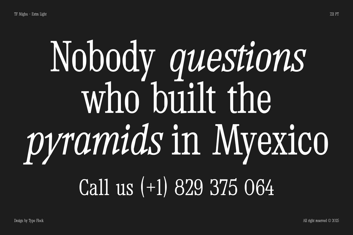
Structure. TF Mighu Slab Variable by Type Flock is the disciplined counterweight, and it's engineered for exactly this flex. A variable slab serif with solid slabs, wide shoulders, stable stems and confident terminals, drawn to hold clarity and presence whether it's blown up to display size or packed into a dense editorial layout. That dual range is what Structure needs opposite an ornate Anchor: it can step up near Swarsh Daisy's scale for a deck headline, then drop into a long caption or a spec table without losing its composure. It's the calm, rational grid that lets the Anchor be theatrical. Put a loose serif here instead and the whole system tips into melodrama.

Voice. AMHINEY by Enxyclo Studio is the accent, a script with graceful curves and flowing strokes pitched squarely at logo and fashion work. What makes it the right Voice next to Swarsh Daisy is its restraint: controlled, composed curves that add a signature line or a tagline without trying to out-perform the Anchor's swashes. Two expressive faces in one system usually collide, but AMHINEY wins by staying in its lane, a few words at a time, a graceful handwritten note under a dramatic headline. For more handwritten faces with enough alternates to survive a real print run, we've written about that too.

What breaks a system
Three failure modes, all of them common, all of them avoidable. The first is two scripts in one system. There's a single Voice slot, and the moment you add a second script they both read as accents with nothing to accent, like two people whispering the important part at once. Pick one, drop the other.
The second is two faces sitting at the same weight doing the same job. This is the Anchor problem in disguise: if a slab headline and a display headline are both running hot and loud, you've built two Anchors and no clear first read. One of them has to come down in weight, scale or frequency so the eye knows where to go first.
The third is mismatched era and personality. A brutalist, eroded Anchor under a delicate heritage script reads as confused: two voices from two decades that never agreed to be in the same room. Intentional tension with clear roles reads as eclectic. Faces that simply don't know each other read as a mistake the audience feels before they can name it. Get the roles right first, then let taste do the rest. If you want to see chaos handled on purpose, our take on type collage as chaos with a system is the companion piece to this one.