

Run a prompt through an illustration generator ten times and you get ten versions of the same over-confident line. The stroke never thins where a wrist slowed down. No spot where the pen skipped, caught, or doubled back on itself. Every curve closes cleanly because nothing was ever holding a pen. Designers clocked this first, and now clients are starting to clock it too. The tell of a human hand, uneven line weight, asymmetry nobody bothered to tidy, a bit of ink bleed at the start of a stroke, reads as evidence somebody made the thing. That evidence is the value now.
Which is why hand-drawn work is back in a deliberate way, and it's back in specific places. Heritage and outdoor-adjacent brands are reaching for engraving-style illustration with that field-guide weight. Café and lifestyle packaging is leaning into loose, warm doodle work. Streetwear has gone back to the tattoo flash sheet. Western and Americana apparel is building whole identity systems out of cowboy iconography. One generic "hand-drawn" bucket won't cover all of that.
The designers getting real mileage out of it are matching the sub-style to the brief. A roastery bag and a heritage merch drop both want hand-drawn, but they want completely different hands. Here are eight packs that each cover a specific corner of that, plus the texture layer that ties the clean ones back to a human.
Hand-drawn Coffee Illustrations by cd-design.co
Coffee branding is where loose linework earns its keep, because the product category is already warm and tactile and a stiff vector drawing fights that. This café-ready illustration pack from cd-design.co gives you 45 drawings covering baristas, espresso machines, cups, brewing gear, café bits, pastries and lettering, with that slightly wobbly, cheerful line that matches a flat white better than anything rendered clean ever will. You get AI and EPS vector files plus separate SVG and transparent PNG. Drop the brewing equipment onto a coffee bag label and the loose edges carry it; print the baristas and cups across secondary packaging; put the lettering on an apron or a tee for roastery merch and the whole thing reads handmade because it was.

Rodeo Graphic Collection by Skilline Supply Co
Most illustration packs hand you parts and leave the assembly to you. The Rodeo Graphic Collection by Skilline Supply Co hands you the finished thing as well: 22 illustrations alongside 22 pre-built logo-style layouts, so the cowboys, cowgirls, horses, cacti, sheriff badges, hats, lassos and desert scenes already come arranged with vintage typography into lockups you can ship. For Western-leaning apparel branding that needs a full system fast, this is the shortcut. The badges work as patch and embroidery placements, the layouts sit straight onto a whiskey or coffee label, and because it's a full system, a merch line built on it holds together across a hat, a tee and a tag.

Knights & Weapons by h0vado
Engraving-adjacent imagery is doing heavy lifting in heritage merch right now, and Knights & Weapons by h0vado is built for exactly that corner. It's over 150 high-resolution PNG files at 300 DPI, isolated on transparent backgrounds, covering knights, helmets, gloves, swords, maces and axes with the dramatic high-contrast detail that reads old and considered. These sit beautifully on heritage-coded streetwear, big single-colour back prints, book covers and gig posters. The transparent backgrounds mean you can drop a mace or a helmet straight into a layout without masking, which matters when you're placing imagery this detailed onto a garment mockup. For more in this territory, there's a piece on vintage engraving illustration for merch and packaging.

Anatomy Illustrations by Nomad Visuals
There's a specific line quality that reads clinical and handmade at once, the look of an old medical plate drawn by someone, and Anatomy Illustrations by Nomad Visuals lives right there. The set runs 36 vectorised anatomical drawings, hearts and skulls and skeletons and muscle studies, delivered in AI (CC and CS4+), PNG, PSD and PDF. It's the darker-edge option for apparel back prints and band merch, and it has a second life on apothecary or skincare packaging where a hand-drawn heart or an antique bone study gives a label an editorial, slightly unsettling weight. Because it's vectorised, you can scale a single illustration from a hang tag up to a full poster without the line breaking down.

Gothic Grunge Tattoo Flash Pack by Designimento
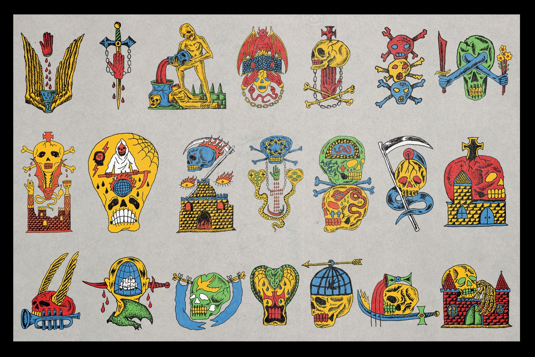
Streetwear went back to the flash sheet for a reason, and this pack was drawn specifically for that move: traditional tattoo linework blended with cyber-grunge and occult edges, built for the job from the start. The Gothic Grunge Tattoo Flash Pack by Designimento is 55-plus hand-drawn tattoo flash illustrations, skulls, crying eyes, melting clocks, biohazard marks. You get source files, individual SVGs and transparent 300 DPI PNGs, so you can pull one icon for a sleeve-style placement or sheet a whole grid across the front of a tee. It's built for streetwear drop graphics, flash-sheet tee and hoodie prints, and album art where the imagery needs to look inked rather than generated. Worth a look alongside the rest of the streetwear graphics and fonts too.

Vintage Icons + Bonus Font Duo by AROKA TRUE INDEPENDENT STUDIO
Small marks carry a surprising amount of a brand's warmth, and a stock icon set drains it right back out. Vintage Icons + Bonus Font Duo by AROKA TRUE INDEPENDENT STUDIO gives you 100 hand-drawn vintage-style icons plus the "Reymo" and "Morey" display font pairing, in AI, PNG and PDF. These are the details that finish a package: the little badge mark on a label, the iconography running along a hang tag, the hand-drawn flourish next to a logo that a geometric icon could never deliver. Pairing the icons with the display duo means you can build a complete badge-and-label system in one sitting. If the typography side pulls you in, there's a guide to hand-drawn fonts for branding worth reading.

Vintage Frames by h0vado
Loose illustration needs structure around it or a label turns to mush, and frames are the device that holds it. Vintage Frames by h0vado is a mega bundle of over 350 high-resolution PNG files with transparent backgrounds, ornate and vintage-style borders in every proportion you'd need. Use one as a dieline border on a label, build a badge around it, or treat it as woven-label art for apparel. The real job it does is containment: drop your loose coffee drawings or your flash icons inside one of these frames and suddenly the whole packaging layout reads intentional, because the structural device is doing the tidying the illustration never had to. It plays well with the rest of the packaging fonts and graphics.

Marker by Studio 2am
Every pack above can still end up looking a touch too clean once it's placed, and that's the gap Marker fills. It's over 500 ultra-high-resolution transparent PNGs scanned at 600 DPI from real permanent marker: 65 lines, 90 scribbles, 94 numbers and letters, 125 shapes and 85 backgrounds, every one of them carrying real pen pressure and ink bleed. Lay a scribble over a too-perfect vector composition and it breaks the symmetry a person would never have drawn. Use the numbers and letters for batch or code-date style marks on packaging. Build tag-style apparel graphics straight from the shapes. This is the layer that makes a vector-perfect pack read as handled by a human, and it sits well next to a set of noise brushes that don't look like a filter if you're building texture a few ways at once.

The thing a generator can't fake is judgement. Reaching for one blanket "hand-drawn" look is how a brand ends up with a nostalgia filter smeared over the top. Matching the right hand to the brief, loose and warm for the café, engraved and heavy for the heritage drop, inked flash for the streetwear, framed and iconed for the label, is what makes the work read as considered. Pick the sub-style on purpose and the pen hesitations stop being a flaw and start being the whole point.