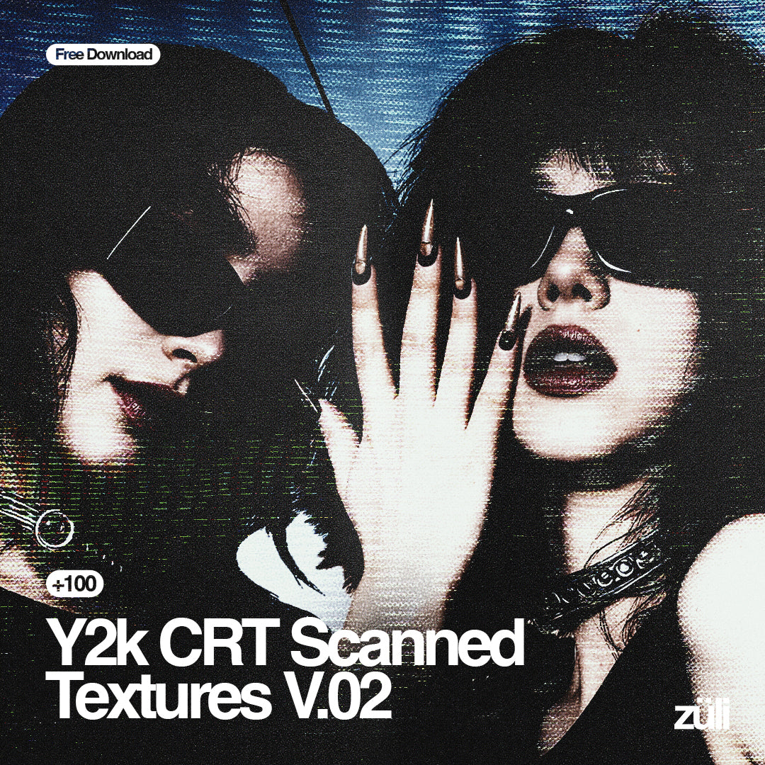
Gig poster design is one of the last places where font choice carries the actual emotional weight of the music. The tradition runs deep: Victor Moscoso's acid-psychedelic Fillmore posters from the 1960s, where type vibrated and pulsed like a contact high; the xerox punk flyers of the late 70s and 80s, where degraded reproduction became the whole aesthetic; hand-lettered tour merch that spawned entire typographic subcultures around death metal, thrash, and hardcore. These weren't incidental choices. The type was the message before anyone read a word.
That lineage still matters when you're laying out a poster at 2am with a headliner, two supports, a date, a venue, and a door price all fighting for attention on an A2 sheet that also needs to photograph well on someone's phone, survive being stuck to a pole in the rain, and potentially get screenprinted onto a tour tee. Font choice isn't decoration in this context. It's structure, mood, and identity all at once.
Here are eight fonts that earn their place on a gig poster. Each one is specific. Each one belongs somewhere.
Doomer TM by Type Mania

Blackletter with a xerox hangover. Doomer TM runs soft edges through gothic letterforms in a way that references photocopied show flyers without being a direct pastiche of one. The contextual alternates do the heavy lifting here, automatically rotating through two stylistic sets as you type so the texture stays organic rather than mechanical. That's the difference between type that looks like it was photocopied five times and type that looks like it was designed by someone who's seen a photocopier once.
Where it earns its place: band name treatments on metal and punk merch, zine-style event posters, anything where you want gothic weight without the rigidity of a traditional blackletter. It sits comfortably in the tradition of distressed gothic without being locked to any single decade. Works dark-on-light and light-on-dark without losing definition, which matters more than people think until they're three hours into a poster that only works in one colourway.
Blightmark by Edignwn Type

Where most punk fonts give you one register, Blightmark gives you a full system. Three typefaces built together as a display duo (technically a trio), each with enough grit and blackletter influence to hold its own while staying visually coherent with the others. That's genuinely useful when you're building a full poster hierarchy: headliner in the heaviest weight, supports dropping down through the lighter cuts, all reading as part of the same visual world.
The design sits in the overlap between underground punk culture and the kind of bold gothic branding that crossover bands put on their merch tables. It's got the distressed texture to feel handmade and enough structural confidence to work at scale. For album art, tour posters, and merch graphics where you need a system rather than a single headline font, this is a serious option. If you're into this territory, there are more grunge fonts worth a look beyond just these two.
Voyager Brush by Set Sail Studios

Wide, all-caps, and built for velocity. Voyager Brush comes in two versions and hits that specific register where brush lettering stops feeling calligraphic and starts feeling like it was painted on the side of a van by someone with a deadline. The strokes are energetic without being erratic; there's genuine weight distribution in the letterforms, not just texture applied to a uniform skeleton.
The all-caps format means it locks into headline hierarchies naturally. Drop it in for a band name or event title and it fills horizontal space with authority. It reads well at distance, which is a real practical test for poster type, and the gritty texture survives compression without dissolving into noise. Retrowave event posters, festival sub-stage headers, streetwear-adjacent merch graphics. Anywhere the energy needs to feel physical rather than digital.
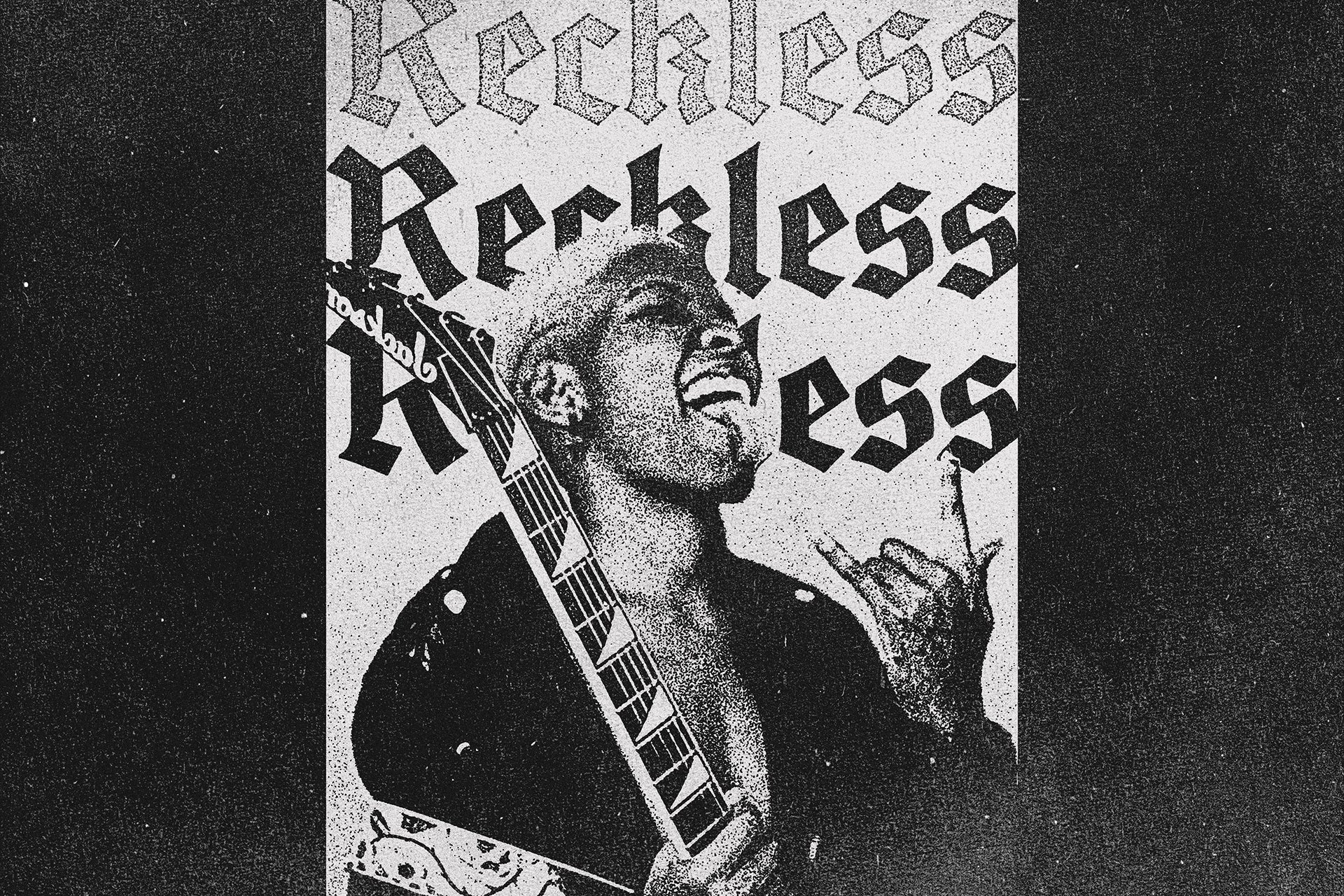
Modern Thrash by The Branded Quotes

The name is accurate. Modern Thrash lives in the hand-drawn punk and hardcore space where letters look like they were scratched into a surface under some kind of emotional duress. The irregularity is the point. Death metal and hardcore poster design has always treated type as a kind of visual aggression, and this font channels that without tipping into illegibility. You can still read the band name. It just makes you feel something while you do it.
It's the kind of font that would have been drawn by hand on a photocopied flyer in 1986 and is now a usable digital asset you can deploy in Illustrator in about thirty seconds. Good for band logos, poster headliners, and any merch graphic where polished is exactly the wrong direction. Pair it with blown-out contrast, overexposed textures, or halftone backgrounds and it's in its element.
Sahir by Aroka True Independent Studio

Built specifically for posters and flyers, and it shows. Sahir is a raw grunge display font with the kind of warm, tactile roughness that reads as genuinely hand-produced rather than algorithmically distressed. The letterforms have personality at the stroke level: not every edge behaves the same way, which gives the overall impression of something made rather than generated.
In the context of gig design, that distinction matters. Audiences for punk, psych rock, garage, and lo-fi folk shows can smell fake texture from a distance. Sahir has the right kind of imperfection: considered enough to be legible at poster size, rough enough to belong on a venue wall. It's particularly strong in the genres where the poster itself is a cultural artefact, something worth keeping, not just a date announcement.
Shock Value by Wingsart Studio

Wingsart's own description claims nobody was waiting for this font. They're wrong. Shock Value fills a specific and underserved niche: the overlap between German Expressionist cinema, 90s cartoon title cards, and horror show aesthetics. Five styles, angular letterforms built on triangular geometry, sharp enough to feel threatening but with enough cartoon energy to stay on the right side of camp.
For horror film screenings, Halloween events, psychobilly or deathrock shows, and anything that needs to exist in the territory between genuinely scary and knowingly theatrical, this is your font. It's expressive in the way Nosferatu's shadows are expressive: extreme, deliberate, visually unmistakable. The five styles give you enough range to build a full poster hierarchy without leaving the aesthetic register. That's rare for a display font this characterful.
GC Vank by Glyphonic

Not everything on a gig poster needs texture. Sometimes the most aggressive thing you can do is go clean. GC Vank is a bold condensed sans with serious structural presence: strong weight, clean lines, the kind of typographic authority that industrial and electronic music poster design has always favoured. Think the stark, high-contrast layouts of Factory Records, or the brutalist minimalism that characterises the better end of European techno event graphics.
Condensed sans-serifs are workhorses in poster design for practical reasons. They stack well, they hold scale from headline down to support act billing, and they reproduce cleanly across print sizes and phone screens. Vank specifically has enough weight in its construction to compete visually with textured and distressed fonts when you need to mix registers on a single poster. It's the font that keeps everything else in line. If you want to dig into more of this kind of display work, there are more display fonts worth exploring.
SFC Bronkos by Skilline Fonts Co.

Hand-drawn cowboy lettering with the confidence of something that's been on the side of a saloon for forty years. SFC Bronkos draws from the visual language of roadside signs, Americana poster culture, and the kind of vernacular lettering that predates digital type by generations. It's bold, rough around the edges in exactly the right way, and carries genuine warmth in its imperfections.
Country, folk, and Americana show posters occupy a specific design tradition that has nothing to do with the sharp distressed edges of metal or punk. The Hobeaux typeface famously started as hand-lettered tour poster work for Vulfpeck before it became a commercial release; SFC Bronkos sits in that same hand-painted heritage. Use it for country and folk headliners, rodeo-themed events, honky-tonk venue branding, or any project where the charm is supposed to feel earned rather than applied. It carries the weight of something made by a person, not produced by a process, and in this genre context that's the whole point.
What Makes a Gig Poster Font Actually Work
The test isn't how it looks on a clean white background in a mockup. The test is: does it hold up at A2 print size, photographed on a phone in low light, posted to Instagram at half resolution, while someone scrolls past at speed? Does it read from across a room when it's stuck next to six other posters on a venue wall? Does it survive being screenprinted onto a black tee?
The fonts above pass those tests in different ways and for different genres. The specific context matters. Doomer TM and Blightmark are doing different work to GC Vank, even if they could all theoretically land on the same bill. Understanding which register your poster is working in, and choosing type that commits to that register rather than hedging, is the difference between a poster that works and one that just has a lot going on.
Gig poster design has always been where graphic designers get to be the most intentional about emotional communication. The type is the band's first impression before anyone hears a note. Take it seriously.