
Search "editorial serif font" and you get the same roundup every time: Playfair Display, Bodoni, Didot, Cormorant Garamond, and a pairing formula bolted on the end. Serif headline, sans body, the New York Times does it, done. That advice has been recycled through a dozen design blogs since somebody first lifted it from a foundry specimen dated 1798. It tells you nothing about why one high-contrast serif holds a cover line and another falls apart the second you blow it up.
The thing worth understanding is that carrying a masthead is a craft with nameable parts. Stroke contrast at display scale, the sculptural gap between the thick and the thin. Where the ball terminals land and how heavy they sit. Whether the italic swashes have restraint or run wild. How many ligatures and alternates are sitting in the file when you go looking for them. These are decisions a type designer makes on purpose, and the people making them best right now are indie designers working in this register full time, over a legacy revival on its fourth reissue. Here are eight worth your masthead.
Crafte by Mbonster Design Studio
Fashion-adjacent without tipping into costume, Crafte from Mbonster Design Studio pushes hard on stroke contrast while keeping its curves under tight control. The serif details are sharply drawn, the kind that stay crisp when you crop in close and reproduce large. It was built to take up space, so treat it that way: a magazine opener, a poster headline, a cover treatment for a lifestyle campaign. It ships in Regular and Italic, and it wants to be the biggest thing on the page.

SLTF The Silver Editorial by SilverStag Type Foundry
Where most of this list gives you a display weight or two, SLTF The Silver Editorial from SilverStag Type Foundry hands you an 18-font system, fully redrawn from one of the foundry's best-selling faces. That depth is the point. With eighteen fonts you can run the drama on the cover line and step down to something calmer for a dek without leaving the family. The mood leans nostalgic and theatrical, the italics do proper work, and it holds a whole editorial identity on its own.

Hecate Display by Roomspace Creative Lab
Roomspace Creative Lab drew Hecate Display with high stroke contrast and confident serifs that stay composed instead of showy, sitting comfortably in that luxury-editorial space where the letterforms feel timeless but the drawing reads unmistakably current. With 52 alternates on hand, set it as a beauty-brand cover line or a boutique masthead and the contrast gives you presence without shouting. It's a face that trusts its own proportions, which is rarer than it sounds.

Camarine by Craft Supply Co
You can feel the magazine influence in Camarine from Craft Supply Co, the sleek finesse of glossy editorial pages translated into a serif with a sharp, stylish presence. It comes as Camarine Regular and Camarine Italic, so you have a display cut and its slanted partner ready out of the box. Point it at a fashion section opener or a stylised pull quote where the italic can breathe.

Lavara by Afterimagine
Tall forms, sharp serifs, and a bold vertical stance give Lavara by Afterimagine the stretched elegance you want stacked at the top of a cover. The high contrast and elegant proportions read as sculptural at hero size. It packs 175 glyphs covering uppercase, lowercase, numbers and punctuation, and ships in OTF, TTF, EOT and WOFF, so it's ready for print or screen. Run it as a vertically stacked masthead or a luxury packaging lockup and let the height do the talking.

Gentara by Marvadesign
Eighteen styles deep, including a full run of italics, and every cut of Gentara from Marvadesign keeps the sculpted terminals and high-contrast drama that make it read editorial instead of corporate. It blends sharp modern curves with classic serif structure across the whole family, which makes it a real editorial workhorse: the boldest cut for the headline, the lighter cuts and italics for kickers and standfirsts. If a single-file family that scales across a whole brand is your thing, this pairs well with our thinking on variable fonts as infrastructure.

Marthi Serif by Genetypeco
Sharp, stylish, high in contrast, with expressive letterforms that lean modern-editorial while keeping the classic bones intact. Marthi Serif by Genetypeco was drawn for fashion branding, luxury packaging and creative headlines, and it wears large sizes well. Its two weights, Regular and Bold, give you room to build contrast, and the details stay crisp enough to survive a tight crop on a poster or a full-bleed cover. Use it where you want the headline to feel cut rather than typed.

GC Beluga Mono by Glyphonic
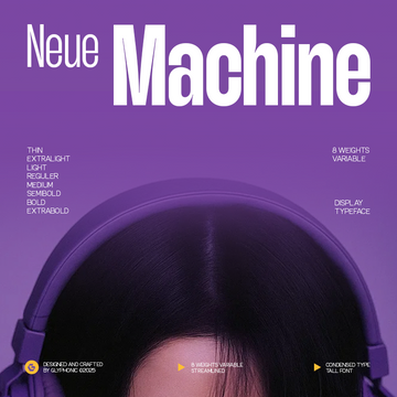
The outlier, and the point. GC Beluga Mono by Glyphonic merges monospaced precision with refined serif forms: uniform spacing on a structured grid, graceful strokes, delicate serif accents. It's a variable font with an adjustable weight axis, and ships in OTF, TTF and Webfont formats. The other seven make their case with ornate high contrast. This one makes its case with a structured, technical editorial system: kickers, bylines, gridded mastheads, anywhere the fixed-width rhythm becomes the design. If mono is your register, we've got more monospaced faces worth a look.

How to put one of these on a cover
High-contrast serifs are hero-size instruments. The thick-thin variation that gives them sculptural authority traces back to the Didone and Bodoni tradition that built glossy magazine mastheads for decades, and it does one job supremely well: command attention at large size. The same construction is a liability at small sizes. A hairline drawn thin enough to look razor-sharp at 120pt will shimmer or vanish at 10pt on screen, and it flattens out in print too. So reserve the display serif for the moment that earns it, the headline, the masthead, the cover line, and hand the deck and body copy to a quieter, lower-contrast face that stays readable down at text sizes. That single discipline separates a cover that looks composed from one that flickers.
Every face here was drawn by a named independent type designer working in this register on purpose, decisions made by hand about where the contrast peaks and how the terminals resolve. None of it was reverse-engineered from a century-old specimen or generated from a prompt. If you want to keep digging, there's plenty more editorial type where these came from, and a whole lot of serifs worth setting large.