In the strongest branding work, the font is rarely decoration. It's structure, personality, and tone of voice compressed into a single typographic decision. Get it right and everything else in the layout clicks into place around it. These eight picks run the gamut from condensed brutalist architecture to heavy geometric weight to distressed vintage energy, but they share one quality: they don't ask for help. They own the space they're placed in.
GC Dooze by Glyphonic

Tall, tight, and built with serious vertical momentum, GC Dooze is a condensed variable display sans from Glyphonic that earns its position at the top of any shortlist for high-impact branding work. The rounded edges soften what could otherwise read as pure aggression, landing somewhere between street-ready and considered, which is a genuinely difficult balance to pull off. Because it's variable, you get continuous control over weight, meaning you can dial from a confident mid-weight to a full-compression heavy without swapping files. That flexibility makes it useful far beyond a single-use poster header; it works across brand systems where hierarchy and consistency both matter. If you're building something with a streetwear edge but you need it to hold up in a more considered branding context, this is where you start.
Renso by Marvadesign

Pull up any image of 1980s industrial signage, machinery labelling, or architectural lettering and you'll find the DNA of Renso sitting right there. Marvadesign has distilled that visual language into a bold geometric sans with beveled cuts that give each letterform a precise, engineered quality, like the type was machined rather than drawn. The result reads with immediate clarity at large sizes, which makes it a strong choice for packaging, brand identities in the tech or construction space, and poster work where you need presence without noise. There's nothing nostalgic about how it lands in a modern layout; it pulls toward the future more than the past. For designers working on briefs where "powerful" and "credible" need to coexist, Renso delivers both without compromise.
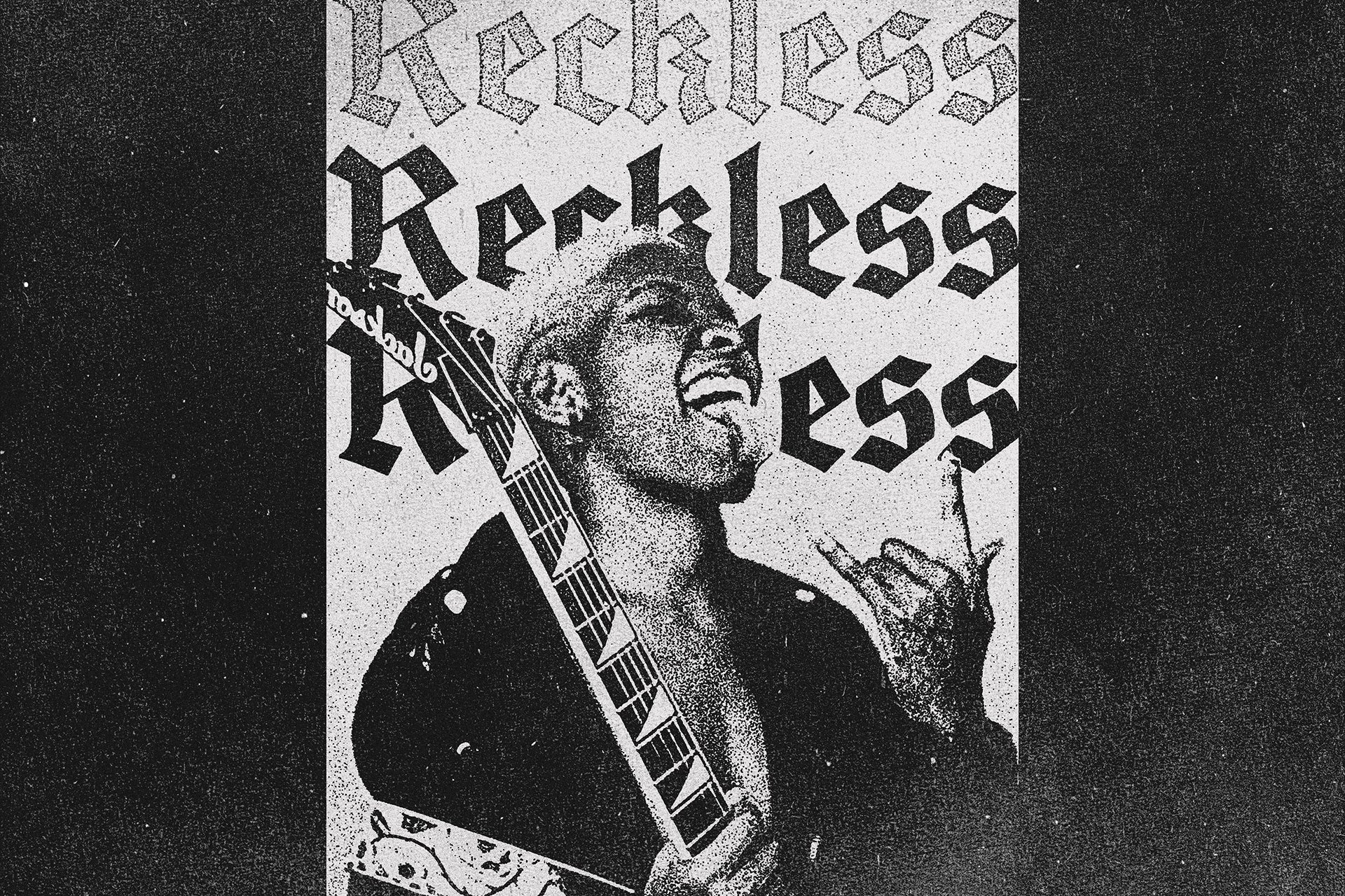
Acid TM by Type Mania

Acid TM is built for the kind of work where a clean font would feel dishonest. It's a rugged geometric sans with three stylistic sets of core glyphs that shift automatically as you type, introducing subtle variation and texture without any manual intervention. That auto-shifting behaviour is what separates it from fonts that just look rough; the irregularity is baked in at the system level, so it reads as genuine character rather than a Photoshop effect layered on top. Flyer design, record covers, merch graphics, and event branding are its natural territory, particularly anything operating in the space between nineties underground aesthetics and current streetwear culture. If you want a font that looks like it came off a photocopier in the best possible way, Acid TM is doing the work. There's plenty more in this vein worth exploring if this direction fits your brief.
Kanada by HVNTER
Four styles, one very specific energy. Kanada by HVNTER comes in Regular, Italic, Wide, and Wide Italic, giving you enough variation to build visual rhythm across a project without ever leaving the same typographic world. The letterforms carry the stretched, slightly alien geometry that defined a particular moment in early-2000s design culture, the era of chrome treatments, angular brand identities, and anything that looked like it belonged on a gaming peripheral or a futuristic streetwear label. That aesthetic has cycled back hard, and Kanada sits right at the centre of it. The Wide and Wide Italic cuts are particularly strong for social content headers and merchandise where the format rewards horizontal spread. This is a font with a clear point of view, and it commits to it completely.
403 Doshi by 403TF

The sheer scope of 403 Doshi makes it worth serious attention before you even look at a single glyph. Four styles, 412 glyphs per style, support for 275 languages: this is a type system built for professional deployment at scale, not a single-use poster face. The Regular, Soft, Slanted, and Soft Slant cuts give you formal range from structured and angular to something with more warmth and movement, which is genuinely rare in bold display type that also carries this kind of language coverage. Visually, the geometric accuracy is balanced with smooth curves in a way that keeps the weight from feeling oppressive. It works across branding, advertising, sport, and headline editorial, and if you have multilingual requirements baked into a brief, finding a display font that handles 275 languages without falling apart stylistically is not something you should take for granted.
New Machines by The Branded Quotes

Extended proportions give New Machines a distinctly cinematic quality: letters that feel like they've been stretched to fill a widescreen format, with glyphs that lean forward into modern and slightly futuristic territory. The Branded Quotes have built this as a two-cut system, Regular and Outline, which immediately opens up layering possibilities without requiring any additional software manipulation. Toggle the shift key to access alternate glyphs, which means the technical depth is there for designers who want it and completely out of the way for those who don't. It handles branding, social media headers, packaging, and editorial work without complaint, and the outline cut in particular is useful for designs that need presence on light or busy backgrounds. When a brief asks for something that reads as modern and forward-facing without tipping into novelty, this is a solid answer.
Premiero by Typeparties

Everything about Premiero looks like it was typeset for a festival poster that's been folded in a back pocket, rained on, and pinned to a telephone pole, and that is entirely a compliment. Typeparties has built a bold condensed all-caps face with thick, blocky shapes that are kept from feeling rigid by subtle wavy edges and slight irregularities in the stroke. The distressed texture, with its internal speckles and surface roughness, gives it the kind of worn physicality that a clean digital font can never quite fake convincingly. It's built for poster work, merch graphics, and branding projects with a vintage or music-adjacent energy, anywhere that a spotless geometric would feel too corporate and too new. For packaging with personality or a brand that wants to look like it's been around long enough to mean something, Premiero has the right kind of history written into its letterforms.
BJÖRN by Any-Type® Foundry

Ultra-heavy, geometrically precise, and clearly built with one priority in mind: occupying space with complete authority. BJÖRN from Any-Type® Foundry operates in the tradition of Swiss typographic rigour filtered through a contemporary sensibility that makes it feel current without being trendy. The letterforms are dense and uncompromising, with a structural confidence that makes it particularly effective for logo work, large-scale brand identities, editorial headers, and any application where softness would read as weakness. Multilingual support broadens its professional utility, which matters when you're building a face this heavy into a real brand system rather than a one-off project. There are more display fonts worth your time if you're still shortlisting, but BJÖRN is the kind of face that tends to end the search.
Choosing the Right Face for the Brief
Weight and width interact in ways that are easy to underestimate. A heavy condensed font will read very differently from a heavy extended one even at identical point sizes, and the right choice often comes down to the format you're designing for rather than pure aesthetic preference. Variable fonts like GC Dooze give you a meaningful advantage in layout work because you can respond to the specific demands of a composition without hunting for a different file. And if you find yourself defaulting to the same display face across multiple projects, that's usually a sign the font is doing the client's job for you, not the other way around. The best branding typography feels inevitable for that specific brief. The only way to get there is to keep pushing the shortlist.