
The capital letters in CS Beware look like they were filed to a point. Every stroke ends in a jagged tooth, the crossbars sit on a reverse slant, and the whole thing reads like a logo scratched into a rehearsal-room door. Then, two tabs over, a windbreaker photographed from the gutter against a cotton-candy sky. Both landed in the shop this week. One was built to scare the back row of a venue; the other wants to sell you a festival jacket. Eight new releases, and they keep pulling in opposite directions.
CS Beware – Black Metal Font
Black metal logos have always been about illegibility as a dare, and CS Beware by Craft Supply Co understands the assignment at the construction level. Angular cuts chew into the stems and the letterforms lean and splinter on a reverse slant. It comes in OTF, TTF, WOFF and WOFF2. Point it at album art, band merch, or a gig poster that needs to look like it bites back. If you want more in this vein, we've got plenty more grunge fonts worth a look.

Torn Cardboard Print Photo Effect
Drop your artwork into one Smart Object and it gets pressed into worn kraft board. The ink soaks in and loses its shine, the edges tear to expose the corrugated fluting underneath, and the image looks like a flyer someone stapled to a packing box and left out overnight. Pixelbuddha built this one as a single PSD at 4500x3000px, 300dpi, with Photoshop Smart Object support. Good for eco-packaging concepts, zine covers, and recycled-brand identities that need the kind of wear you can't fake with a blur tool. It sits nicely alongside the recycled logo work and real paper grain we covered a few drops back.

Plastisol T-shirt Texture Collection
Twenty screen-print textures that model how plastisol ink behaves after a shirt has been worn and washed into the ground. The cracking, the flaking, the way a solid fill wears thin across the chest first. cd-design.co's pack ships as EPS and SVG plus an ABR brush file for Photoshop, with PNG and JPEG thrown in, so you can stamp the wear on vector or paint it in by hand. It's already finding its way into apparel work, which tracks, because faking this convincingly from scratch is a pain and these do the behaviour properly. If you're after more texture to dig through, there's more where that came from.

RP V10 Windbreaker Jacket 05 Mockup
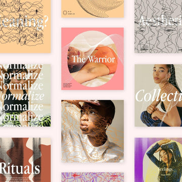
Shot from the ground looking up, a hooded windbreaker against a soft gradient sky, with a playful illustrated face dropped over the model so nobody steals focus from the garment. Mockup Flock's presentation runs on a fully editable Smart Object for the chest placement, and the low angle does the heavy lifting on drama. Built for festival and sportswear pitches where the deck needs to look like a campaign shot before the campaign exists. It pairs with the streetwear mockup PSDs we walked through earlier.

Folk & Myth Vector Illustrations
Thirty-five glyphs drawn in the flat, declarative shape-language that folk art has always used, where a creature gets cut down to its silhouette and a spirit becomes a handful of strokes. Horned goats, a spread-winged thunderbird, charging bulls, running hunters, arms-raised shamans, a canoe rower, owls, foxes, spiral suns. Pixelbuddha pulled these from petroglyph and folk-ornament vocabularies, with solid black fills that hold from a tiny stamp up to a full back print. Ships SVG, AI, EPS and PNG. Band merch and packaging accents will eat these up.

Roots
Farm illustration usually arrives soaked in warm cottagecore nostalgia. KEDSOL's Roots goes the other way: 40 vintage-inspired drawings of animals, plants and countryside detail with a dark, rustic weight to the linework. It reads like old feed-sack print more than a farmers-market tote. Formats are AI, SVG and PNG, so it scales clean across branding and apparel work that wants the rural reference with some weight behind it. There's a moodiness here that makes it play well with the heavier stuff in this drop.

TRT Bright Guard Editorial Display Typeface
After all that noise, something with its shoulders back. TRT Bright Guard by True Type Lab is a minimal, deliberate display face drawn for the two spots a brand speaks loudest, the headline and the wordmark. It reads calm at poster scale and keeps its structure when a name shrinks to a single mark. The spacing stays even through the caps, so a logotype can sit beside body copy without elbowing it. Ships as static fonts in OTF, TTF, WOFF and WOFF2. This is the one you reach for when the brief says refined and means it.

VEROX Pixel Font
We opened on a font modelled on the underground of the 1990s, so it's fitting to close on one modelled on a future that hasn't happened yet. VEROX by Enxyclo Studio is a geometric pixel font with a clean, contemporary build and sharp letterforms built with dashboard-readout precision, drawn for tech, gaming and sci-fi identity work. It ships OTF, TTF and WOFF with uppercase, lowercase, punctuation, a symbol set and currency glyphs. Between the metal teeth and the neon grid this week, there's real screen-print wear holding the middle together.

That's the spread for #48. The loudest font and the most futuristic one here were both drawn out by hand, stroke by stroke, and the torn board and plastisol cracking carry wear nobody faked with a slider. Aggressive or polished, physical or synthetic, somebody sat down and made the shapes. If you want to see how this week lines up against the last few, #47 had its own screen-print cracks and #45 leaned into jammed printers and broken signal.