
A heavy week, in more than one sense. A US government department unveiled an eagle that set off every alarm in the room, a storied London studio closed its doors after nearly three decades, and a Lagos bank showed the fintech world what an identity with a pulse looks like. Also: a football club's four-year blackletter saga, and two separate questions about what AI is doing to the software and games we use. Let's get into it.
The US Department of War's new eagle lands badly
On 3-4 October, US Secretary of War Pete Hegseth gave a speech at the US Air Force Academy standing in front of a redrawn version of the department's eagle seal. The redesign drops the olive branches, laurel leaves and the historic 13 stars, cutting the star count to five, and renders the bird in flat, hard-edged, angular monochrome. The rebrand follows a September 2025 executive order authorising "Department of War" as a secondary title for the Department of Defense. Online, the flat horizontal wings drew immediate comparisons to the Reichsadler, as covered by Yahoo News.

When the comparison was put to the Pentagon, the response, via Snopes, was that anyone seeing Nazi imagery in a bald eagle "may need to get your head checked." Wing position in federal iconography is a deliberate choice. Every US federal seal uses a V-shaped spread for a reason, and flattening it to a stiff horizontal is a specific decision that carries meaning whether intended or not. The denial doesn't change the semiotics.
Barkas gives Nigerian bank Kuda an identity with a heartbeat
Kuda, the Nigerian digital bank, has a new identity from Lagos independent studio Barkas. The system runs on chunky geometric letterforms, a custom Naira currency sign and hand-drawn illustration, moving Kuda off its earlier challenger-bank look under the tagline "Less bank, more life." The work, detailed by It's Nice That, is framed against a real problem: the soft-gradient, pastel, friendly-sans, half-smiling-illustrated-figure template has calcified into a single house style across fintech. The piece points to Monzo warming up with Ragged Edge in 2022 and Wolff Olins' coin-mid-toss logo for DailyPay as earlier breaks from the mould.

The challenger-bank aesthetic was fresh around 2016. Now every banking app looks like the same deck got emailed around the sector. What Barkas has done is tie the identity to a place, Lagos, its pace, its hand, instead of a generic idea of friendliness. Specificity wins here: a custom currency sign alone says more about intent than a thousand pastel gradients.

David Rudnick spends four years on Arsenal's bespoke blackletter
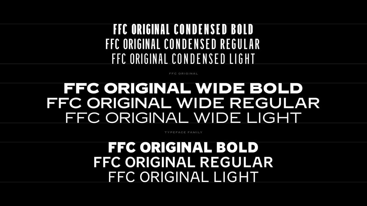
Designer David Rudnick has spent four years building "Rocastle," a hand-drawn, three-weight blackletter family commissioned by Arsenal Football Club with Arsenal Creative Studio lead Johnnie Campbell. It's named after David Rocastle, one of the club's most beloved players. The brief, as laid out by It's Nice That, was to build type for every moment Arsenal appears in culture beyond the pitch: screens, clothing, stadium walls, contexts far from football. Rudnick calls the process "borderline impossible" given the scale of application and the size of the fanbase that has to recognise itself in it.

Blackletter for a Premier League club is a bold call. It carries real risk of tipping into cliche, but done with this level of care it reads as heritage and attitude at once. Four years on a single type family is also a quiet rebuke to the idea that identity work should be fast and cheap. Some things take the time they take.

AI clones of Adobe's apps spark a "Napster moment" question
Free, AI-coded clones of familiar Creative Cloud-style tools have started appearing, and Creative Boom asks whether this is design software's Napster moment. The piece names the feeling plainly: resentment at the annual subscription renewal, even though Creative Cloud costs less than a chair, a phone or a year of coffee. It traces that resentment to generational memory, the designers who bought Photoshop once on a disc versus a subscription-only generation that never got the choice, and suggests what comes next could reshape software development and the wider creative industry.

The Napster framing is apt and a little ominous. Napster didn't kill music; it forced the industry to rebuild around streaming. If AI can clone a tool's function overnight, the question stops being price and becomes provenance and trust. We're in the human-craft camp here, and tools are part of that story. But subscription fatigue is real, and pretending otherwise helps nobody.
Epic's AI-first Disney game delay draws a loud "why"
Epic Games is copping backlash after reports its unannounced Disney game, a Marvel and Star Wars mash-up shooter once pencilled for March 2027, has been delayed indefinitely while teams pivot to an "AI first" production model. Per Creative Bloq, citing Bloomberg's original reporting, staff have been told to use tools like Anthropic's Claude, with one director reportedly declaring "no more hand-written code," with artwork set to come from AI workflows. AI tooling is also tipped to feature heavily in Unreal Engine 6.

On Reddit, players and developers keep asking the same thing: what is AI bringing to this game that makes it better? It's the right question. Shipping a delayed game built on tools nobody asked for is a hard sell, and "AI first" as a production mandate reads like a strategy aimed at shareholders more than players. Craft at this scale still comes from people who care, and that's hard to automate your way around.
That's your week: an eagle that needed a second opinion, a studio bowing out with grace, and a bank that remembered it operates in a real city. If you want more of this, our recent roundups are stacked with it. Back next week.