
Y2K design didn't die when the millennium anxiety faded. It went dormant, got archived, and got rediscovered by people who were in nappies when it peaked. The designers deploying it now weren't there for the original run; they found it through TikTok edits, Pinterest dives, and Tumblr archives that preserved the era in amber. That distance is exactly what makes it useful. There's no sentimentality clouding the work, just the visual grammar, extracted and applied with precision. Right now that grammar is being actively mined rather than remembered: Diesel, Blumarine and Fiorucci have pulled from their own archives for recent runway work, and at the indie level it's all over club visuals, streetwear drops and short-form social content, where maximalist visuals compress better than clean minimalism at small sizes.
This guide covers what the Y2K aesthetic is, the styles inside it, why it has teeth in 2026, and the specific fonts, effects, graphics and textures that do the work. If you want everything in one place, the Y2K collection gathers it all.
What Is the Y2K Aesthetic?
The Y2K aesthetic is the graphic design language of the late-1990s-to-early-2000s digital moment, roughly 1998 to 2004, when screens first became capable of imitating physical materials. It is defined by chrome and liquid-metal type, inflated bubble letterforms, cyber-grids and wireframe perspectives, neon-to-pastel gradient blobs, pixel and bitmap texture, and glitch or scan-line distortion. Where minimalism strips detail away, the Y2K design style piles it on: layered, reflective, dense, and unmistakably screen-born. The Spanish-speaking design world knows the same movement as estética Y2K or diseño Y2K, and the reference points travel identically.
If you want the whole attitude in a single typeface, start with HVNTER's SMEGS typeface: hand-drawn, ink-bleed letterforms in two styles with full character sets, sitting at the rave-flyer and streetwear end of Y2K rather than the chrome end. It looks like it was produced in a sweaty basement at 2am rather than a clean studio, which is precisely the register most Y2K briefs are chasing.

What It Actually Looked Like
The visual characteristics of the Y2K art style are specific enough to be learned as a system, and the first layer is chrome. Reflective, liquid-metal letterforms with specular highlights catching imaginary light from several directions were the signature move, born from early Photoshop's chrome filters, lens flares and bevel-and-emboss. It was the first moment on-screen elements were designed to look like physical objects: type that looked like cast metal, buttons that looked pressable, gradients that looked lit from inside. Pixelbuddha's Hard Prismic Leak Chrome Effect is the fastest route to that surface today: a 4500×3000px, 300dpi PSD that turns any text into polished metal with rainbow edge fringing, hard light leaks and small star glints on the curves, with a changeable background light so it sits in whatever palette the layout needs.

Underneath the type, the structural vocabulary was cyber-grid and sigil: wireframe perspectives borrowed from early 3D software, data-visualisation aesthetics repurposed as decoration, and the spiky tribal marks that shared space with them on game packaging, rave flyers and skate graphics. Neotribal Shapes by MiksKS covers that second half properly, with 50 hand-drawn neotribal vector shapes in AI, EPS, PNG and Photoshop CSH formats that combine into compositions or drop in as accents on posters, sleeves, stickers and streetwear.

Then colour. Neon gradient blobs pulled organic forms through neon-to-pastel gradients, the "aura" aesthetic that is essentially Y2K's fingerprint on the current cycle, and it's one of the easiest elements to get wrong because stock-looking gradient blobs are everywhere. Morpha Vol.1 by Kuro ships 100 high-resolution PNGs (minimum 3000×3000px) plus an editable PSD template, with the vibrance and organic form that puts them in the right era without tipping into generic. Drag them in as background elements or the primary visual and they anchor a layout in the colour logic of the period without custom gradient work.

Surface came next: pixel and bitmap texture used as grain rather than actual low resolution, and glitch and scan-line distortion adding noise to otherwise clean compositions. Vanzyst's 100 Bitmap Vector Textures is the reference pack for this, a set of dither and halftone distress textures built as true vector pixel patterns rather than image traces, so they recolour and rescale cleanly onto packaging, apparel prints, posters and album art. It is the pack to reach for whenever a layout needs that grain and the photographic noise filters keep looking wrong.

The final layer was the CD-ROM and early web UI element lifted wholesale into graphic design: bevel-and-emboss buttons, progress bars, cursor icons used decoratively, 3D extruded type with multi-plane drop shadows, all glowing off a CRT. These weren't retro references in their original context; they were the cutting edge of what design tools could produce. The Cyber Machine CRT Effect by Divided.co puts that monitor back in front of the work: a 4000×3000px, 300dpi Photoshop PSD with smart-object replacement that wraps any image in scan lines, neon colour and a pulsing screen glow, with adjustable intensity, brightness and hue.

Types of Y2K Design: The Main Styles
Y2K isn't a single look. It's a cluster of related styles that share a period but diverge in mood, and knowing which one you're reaching for is half the work. Most strong Y2K graphics borrow from more than one of these, but they start from a clear centre.
Chrome and cyber is the sleek, futuristic strand: liquid-metal type, mecha-industrial geometry, wireframe grids, the visual language of game packaging and sci-fi UI. HVNTER's Foster Typeface is built for exactly this kind of constructed headline, a highly customisable display face with over 100 glyph variations across A–Z, 0–9 and basic symbols, so you assemble your own custom cyber wordmark rather than typing a default one.

Bubble and inflated is warmer and more playful, all rounded letterforms and candy gradients: air-filled construction that looks like it was pumped up under pressure. Penary by Typeparties is the purest version of it, bold and bubbly with chunky strokes and fluid letterforms, shipped as OTF, TTF, WOFF and WOFF2 with multilingual support. Fashion drops, music artwork and social headlines are where it lands hardest.

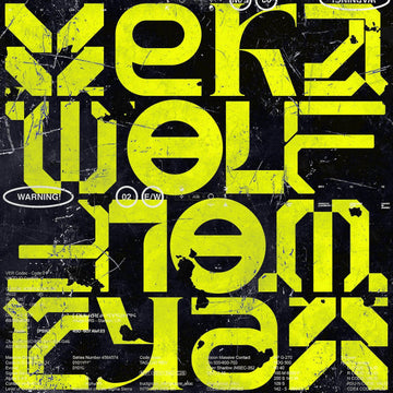
Rave and flyer is rougher, hand-drawn and ink-heavy, carrying the club and streetwear energy. Overprint TM by Type Mania is the one to start with here, a distressed face with uneven edges and a xeroxed finish whose two stylistic sets rotate automatically through contextual alternates, so imperfections vary across a word instead of repeating. OTF, TTF and WOFF2 are in the zip, and there's an outline companion cut if the layout needs a second weight.

Glitch and bitmap handles surface: dither texture, scan lines, RGB drift, the digitally-native grain that separates constructed Y2K work from clean design with Y2K type dropped on top. Vanzyst's Stochastic Archive Collection is the shape library for it, 144 abstract vector graphics with perfectly pixelated textures, each built from separable colour parts you can recombine, delivered as AI and EPS masters plus raster versions. Pull a few apart and recombine them and you have a poster grid in minutes.

Why Now, and Why It Has Teeth
The pandemic nostalgia explanation for Y2K's revival is overused and mostly wrong. The designers working with this aesthetic weren't adults retreating to comfort; they encountered it fresh, as a purely visual system with no emotional baggage attached, through TikTok and archive culture rather than lived experience. That means it arrives stripped of its original cultural anxiety and functions as a toolkit. You pick up chrome type the way you'd pick up a Swiss grotesque, because it does a specific visual job.
The more interesting explanation for 2026 is about craft signals. The defining counter-movement in design right now is a deliberate turn away from AI-generated frictionless perfection toward work that shows its construction. It's Nice That's 2026 trends reporting put it clearly: "It's as if we're realising design work can't be separated from the hands that make it, that's why people are turning back to scanning, scrapbooking, collecting and collaging to make things feel mismatched where polish is otherwise making the work feel flat." Y2K's layered, filter-heavy, visually dense language is the opposite of generated smoothness. It reads as proof of effort.
That is why Y2K maximalism functions as an anti-AI signal, and why designers are degrading things on purpose. Some generate hyperreal chrome or holographic surfaces and then wreck them to meet the expectation of a human hand. Pixelbuddha's VHS Tape Text & Logo Effect is the controlled version of that move: a 4500×3000px, 300dpi PSD with four effect styles that run any logotype or headline through tape-era tracking damage via smart objects, so the degradation is a decision rather than an accident.

The Toolkit: Products That Do Specific Work
If you're building out a Y2K-informed visual system, the gap between having the reference and having the actual assets is real. These are the remaining pieces worth knowing about.
What Normal TM by Type Mania does that most distressed fonts don't is rotate two stylistic sets using contextual alternates, so consecutive characters vary automatically without manual intervention. That near-automatic irregularity is the difference between a layout that feels hand-assembled and one that looks like a single effect applied uniformly. It solves the problem of making grunge feel irregular rather than systematically distressed, which is a harder problem than it looks, and it pairs naturally with Overprint TM above.

Bio-Map by Vanzyst is a set of 40 seamless vector patterns built on dither and bitmap logic, the kind of low-res grain that reads as digitally native rather than photographic noise. Because they're vector you can recolour and rescale without quality loss, and the files span AI, EPS, SVG, PDF, a Photoshop PAT library, plus 5000×5000px 300ppi PNGs and JPGs. The organic-meets-industrial character means they work on apparel, packaging and posters without looking like one texture applied everywhere.

Where Stochastic Archive is abstract, Digital Fantasy by Vanzyst is the colour edition: 144 pixel-inspired vector shapes mixing simple geometry, ASCII-style details and dithered bitmap texture, built as scalable vectors so the pixel-art look has no resolution ceiling. AI and EPS masters, fully editable, and pitched at posters, clothing prints, album covers and UI elements that need glitchy, futuristic forms ready to drop in.

For photography and imagery rather than type, züli's Y2K Image Effects Pack is the quick fix: three PSD effects with different settings in each file, where you replace the placeholder image and the treatment does the rest. It's the quickest way on this page to push a flat product shot or portrait into the era's colour and surface language.

Finally, the layer nobody notices until it's missing. Textexp's Light Noise Printer Texture Pack is 22 high-resolution printer-noise textures at 6000×9000px, 300dpi JPEG, whisper-thin grain that adds tactile depth to a composition without visual weight. Set one over a finished Y2K layout on a soft blend mode and the whole piece stops looking rendered and starts looking printed, which is the entire point of the craft-signal argument above.

How Long This Has Left
Most trend cycles burn out when the references become too legible, when the aesthetic becomes a shorthand anyone can deploy without understanding it. Y2K is different because the visual language is complex. It has specific rules, specific tensions between maximalism and technical precision, between organic form and digital construction. Designers who've taken the time to understand it at that level are producing work that looks nothing like the surface-level versions, and the gap between a well-executed Y2K piece and a lazy one is obvious to anyone who's spent time with the reference material.
The fact that it's also functioning as a craft signal right now, as proof that work was made by a person with a specific set of skills and a specific point of view, gives it a reason to exist beyond the trend cycle. That's no guarantee it lasts forever, but it's a more solid foundation than most aesthetics get. Everything above lives in the Y2K collection.