Two weeks of solid additions and this batch has real range: print effects with genuine grit, type covering everything from couture to cyberpunk, and graphics for merch, streetwear, and outdoor branding. Here's what landed.
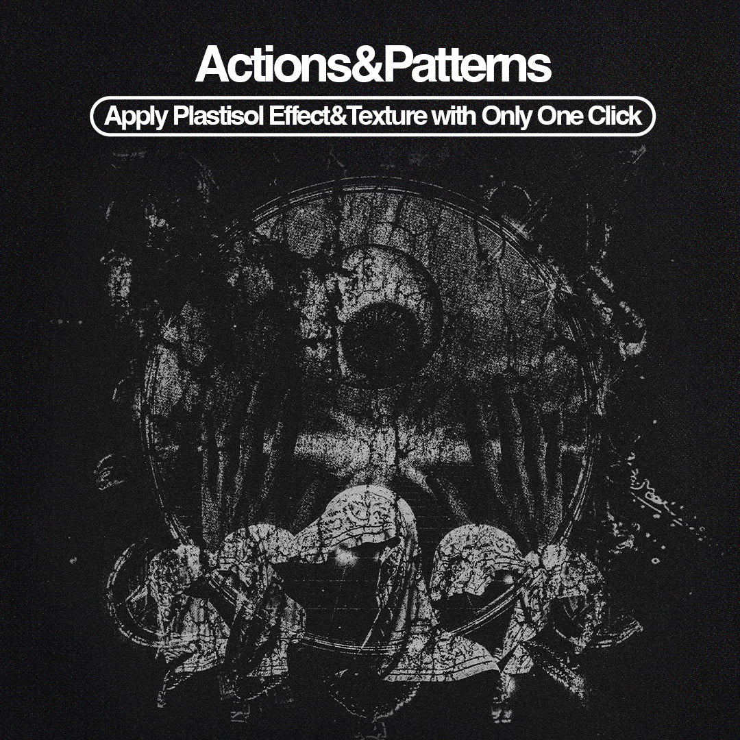
Halftone Print Photo Effect by Pixelbuddha
![]()
The hero drop of the fortnight, and it earns it. This effect breaks your image into a dot screen over a creased paper base, contrast pushed hard, shadows going dense and inky the way offset-printed broadsheets used to look when the ink sat heavy on newsprint. The grain shows through the halftone so it reads like a real print artefact rather than a digital filter. Ideal for gig posters, zine covers, and editorial work where "vintage" needs to mean something specific. If you're into halftones, there's more where that came from.
Antique Photo Effect by Pixelbuddha
![]()
Where the halftone effect goes gritty and monochrome, this one goes warm and damaged. Images get coated in a yellowed, olive-tinted wash with heavy grain, ink blot edges bleeding into the corners, and fine surface scratches that make photos look like they've spent decades in a shoebox. The uneven fade into the textured background is the detail that sells it, that's the thing that separates a well-made vintage effect from a one-click filter. Good fit for book covers, editorial spreads, and album art sitting somewhere between dark academia and mid-century.
Aged Photo Effect by Pixelbuddha
![]()
The third in Pixelbuddha's photo effect run this drop, and it carves out its own lane. This one leans into oversaturated warmth rather than damage, pulling images into the bleached-out colour palette of a 1970s holiday snapshot. Grain over faded tones, dust specks, surface scratches that feel incidental rather than heavy-handed. If the Antique effect reads Victorian, this one reads Kodachrome. The set of three together covers serious ground for any editorial or social workflow built around analogue aesthetics.
Holographic Chrome Text Effect by Matsero

Reflective metallic surfaces, cosmic gradients, the full early-internet visual language brought back with production quality that the era never actually had. This text effect collection from Matsero taps into a nostalgia cycle that shows no sign of slowing, and does it without looking like a trend-chasing afterthought. The colour shifts read genuinely iridescent rather than flat and plasticky. Use it for album art, social headers, or anywhere a client asks for "futuristic but retro" and actually means it.
Flaming Text Effect by Matsero

Matsero's other drop this fortnight takes a different temperature entirely. Sharp lettering, molten textures, blazing flame elements built for heavy music culture and high-energy visual work. This is the effect for band merch, aggressive poster work, or any brief where the word "bold" doesn't cover half of what the client wants. The metallic detail keeps it from reading as clip art; there's actual craft in the finish.
Rekogil Luxury Ligature Serif by Say Studio

High-contrast letterforms, graceful proportions, and the kind of ligatures that make a logotype feel considered rather than assembled. Say Studio have built Rekogil for the upper end of fashion and beauty branding, the fragrance packaging, the boutique wordmark, the magazine masthead that needs to hold weight at large sizes without going cold. The ligature set is the main event here; it's what gives the font its personality beyond the expected luxury serif formula.
Bornean Elegant Serif by Craft Supply Co

Craft Supply Co's cleaner serif offering this drop. Bornean sits in the space between editorial utility and branding elegance, refined enough for premium work but with enough structure to hold across body text without losing itself. It's the kind of face that reads well on a magazine feature spread and looks just as intentional on a minimal logo lockup. Less decorative than Rekogil, more versatile for it.
Guinsa Futuristic Font by Craft Supply Co

Craft Supply Co's second font in this drop moves in a completely different direction. Guinsa is a geometric display face built for tech, motion, and anything that needs to feel like it belongs five years from now. The letterforms have that sharp, constructed quality that works at large scale on posters and title cards without needing much support from layout. Strong option for branding in the tech and entertainment space where "modern" still gets asked for constantly but rarely looks this deliberate.
Premierre Marsiella Font Duo by Jolicia Type

An oldstyle serif paired with a handwritten script, and the pairing actually works. Jolicia Type have calibrated the weight and scale relationship so the two sit together without the script swamping the serif or the serif making the script look flimsy. Built for luxury invitations, wedding stationery, and boutique branding, but the oldstyle has enough structure that you could use it on its own for editorial work without it reading as purely ceremonial.
Animal Hunt Badge Collection by Skilline Supply Co
![]()
Twenty-five wildlife and hunting badge illustrations with 24 text layout pairings, all sitting in that mid-century illustrative territory that's been reliable for outdoor and adventure branding for years without feeling tired. The paired text layouts are the practical differentiator here; they make this immediately usable for apparel and merchandise work without requiring a full custom build around each mark. Good for anyone doing outdoor brand identity, hunting club collateral, or rugged merch work.
Cyber Grunge and Streetwear Vector Pack by Designimento

Thirty-four vector assets built around the raw, layered aesthetic sitting at the intersection of underground streetwear, post-Y2K digital culture, and contemporary grunge. The assets are meticulously constructed, which matters for vector work that needs to scale across merch formats without falling apart. If you're doing DTC streetwear brand work or designing graphics for drops that need an edge beyond the obvious, there's more worth digging through on the picks front too.