In the bustling world of design, the choice between free and paid fonts can feel like a minefield. One moment, you’re scrolling through a treasure trove of free typefaces, and the next, you’re questioning if that “perfect” serif is worth splurging on. It’s a dilemma many designers face, whether they’re graphic design veterans or fresh-faced creatives diving into a new project. But fear not! We're diving deep into the nitty-gritty of free fonts versus their premium counterparts, helping you navigate when it’s time to invest and why it matters more than you might think.
The Allure of Free Fonts
Let’s start with the obvious: free fonts are enticing. They’re like those irresistible samples at a fancy cheese shop, easy to grab and often delightful. Platforms like Google Fonts or DaFont offer a staggering variety of options, from quirky display fonts to sleek sans-serifs. You can experiment without breaking the bank, which is essential for freelancers and small businesses trying to stretch their design budgets.
But here’s the catch: while free fonts can be the perfect starting point for personal projects, they often come with limitations. Many are overused, leading to that dreaded design cliché. You know the feeling — seeing the same font on a dozen different websites or social media posts. Plus, free fonts sometimes lack the refinement or versatility that premium fonts provide.
The Dark Side of Free Fonts
Not all free fonts are created equal. Some may lack proper kerning or come with limited characters, meaning your design could end up looking sloppy or incomplete. Imagine crafting a stunning poster only to realise part of your text is missing an accent or doesn’t align correctly. Frustrating, right?
Additionally, many free fonts come with ambiguous licensing. You might think you’re completely in the clear, only to find out later that the font you used isn’t actually free for commercial use. This can lead to unnecessary headaches—like getting hit with a cease-and-desist letter when you least expect it.
The Case for Premium Fonts
Now, let’s pivot to the world of premium typefaces. Investing in a premium font is like upgrading from a basic flip phone to the latest smartphone — suddenly, your design possibilities expand exponentially. Premium fonts often offer extensive character sets, multiple weights, and styles, which can elevate your projects from mediocre to memorable.
Quality and Craftsmanship
When you buy a typeface, you’re not just paying for the letters; you’re investing in quality. Premium fonts are typically crafted by skilled type designers who take great care in ensuring that each character is visually appealing and functional. This means perfect kerning, a variety of ligatures, and often, support for multiple languages. Imagine using a beautifully designed script font that flows perfectly in a logo or a bold display font that captures attention at a distance — these are the kinds of experiences premium fonts can provide.

Unique and Exclusive
One of the biggest advantages of paid fonts is exclusivity. Ever noticed how that trendy, eye-catching font you love suddenly pops up everywhere? Premium fonts are less likely to be overused, allowing your work to stand out in a sea of sameness. If you’re designing for a client or your brand, having a unique typeface can set you apart and communicate a stronger brand identity.

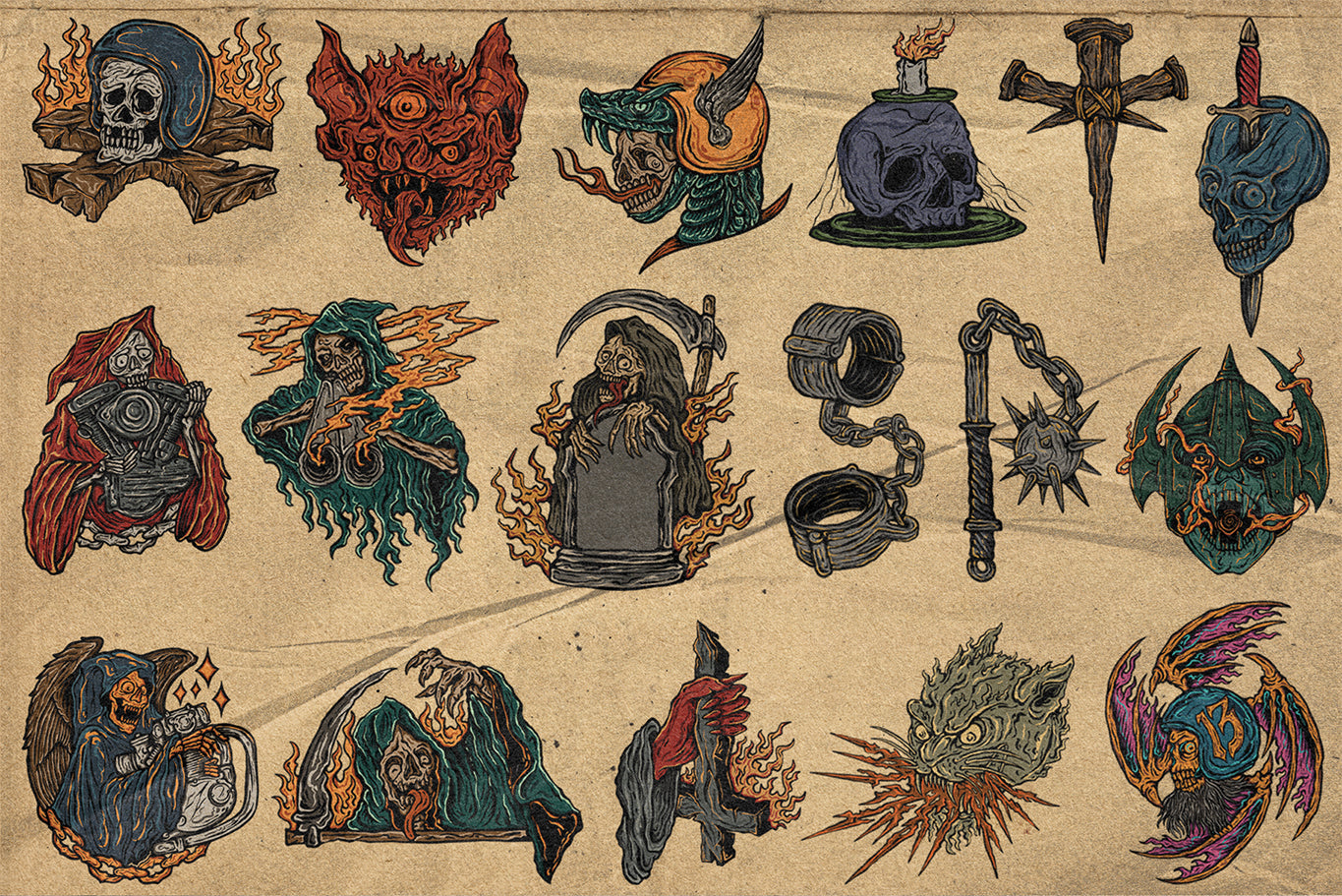
Lozer by Marvadesign
Support and Updates
Let’s not forget about the added perks of purchasing a premium font. Many font foundries offer customer support, which can be incredibly helpful if you run into any issues. Plus, you often receive updates and new styles as they’re developed. This means your investment can evolve with your design needs.

Supporting Small Creators and Businesses
Investing in premium fonts also means supporting independent type designers and small businesses. Many high-quality typefaces are created by talented artists who rely on font sales to continue producing innovative designs. By choosing a paid font, you’re contributing to the sustainability of the creative industry, helping designers refine their craft and develop new, unique typefaces that push the boundaries of design.
 Bageshron - Blackletter Font Family by Enxyclo Studio
When to Choose Free vs. Paid Fonts
So, when should you take the plunge and invest in a premium typeface? Here’s a quick guide:
Go Free When:
- You’re experimenting: If you’re just starting out or playing around with concepts, free fonts can be great for prototyping.
- Budget constraints: If you’re a student or a freelancer on a tight budget, there’s nothing wrong with starting your design journey with free options.
- Personal projects: For personal use or non-commercial projects, free fonts can give you the flexibility to explore without financial commitment.
Invest in Premium When:
- Branding is key: If you’re designing for a client or developing your own brand identity, a premium font can provide the uniqueness that sets you apart.
- Quality matters: When the project demands a polished, professional look, investing in a well-crafted typeface pays off.
- Commercial use: Always consider the licensing. If your work will be used commercially, a premium font often comes with clearer licensing terms.
Experimentation is Key
In the ever-evolving world of design, experimentation is essential. As you explore the realms of typography, don’t hesitate to mix and match. Perhaps start with a free font for a draft and then transition to a premium font for the final presentation. You might find that a combination of both can create a unique vibe that speaks to your design aesthetic.
Try the Unexpected
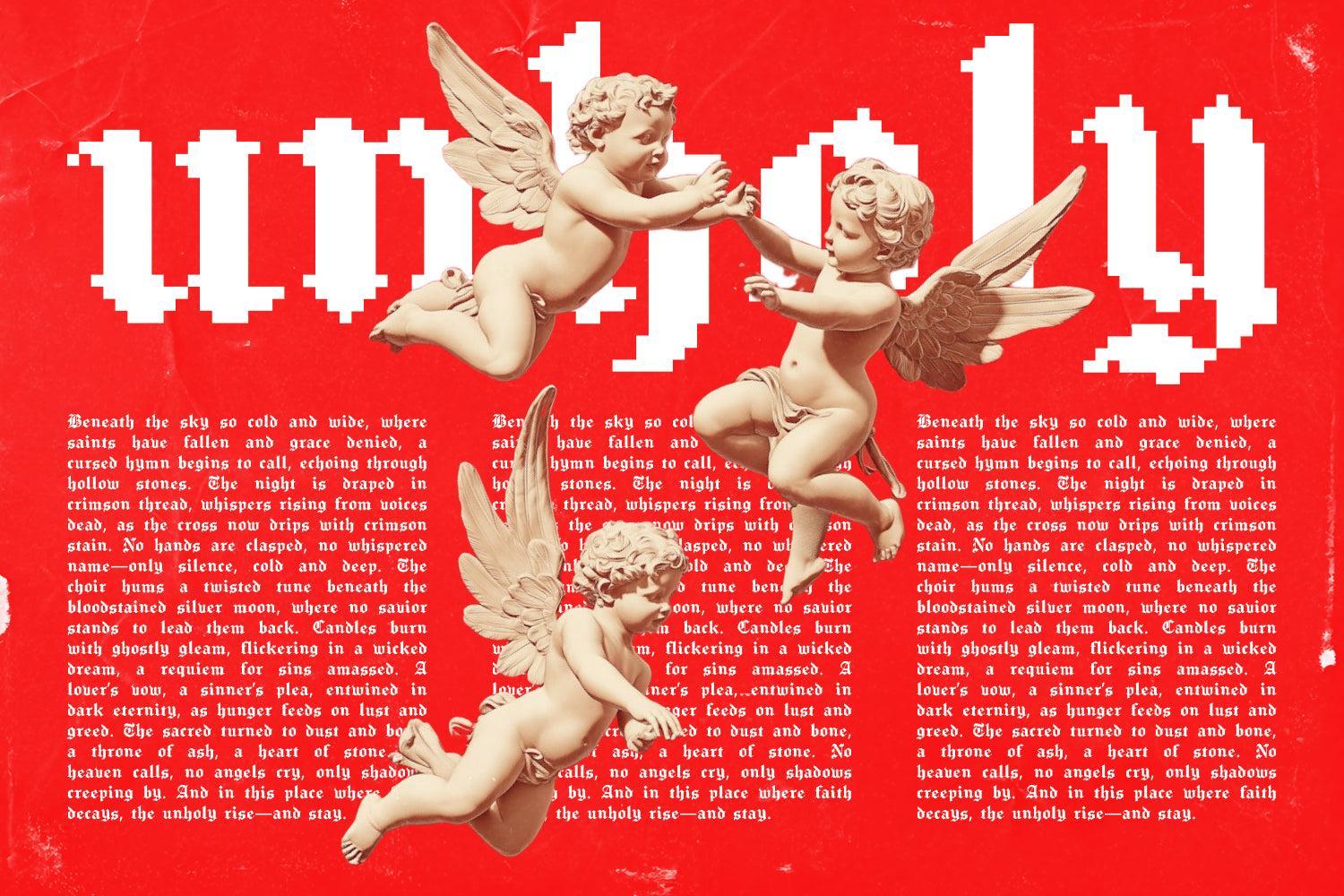
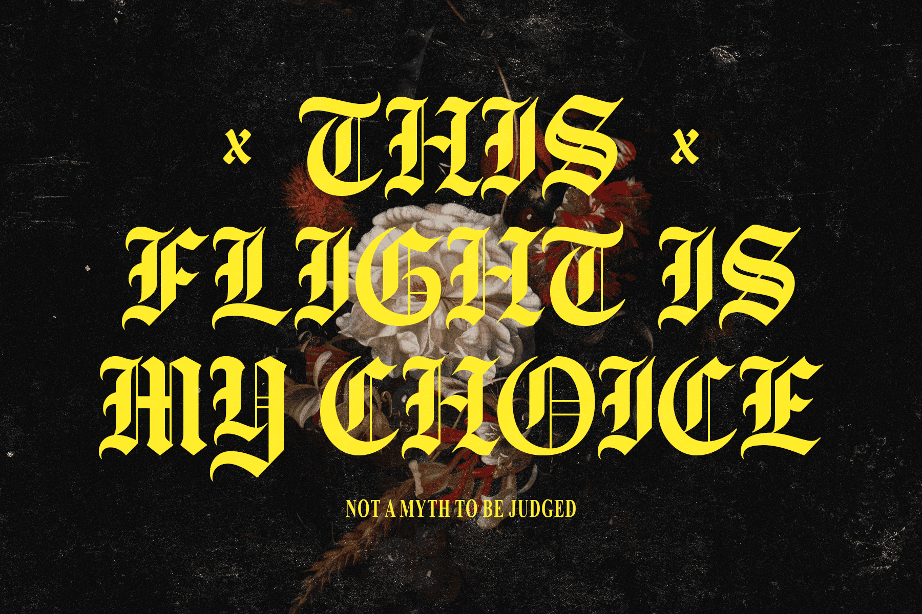
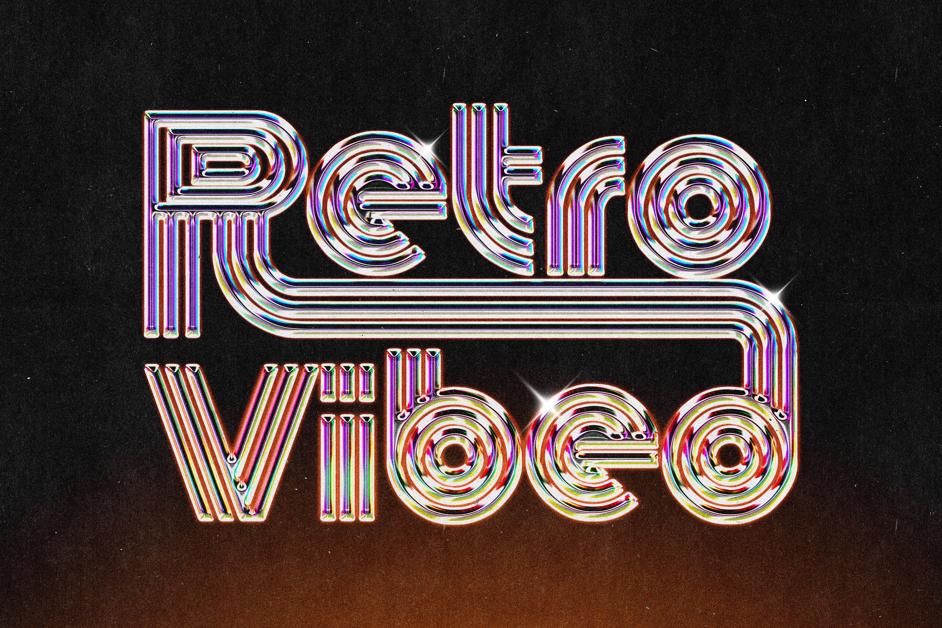
Don’t shy away from breaking traditional design rules. Embrace the chaos of maximalism, where bold typography and vibrant colours reign. Think about using a collection of cool display fonts that push the boundaries of what’s considered “normal.” Play with textures, add a glitch effect, or layer your type with digital grunge aesthetics. The key is to make your designs feel alive and engaging, whether you’re using free or premium fonts.
Wrapping It Up
When it comes to choosing between free and paid fonts, there’s no one-size-fits-all answer. Each option has its merits and drawbacks, and the right choice often depends on your individual project needs and design goals. By understanding the strengths and weaknesses of both, you’ll be better equipped to make informed decisions that enhance your work.
In a world filled with design possibilities, remember that the best font is one that resonates with your vision. Whether you opt for a quirky free typeface or a premium one that brings your design to life, what matters most is how you wield it. So, go forth and create — your perfect typeface is out there waiting for you!
Want to dive deeper into typography? Check out our enormous collection of groovy typography mockups that can help your designs pop. Happy designing!