Choosing the right typeface can feel like standing in front of a buffet—so many options, yet the wrong choice can ruin the whole meal. Whether you're designing a vibrant poster for a local gig or crafting a sleek website for a startup, your font selection can make or break your project. In a world where design is constantly evolving, understanding the nuances of serif, sans-serif, and display fonts is essential. So, when should you use each? Let’s dive into the delicious world of typography.
Understanding the Basics
Before we get into the nitty-gritty, let’s clarify what we mean by serif, sans-serif, and display fonts.
Serif Fonts: These are the classic typefaces adorned with little “feet” or “tails” at the end of each letter. Think Times New Roman or Garamond. Historically, they’ve been associated with traditional print and give off a sense of reliability and respectability.
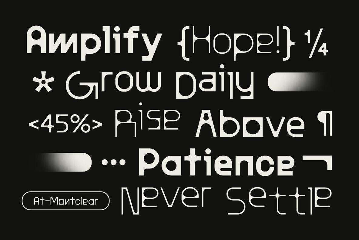
Sans-Serif Fonts: As the name suggests, these fonts lack those decorative strokes. Fonts like Arial or Helvetica fall into this category. They’re often seen as modern and clean, making them a staple in digital design.
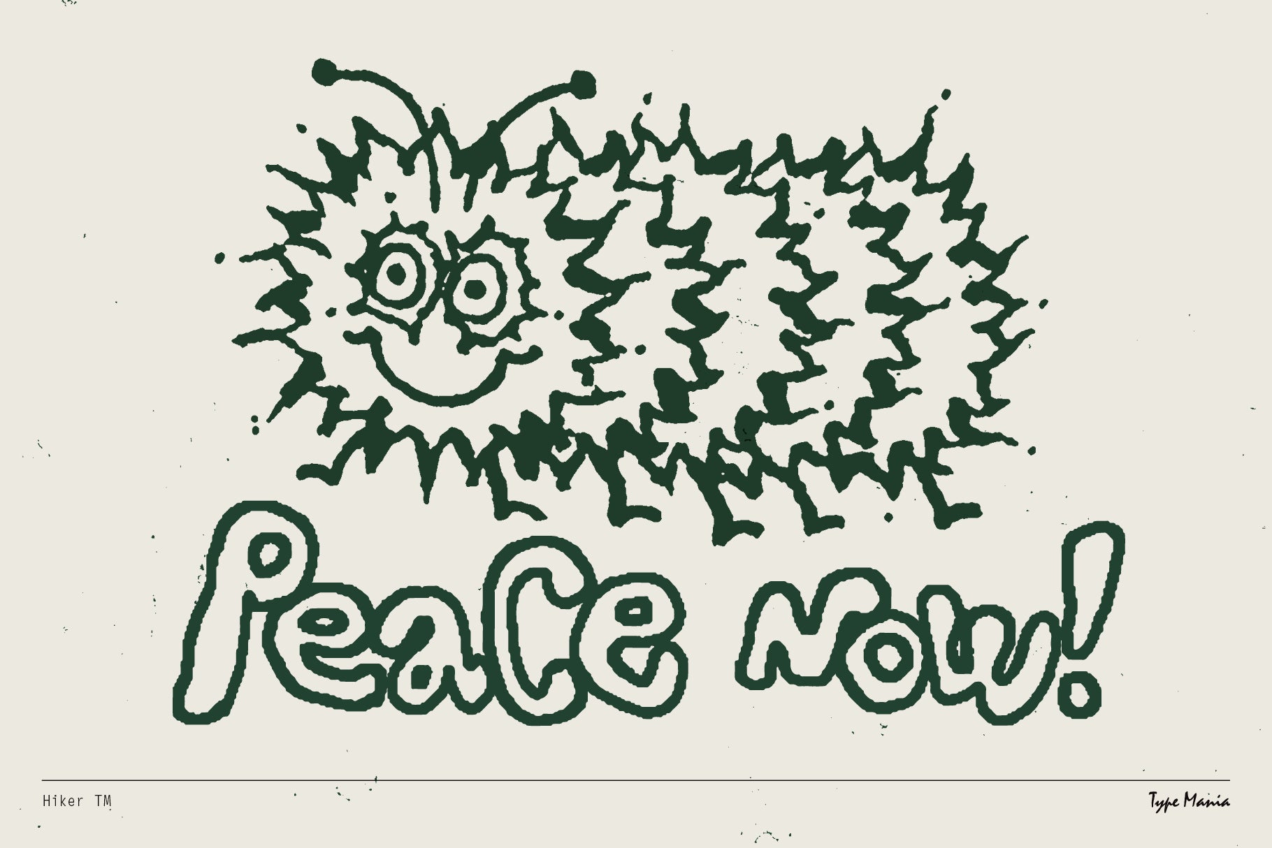
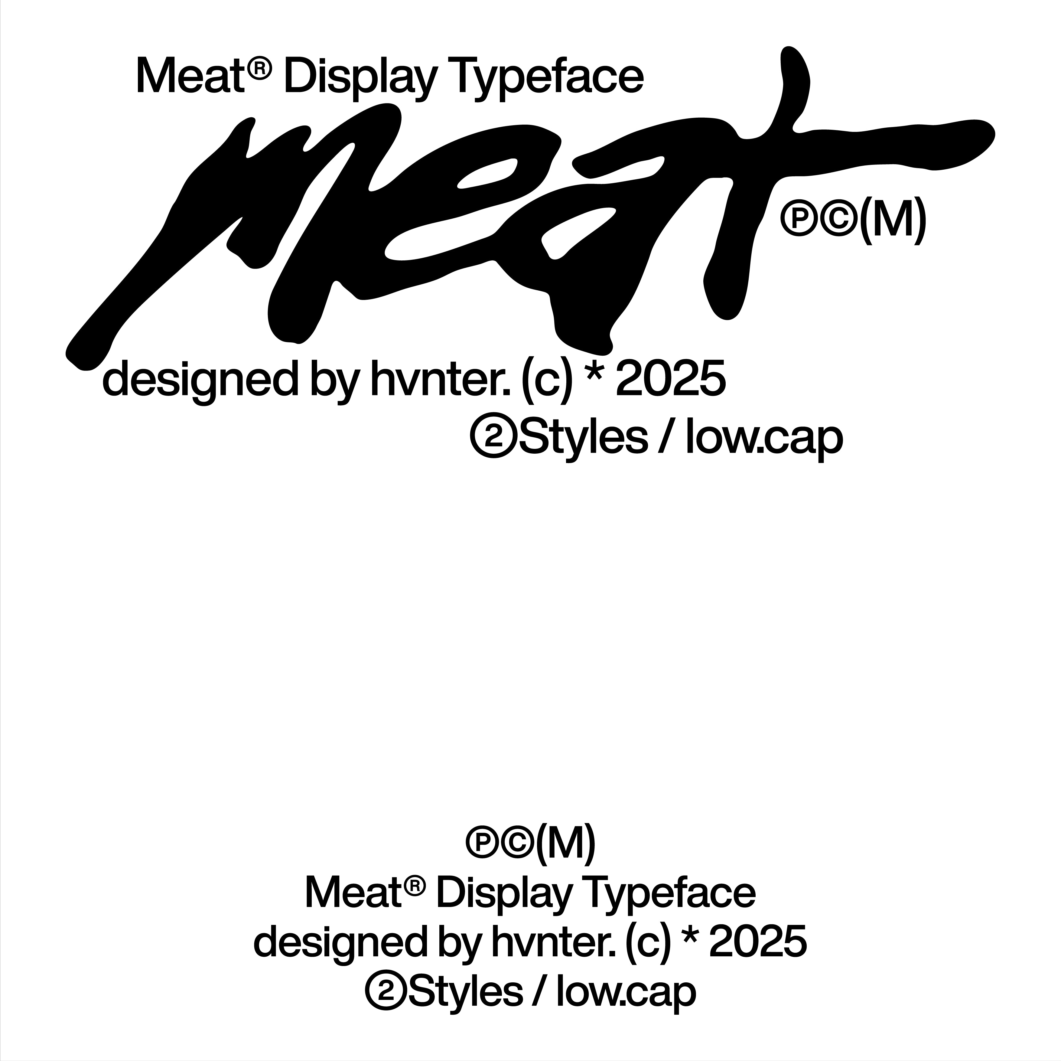
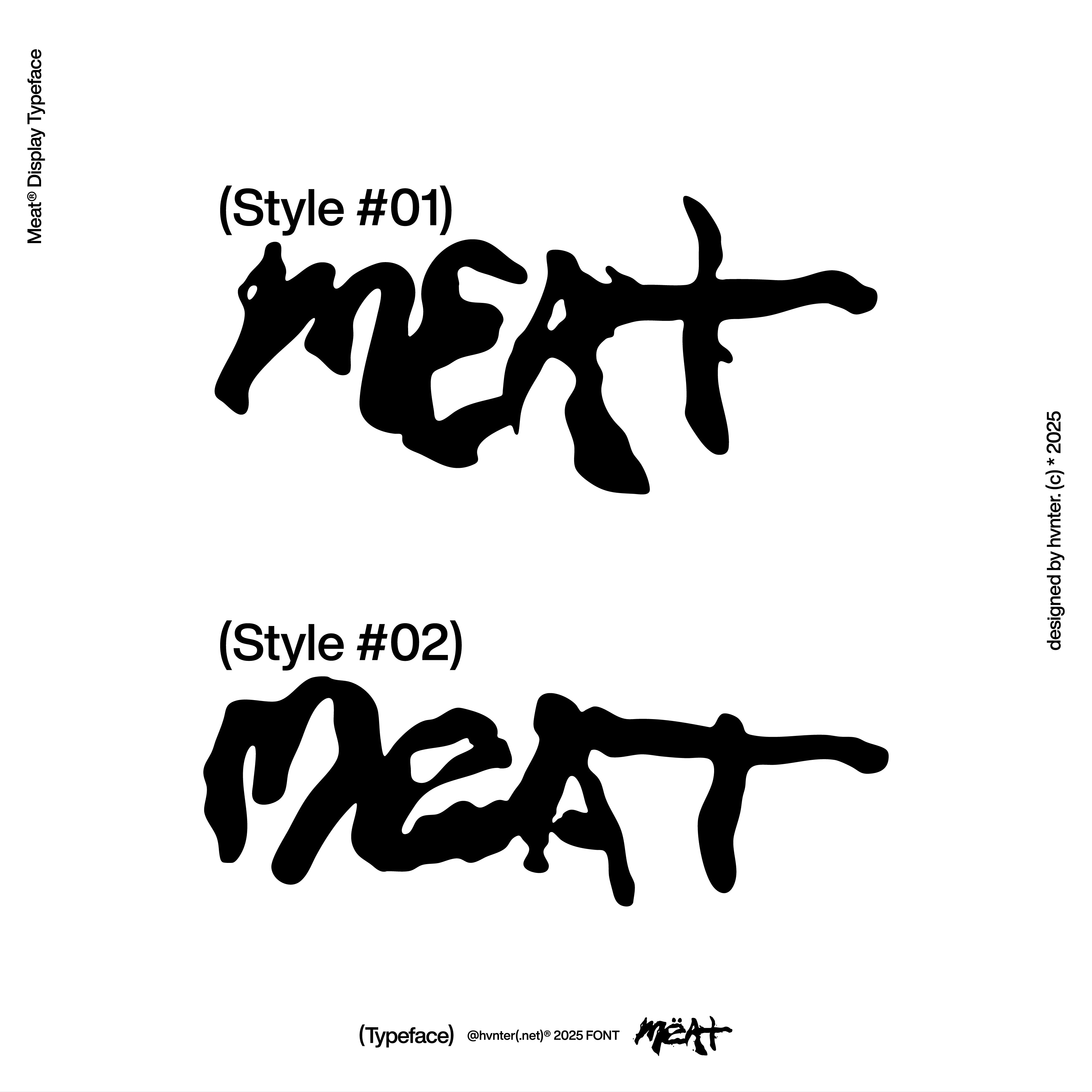
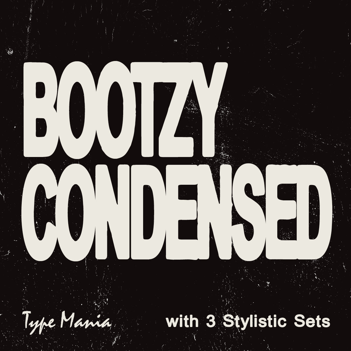
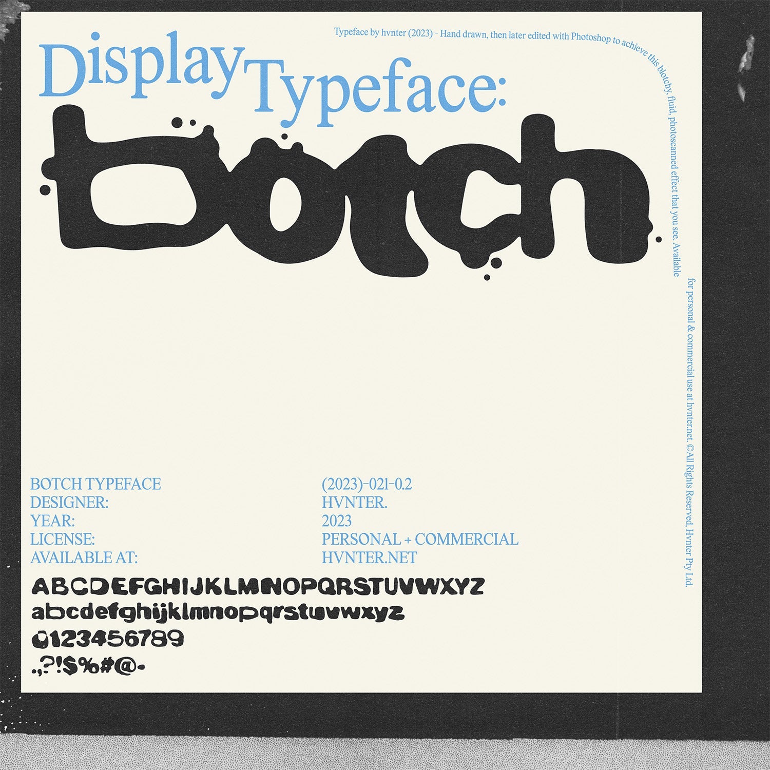
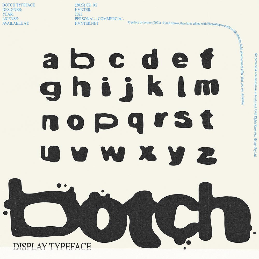
Display Fonts: These are the showstoppers! Display fonts are designed to grab attention and are best used in larger sizes. From funky, hand-drawn styles to bold, geometric shapes, display fonts are all about personality and flair.
The Allure of Serif Fonts
When to Use Them
Serif fonts have a timeless quality that can evoke a sense of tradition and authority. They work wonders in print media, where readability is key. Imagine your latest book cover or a magazine spread: a serif font can lend that touch of elegance and sophistication, drawing readers in.
Example: If you're designing a logo for a luxury brand or creating a flyer for a classical music concert, a serif typeface can convey that sense of prestige. A good choice might be to explore options like [classic serif fonts] that offer a modern twist on tradition.
Why They Matter
Using serif fonts can help establish a brand identity that resonates with an audience looking for authenticity. Think about it: when you see a brand using a serif typeface, it often feels more established, more trustworthy. In an age where consumers crave connection and reliability, this can be a game-changer.
The Modern Touch of Sans-Serif Fonts
When to Use Them
Sans-serif fonts are the go-to for digital design. Their clean lines and straightforward appearance make them incredibly legible on screens. Whether you’re crafting a minimalist website or a sleek app interface, sans-serif fonts can help create that crisp, modern aesthetic that’s so popular today.
Example: Ever notice how tech companies often choose sans-serif fonts? It’s because they want to project a forward-thinking image. A font like [futuristic sans-serif types] can enhance your designs by providing clarity without sacrificing style.
Why They Matter
In a fast-paced world where attention spans are dwindling, clear communication is essential. Sans-serif fonts excel in this regard, allowing your message to shine without distractions. They’re perfect for body text, user interfaces, and any context where legibility is crucial.
The Bold Statements of Display Fonts
When to Use Them
Display fonts are all about making a statement. Use them in headlines, posters, or anywhere you want to capture attention. They’re ideal for creative projects where personality and flair are key, like event posters, album covers, or even streetwear graphics.
Example: Think of a bold, graffiti-inspired display font for a music festival flyer. It instantly communicates energy and excitement. Explore [dynamic display fonts] to find the perfect match for your next project.
Why They Matter
In a world saturated with content, standing out is vital. Display fonts can help you do just that, allowing you to express your creativity and brand's unique voice. However, moderation is key; using them sparingly can ensure your message remains clear while still catching the eye.
Mixing It Up: Finding the Right Balance
So, how do you decide which font to use when? It often comes down to context and intention. A good rule of thumb is to mix fonts wisely. Pair a serif font with a sans-serif for a fresh contrast, or use a bold display font alongside cleaner body text to create a hierarchy within your design.
Practical Tips
Contrast is Key: Pair a serif for headlines with a sans-serif for body text to create visual interest without chaos.
Stay on Brand: Your font choices should reflect your brand’s personality. If you’re aiming for modern and sleek, lean towards sans-serifs. If you want to convey tradition and reliability, opt for serif fonts.
Test Legibility: Always consider where your design will be viewed. If it’s on a phone screen, ensure your chosen fonts are legible at smaller sizes.
Experiment: Don’t hesitate to play around with combinations! Tools like Figma or Adobe XD can help you visualise how different fonts work together.
What to Remember
Choosing the right typeface isn't just about aesthetics; it's about communication. Serif fonts convey tradition, sans-serif fonts scream modernity, and display fonts demand attention. Each has its place in the design world, and knowing when and why to use them can elevate your projects from ordinary to extraordinary.
In our ever-evolving digital landscape, embracing the full spectrum of typography can lead to innovative design solutions. So, whether you’re diving into a new project or refreshing your brand, remember to think critically about your font choices.
Looking for inspiration? Check out a collection of [bold typography mockups] to see how these fonts can come to life in your designs. And keep exploring—there's a whole universe of fonts waiting to be discovered!
Conclusion
Typography is more than just letters on a page; it's the voice of your design. So go ahead, mix it up, break some rules, and let your creativity flow. After all, in the world of design, sometimes the best ideas come from embracing the unconventional!