Colour is a powerful language that speaks volumes without uttering a single word. As designers, we often lean into colour choices, believing we're tapping into its psychological effects. But let's be real: too many creatives fall into the trap of using colour in predictable ways, missing out on the deeper nuances that can elevate their work. So, what are some common misconceptions about colour psychology that could be holding your designs back? Let’s dive in!
The Basics of Colour Psychology
Before we get into what designers often overlook, let’s lay down the groundwork. Colour psychology is the study of how colours influence perceptions and behaviours. For instance, red is often associated with passion or urgency, while blue evokes calmness and trust. You've probably read about these associations in design blogs or marketing seminars. But here's the kicker: these associations can vary significantly across cultures and contexts.

Image: Adobe: A guide to colour meaning
Colours Aren’t One-Size-Fits-All
One of the biggest mistakes is assuming a colour evokes the same emotional response universally. For example, while white symbolises purity in Western cultures, it’s associated with mourning in some Eastern cultures. This is crucial for designers, especially if your work crosses cultural boundaries. Instead of defaulting to "blue = calm," consider your audience. Are they in a culture where blue has a different significance? Use this knowledge to inform your colour choices.
Context is Key: The Setting Matters
Another common pitfall is neglecting the context in which colours are applied. A vibrant orange might energise a sports brand, but it could feel overwhelming for a wellness app. Context includes factors like the medium (digital vs. print), the surrounding colours, and even the intended message.
For instance, a chaotic layout with bold, clashing colours might resonate with a streetwear brand looking to capture attention, while a minimalist aesthetic could soften the impact for a luxury skincare line. Make sure your colours align with the overall vibe you want to convey.

Drifter Motion Blur Effect by Divided.co
Experimentation Over Convention
In the age of maximalism and experimental design, breaking traditional colour rules can lead to fresh, impactful designs. Think outside the box! Why not combine neon greens with muted earth tones? Or use an unexpected colour palette that challenges the norm?
Take a page from the world of cyberpunk aesthetics, where vibrant neon colours clash with dark, gritty backdrops. This creates a thrilling, immersive experience that pulls viewers in. Embrace the chaos! By breaking conventional colour rules, you can create something truly unique and memorable.

Cyber by Studio 2am
The Role of Colour in Branding
It’s easy to see why many designers stick to the “typical” colour guidelines when it comes to branding. But here’s the thing: your brand’s voice should dictate your colour usage, not the other way around. A tech start-up might choose sleek, modern colours, while a vintage clothing shop might go for retro hues.
Yet, many designers stick to the same tired palettes. Consider brands like Glossier, which utilises soft pinks to convey a sense of inclusivity and beauty. Or take a look at the bold, saturated colours in the branding of brands like Supreme, which scream street credibility. Colours can be a focal point that expresses a brand’s identity, so don’t shy away from experimenting with palettes that resonate with your brand’s ethos.
Explore our collection of bold typography that can showcase your daring colour choices.

Golte by Marvadesign
Mixing Colours Like a Pro — Or Not
Another area where designers often trip is in colour mixing. The classic colour wheel is a great starting point, but relying solely on it can stifle creativity. Too often, designers think they need to stick to complementary or analogous colour schemes to get it “right.”
Instead, why not explore more complex relationships? Triadic colour schemes can offer a vibrant, energetic feel, while split-complementary schemes can add depth without overwhelming the viewer.
Take a look at streetwear graphics for inspiration. Designers often play with contrasting colours in unexpected ways, creating a visual feast that draws the eye. This technique can elevate your designs, making them feel alive and engaging.

Surreal Gradients - 60 Backgrounds by Designessence
Testing and Feedback: The Colour Experiment
Even the most seasoned designers sometimes miss the mark when it comes to colour. That’s where testing comes in. A/B testing with different colour schemes can provide real insight into how your audience responds.
You might think a bold red will drive conversions on a call-to-action button, but what if a softer hue does the trick instead? Utilise tools like Google Optimise or even social media polls to gather feedback. The more you experiment and adapt based on real-world responses, the more refined your colour choices will become.
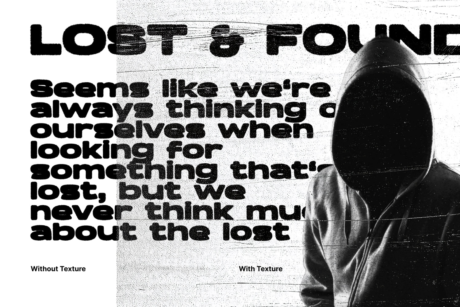
Use a texture brush to add depth and dimension to your colour choices in your designs.
![]()
Misterio Shader Procreate Brushes by Pixelbuddha
The Emotional Spectrum: More Than Just Primary Colours
When it comes to colour, there’s more than just the basic hues. Consider the emotional spectrum that colours can evoke. For instance, using muted tones can convey sophistication, while vibrant colours might evoke excitement.
Imagine a design project that aims to reflect nostalgia. Instead of just using retro colours, think about how muted pastels or faded tones can create a sense of longing or memory.
Incorporating textures, like a grainy overlay or noise effect, can further enhance these emotional cues. This is where our products like vintage textures, could come in handy. They can add that extra layer of depth to your designs, pushing the emotional impact even further.

Neon Inks Retro Textures 7000px+ by angelainthefields
What to Remember
Colour is more than just a tool in a designer’s toolkit; it’s a language that communicates emotions, tells stories, and builds brands. By breaking the mould and understanding the psychological nuances of colour, you can create designs that resonate on a deeper level.
So, the next time you're faced with a colour choice, don’t just follow the rules — rewrite them. Explore, experiment, and embrace the imperfections that come with creativity. And remember, design is about pushing boundaries, so let your colours run wild!
If you want to dive deeper into the ever-evolving world of graphic design and all it has to offer, check out some of our other articles on overcoming creative block or how to deal with impostor syndrome as a designer. Happy designing!