
A blackletter font with fine hairlines and curling ornamental flourishes can look staggering as a 120pt specimen and come apart the second it hits production. Shrink it to a three-inch chest print on a dark tee and those hairlines flood with ink until the whole mark reads as a black blob. Hand it to an embroidery digitiser and the tight counters fill with stitches and the delicate strokes vanish into gaps the machine cannot bridge. Most blackletter was drawn for 15th and 16th century manuscripts and letterpress, cut by hand onto metal and vellum, with no thought spared for DTG printers, vinyl cutters, or a logo that has to survive being woven onto a neck tag at fingernail size.
So every font here gets judged on one thing: whether its structure survives the production method it is likely heading for. The question is whether the strokes hold their weight, whether the counters stay open, whether a digitiser can read it at all — not how dramatic it looks in a mockup.
There is a reason blackletter keeps coming back instead of sitting in a history book. Gothic box-logo treatments have been part of the luxury-streetwear crossover for years, and metal and hardcore scenes have reached for these letterforms since their earliest flyers and sleeves because the shapes communicate weight and intensity instantly, no explanation required. That lineage is why it stays a live choice in apparel and band branding. The trick is picking the one built, or rebuilt, for the job.
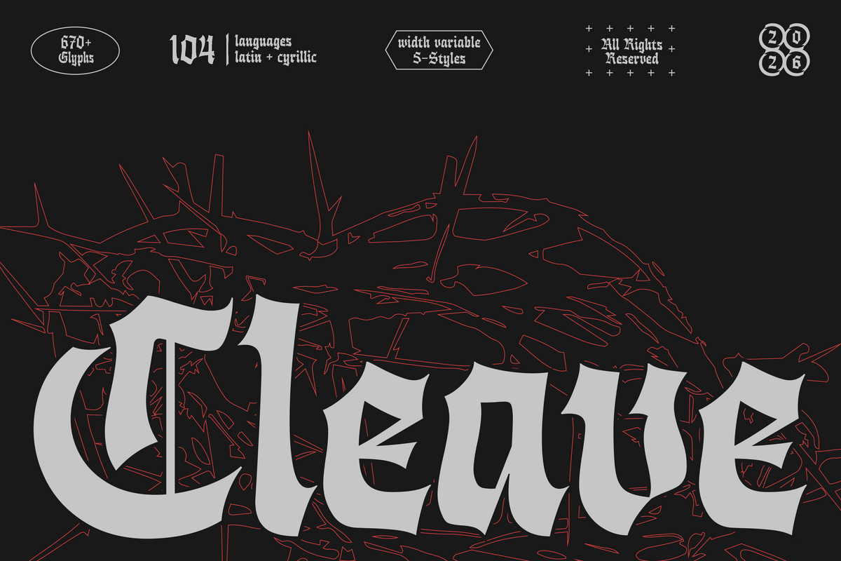
HN Cleave by Hora Nocte Type Foundry
Most blackletter forces you to redraw a mark every time it changes shape. HN Cleave solves that with a true variable-width axis. It ships with five styles, plus the variable font itself, and carries 670+ glyphs across 104 languages spanning Latin and Cyrillic. The width axis is the real story: you can compress the whole mark to fit a cramped chest print, then expand the same forms for a wide back-piece, without distorting the stroke contrast that makes it read as blackletter in the first place. One file does the lockup work that normally eats an afternoon of manual condensing. If you want to see why that matters at brand scale, we got into variable fonts as brand infrastructure elsewhere.

CS Hustle by Craft Supply Co
Historical blackletter earns its drama from density and ornament, which is also what kills it at small scale. CS Hustle strips that back. The letterforms stay angular and sharp but run on cleaner, more structural lines than the manuscript stuff. That simplification is what lets it hold together in a single-colour screen print, where the extra flicks and hairlines of a traditional face would bridge into mush. Bold, one plate, dark ink on light cotton, and it stays legible.

403 Holister by 403TF
Slant is a weapon most blackletter never picks up. 403 Holister comes with slanted and backslant forms, giving a logo lockup movement a static gothic face cannot offer: lean the mark forward for speed and energy, tip it back for planted, immovable weight. With 530 glyphs, OpenType features, ligatures and multilingual support, there is enough here to build a proper wordmark rather than just set a word. The backslant in particular is rare and reads as heavy without feeling frantic, which is a gift when you want gothic authority that sits still.

Forge Garage – Motorcycle Font Duo by Edignwn Type
Solo blackletter fonts create a problem nobody admits to until the layout stage: you cannot set an entire logo in it. Address lines, est. dates and the call to action all collapse into noise. Forge Garage answers that by shipping a system. It pairs a blackletter with a chunky sans, each in Regular and Textured worn-ink styles, four font files in total, built around motorcycle and garage culture. The blackletter carries the shop name with all the attitude, the sans handles the supporting text so it stays readable at a glance, and the textured versions give you that pressed, over-inked look baked in rather than faked in post.

Agnes Typeface by hvnter
There is a point where cleaning up a blackletter face defeats the whole purpose. Agnes refuses to cross it. It is a hand-drawn metal typeface with real tooth, two styles, uppercase only with no numerals or symbols. It is the best seller in this lineup by a wide margin, and that tells you something plain: when the brief is truly metal or hardcore and not just metal-adjacent, a rough, hand-built face beats the tidy historical reproductions every time. The irregularity is the point. It looks drawn by a human who meant it, which is exactly what a hardcore sleeve or a merch run wants.

Bulldach Lettra by Jolicia Type
Two jobs, one file. Bulldach Lettra gives you a clean, polished style that reads as professional for a logo or branding system, plus a distressed style with worn texture and rough edges for the aged-print feel merch wants. That pairing covers the full arc of a project: the pristine version for the brand sheet and the digital lockup, the beat-up version for the tee that is supposed to look like it has already lived through three tours. You buy once and get both the boardroom and the back-of-the-venue version of the same voice.

Banas by Marvadesign
Named after Banaspati, a fire demon from Indonesian mythology, Banas was built by its creator for exactly one world: metal band logos, concert posters, album covers and t-shirts. The letterforms render as blazing, flame-like strokes, and there are alternate uppercase characters to keep a logo from feeling locked and repetitive. It is the second-best seller here and the most on-the-nose pick for a metal brief. If you have ever squinted at a death metal logo trying to decode it, this lives in that lineage proudly, and it knows precisely what it is for.

Comrades by Any-Type® Foundry
Gothic weight without gothic menace is a narrow target, and Comrades hits it. This is a blackletter-display hybrid with geometric precision and rounder, smoother terminals than a traditional face, carrying 450+ glyphs, multilingual support and alternate characters. The geometric regularity is what makes it read as confident branding rather than horror poster, which suits a streetwear or activist-adjacent mark that wants heft and heritage without tipping into dread. It is a staff-select pick for good reason. The rounded terminals also weed and apply far more cleanly than spiky traditional blackletter, so it survives vinyl and heat transfer without a fight.

Pick the structure, not the specimen
The best blackletter for apparel and band work is rarely the most ornate one. It is the one whose strokes, counters and contrast were built, or rebuilt, with the production method already in mind. A face that dazzles at 120pt and dies at three inches wide is a liability on a merch run. A face that was engineered to hold ink, weed clean or compress without distortion is the one you reach for again. Read the brief, read the press, then pick the font that answers both.