Ah, the early 2000s — a time of flip phones, frosted tips, and the unmistakable charm of Y2K aesthetics. As we venture further into the 2020s, designers are looking back at this era for inspiration, embracing the bold, chaotic, and sometimes downright bizarre designs that defined it. If you’re a designer craving that nostalgic edge, you’re in luck! Today, we’re diving into 15 must-have Y2K fonts that can elevate your design projects, whether you’re creating vibrant web pages, edgy posters, or anything in between.
Why Y2K Fonts Matter Now
You might be wondering, why revisit Y2K fonts in 2025? Well, design is cyclical. Trends from the past often resurface, and right now, we’re experiencing a resurgence of maximalism, bold typography, and a love for all things retro. Y2K fonts encapsulate this vibe perfectly, offering a unique blend of nostalgia and rebellion against minimalist design trends. They allow for experimentation and creativity — a chance to break traditional design rules and embrace imperfection, which is what we’re all about at Studio 2am.
So let’s dive into these must-have Y2K fonts that you should definitely add to your design arsenal!
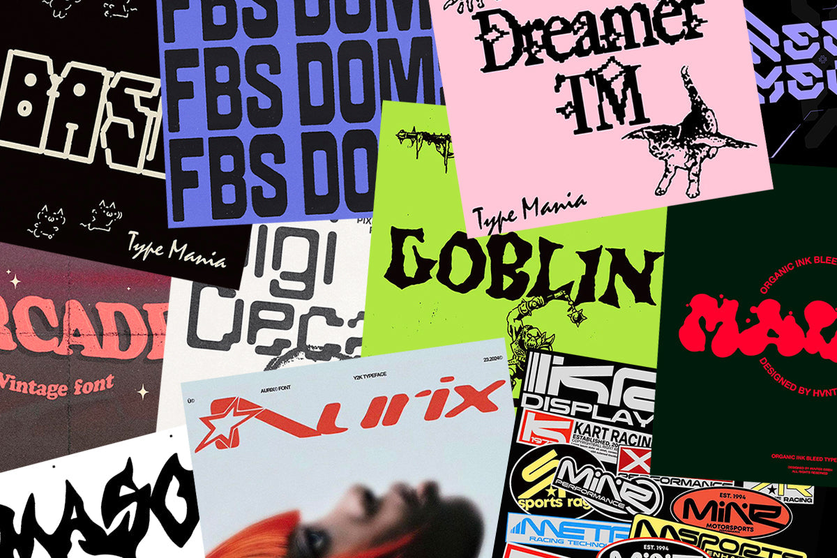
1. Dreamer TM by Type Mania
 Blending Y2K nostalgia with a raw digital edge, this serif distorts tradition with pixelated details and jagged serifs. Its mix of structured elegance and glitchy imperfection feels straight out of an early internet archive, making it perfect for bold, experimental designs. Dreamer TM captures the energy of the era with a unique balance of futurism and nostalgia.
2. Aürix by Züli

Sleek and fluid, this Y2K-inspired typeface embodies the futuristic optimism of the early 2000s. With its bold, aerodynamic letterforms and smooth curves, Aürix feels straight out of a tech startup logo or a retro-futuristic ad. Designed exclusively in uppercase, it’s effortlessly ready to drop into any layout, bringing that glossy, high-speed aesthetic with zero adjustments needed.
3. FBS Doms by Febspace Studio

Unapologetically bold and built for impact, this heavyweight display typeface commands attention with its blocky, high-contrast letterforms. Whether in its clean Regular style, softened for a smoother look, or roughed up with its Rugged version, FBS DOMS is made for statement-making designs. Perfect for posters, album covers, or streetwear branding, it channels a raw, rebellious energy straight from the Y2K era.
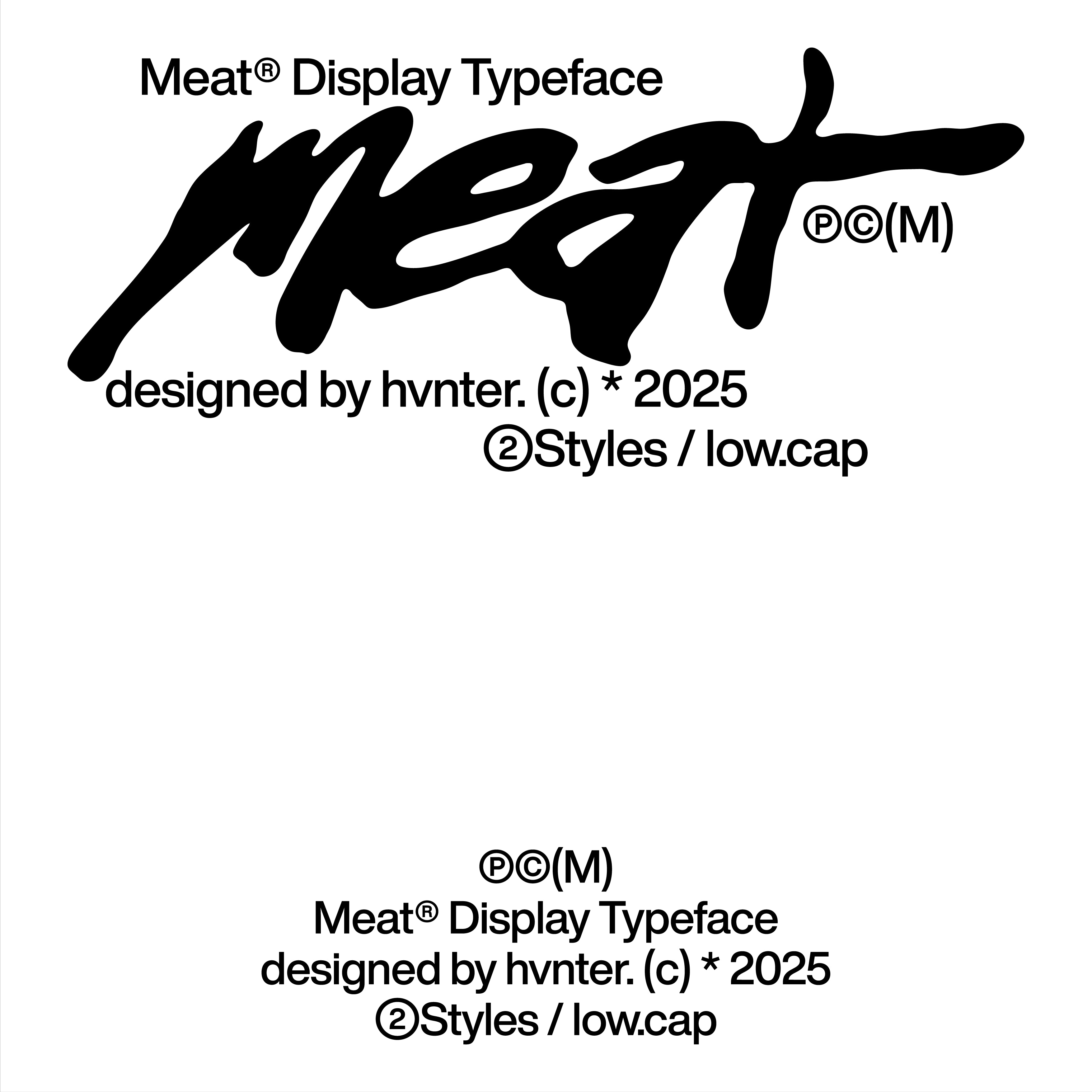
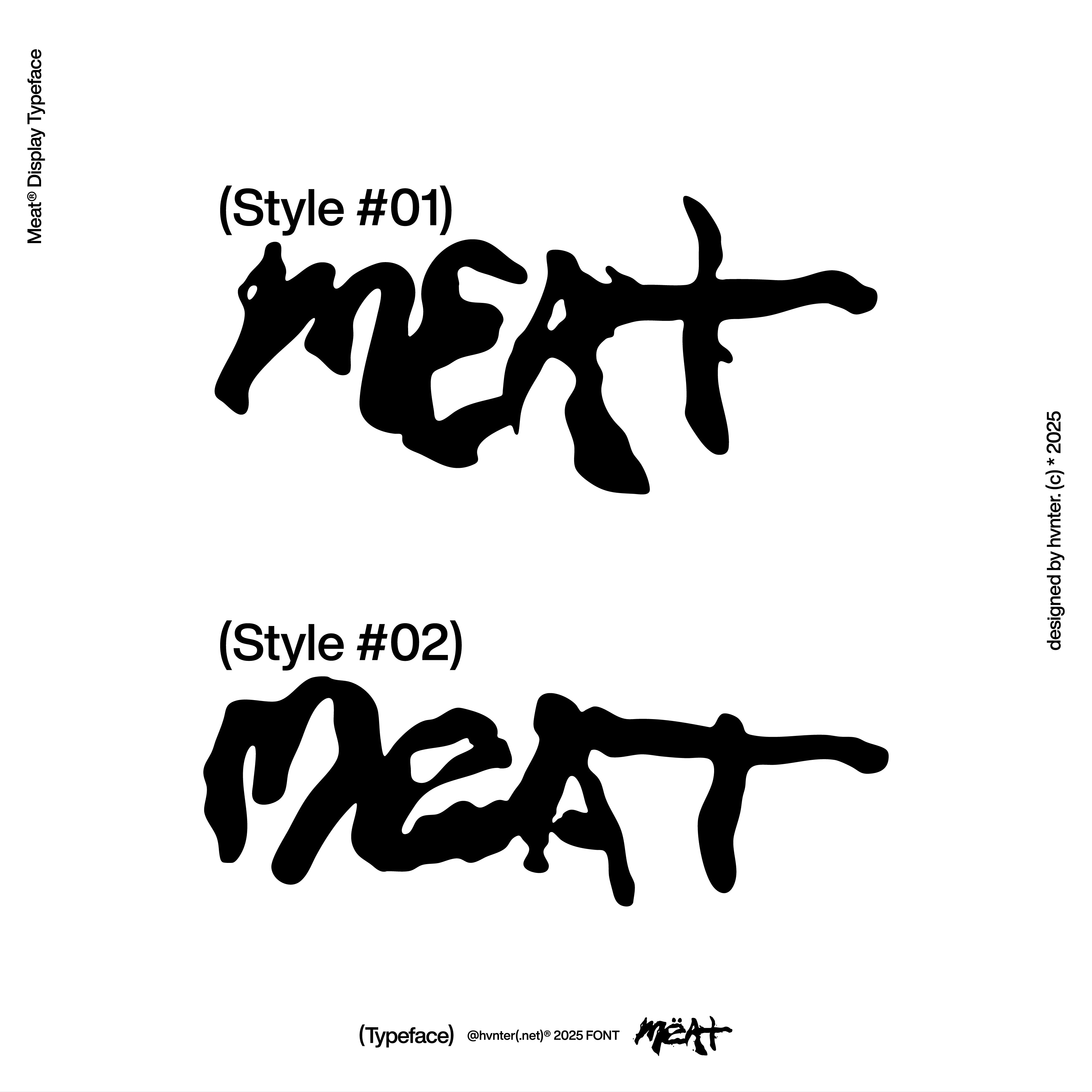
4. Kraft by HVNTER
 Built for speed and precision, this racing-inspired typeface brings high-energy Y2K aesthetics straight from the world of motorsports. With multiple variations for each letter, Kraft offers dynamic versatility, perfect for bold branding, performance gear, and retro-futuristic layouts. Its sleek, angular forms and industrial edge make it feel straight out of a late '90s tuner magazine or a high-adrenaline arcade game.
5. Basic TM by Type Mania
 Bringing ASCII aesthetics into the modern era, this pixel-perfect display font taps into the raw, experimental energy of early computing. Basic TM turns monospaced digital nostalgia into a bold, grid-like letterform structure, perfect for underground flyers, tech branding, or any project that thrives on a lo-fi, cyber-inspired edge.
6. Mason by HVNTER
 Dripping with attitude, this hand-drawn typeface fuses soft metal aesthetics with raw, organic energy. Mason warps and twists each letter into an almost liquid form, making it perfect for rebellious branding, experimental posters, or anything that leans into Y2K’s grungy, underground edge.
7. Goblin by Type Mania
 Rough, jagged, and dripping with chaotic energy, this gothic-inspired typeface brings a raw, hand-drawn feel to the Y2K aesthetic. Goblin TM leans into eerie, medieval influences with its uneven letterforms and sinister curves, perfect for album covers, metal-inspired branding, or anything that thrives on a bit of controlled mayhem. With two stylistic sets that rotate automatically, it keeps every composition looking organic and unpredictable.
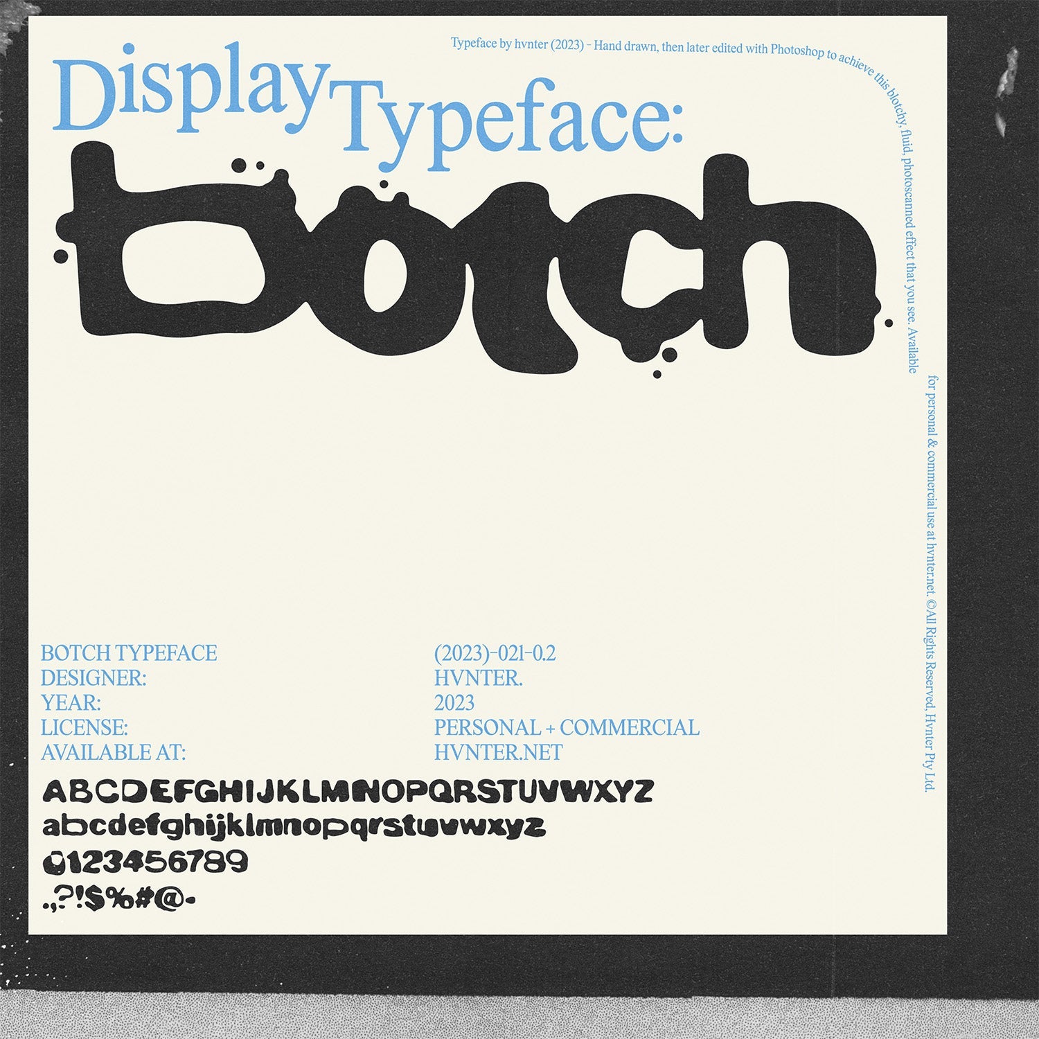
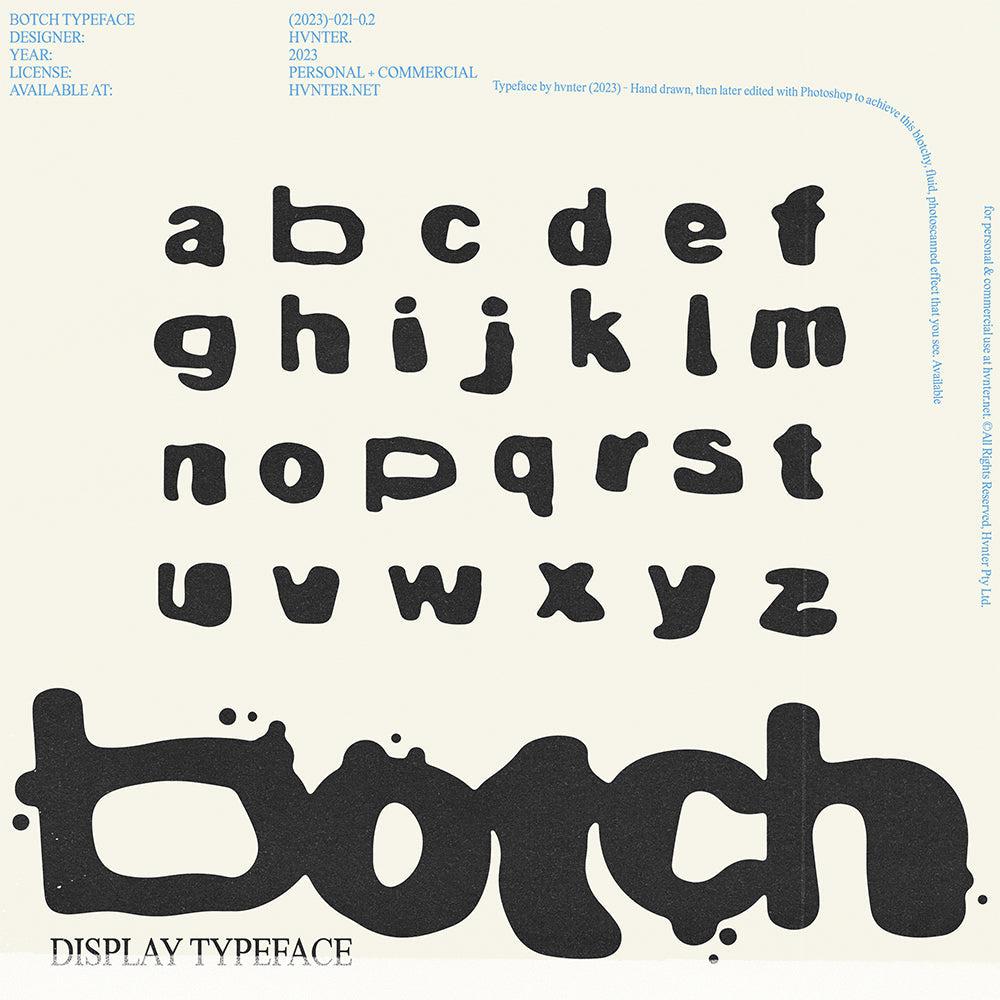
8. Malbo by HVNTER
 Oozing with personality, this ink-bleed typeface brings a fluid, organic feel to the Y2K aesthetic. Malbo stretches and warps each letter into a melting, almost liquid form, making it perfect for experimental branding, bold posters, or eye-catching streetwear graphics.
9. Digi Decay by Softulka
![]() Glitchy, raw, and undeniably digital, this pixelated typeface distorts the clean precision of tech fonts with intentional breaks and rounded edges. DigiDecay embraces the beauty of imperfection — reminiscent of corrupted files, decayed machine text, and early digital displays on the brink of failure. Perfect for cyberpunk visuals, dystopian branding, or any project that thrives on a futuristic yet deconstructed aesthetic.
Glitchy, raw, and undeniably digital, this pixelated typeface distorts the clean precision of tech fonts with intentional breaks and rounded edges. DigiDecay embraces the beauty of imperfection — reminiscent of corrupted files, decayed machine text, and early digital displays on the brink of failure. Perfect for cyberpunk visuals, dystopian branding, or any project that thrives on a futuristic yet deconstructed aesthetic.
10. Anero Mecha by Font For Zula

Sharp, angular, and built for the future, this high-tech typeface fuses mecha-inspired geometry with a digital-age aesthetic. Anero Mecha features bold, modular letterforms that feel straight out of a cybernetic interface or a sci-fi battle mech blueprint. With 58 alternates and a bonus monospace version, it offers endless possibilities for futuristic branding, game design, and experimental typography.
11. Powerpuff by Daniel Chapman

Bold, bubbly, and bursting with 90s energy, this playful display font brings back the fun of early Y2K aesthetics. Powerpuff balances thick, high-impact letterforms with a soft, rounded edge, making it perfect for nostalgic branding, sticker-style graphics, and eye-catching headlines. Whether used for retro-inspired merch or vibrant social media posts, it radiates pure throwback charm.
12. Arcade by FREND.

Retro with a twist, this vintage-inspired typeface blends nostalgia with playful energy. Arcade features wavy, hand-drawn letterforms that feel straight out of a faded 70s poster or a dreamy VHS-era title card. With three variations to mix and match, it’s perfect for bold, character-driven designs that lean into warm, Y2K-era aesthetics.
How to Incorporate Y2K Fonts into Your Designs
When using these fonts, consider the overall aesthetic you want to achieve. Mixing and matching different styles can create interesting juxtapositions. For instance, pair a bold font like Dummy TM by Type Mania with a softer one like Altotype by HVNTER for a striking, yet balanced composition.
Experimenting with color is also key! Bright, saturated colors were a hallmark of Y2K design, so don’t shy away from using a neon palette to bring your typography to life. Remember, the goal is to evoke that retro vibe while still making it feel fresh and relevant for today’s audience.
You can also explore different formats. Use layering, distortion, or glitch effects to enhance the rebellious spirit of Y2K design. This is where you can truly let your creativity shine!
What to Remember
The early 2000s were a time of experimentation and bold choices. By incorporating these 12 must-have Y2K fonts into your design toolkit, you can break free from traditional confines and create work that is both nostalgic and contemporary. Whether you’re designing for a client or your own personal projects, these fonts can help you capture the essence of a dynamic era that continues to inspire designers today.