


A founder emails you with 50 units of serum coming out of a contract filler in three weeks, or a pallet of canned seltzer landing at a co-packer by month's end. There's no budget for a product photographer, the product doesn't exist in its final form yet, and the Shopify store needs to look shelf-ready tomorrow. The investor deck needed to look shelf-ready last week. This is the brief half of small-batch DTC work runs on, and none of the free-resource dumps that come up when you search for a product mockup PSD have anything useful to say about it.
Small-batch DTC is its own design problem. The product might be a kitchen-table batch of 50, but the client needs it to read like it's already sitting on a shelf at Credo or chilling in the fridge of an indie bottle shop. The mockup carries that entire illusion, which means sloppy material rendering kills it on sight. A scuffed, flatly-lit amber bottle reads as stock. A can with dead lighting and no condensation reads as template. For a brand with no retail footprint, the packaging is the positioning, so a mockup that fakes the material unconvincingly undercuts the whole pitch before anyone's read the copy.
Current packaging direction raises the stakes here. Skincare and beverage brands are leaning hard into mono-material formats, amber and tinted glass, matte finishes, tactile embossed caps and labels, and refillable systems as a baseline instead of a premium add-on. Minimal, typography-led labels are doing the heavy lifting, letting the substrate speak. If the substrate in your mockup looks wrong, the whole story collapses. So we pulled the ones that render material like they mean it, split their smart objects sensibly, and tell a client story you can sell.
Skincare & Wellness
Start with the workhorse. The Cosmetic Jar Mockup by Farabion Studio handles the shape every beauty and personal-care line eventually needs, a squat jar for balms, masks and creams, with smart object label layers and adjustable colour so you can walk a founder through three lid finishes in one sitting. The lighting and shadow work is clean enough to hold at 4500x3000px and 300 DPI, which is the difference between a crop that survives a hero banner and one that falls apart the moment someone zooms the Shopify listing.

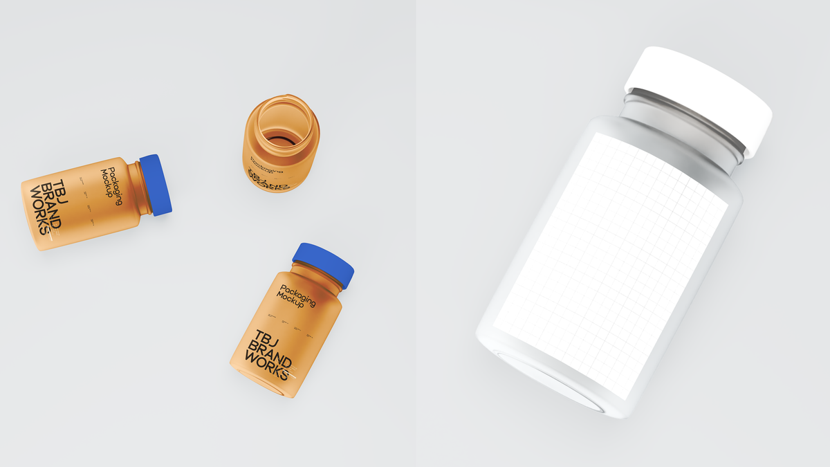
Where a single jar tests one SKU, Taboja Brand Works' Amber Capsule Bottle & Jar Dose Pack tests a whole line's material logic at once. Three vessels staged as a family: an amber bottle standing tall for the label shot, the same bottle lying flat for a detail crop, and an open jar. Amber glass is doing specific cultural work right now, it's the shorthand for clinical and apothecary positioning, and getting a supplement or wellness range to read as one coherent system across SKUs is exactly the thing a stakeholder deck needs to show. This is the set for the brand that's launching a dose protocol, not a single hero product.

For editorial polish, Blank Studio's Cosmetic Tube on Ceramic Tile is the understated high performer. A cosmetic tube on a neutral ceramic surface, soft light, minimal composition, muted and refined. It's built for the apothecary-adjacent skincare brand that wants shelf presence without clutter, the kind of label that leans on embossing and a single well-chosen typeface. Drop your artwork in and it photographs like a considered flat-lay from a studio shoot that never happened.

The Serum Glass Bottle Mockup by Pixelbuddha is the one that earns its keep when a range gets wide. A frosted glass dropper bottle with a knurled metal cap, held in-hand against a soft neutral backdrop, with the background, cap and bottle each taking independent colour control from the same file. That split matters: you can run a full serum range's worth of label and colour variants through one scene without rebuilding the lighting every time. Frosted glass and knurled metal are both finishes that cheaper mockups botch, and this one renders the tactility that sells the premium read.

When it's time to move from concept to sign-off, Graphicologystd's Dropper Bottle & Box Mockup 001 gives you the bottle from three angles paired with its retail box, at 4500x3000px and 300 DPI. The box is the part most dropper mockups skip, and it's the part that makes a line feel production-ready rather than conceptual. This is a pre-production and stakeholder tool, the thing you show before anything goes to print, cool-toned and clean enough that nobody in the review call mistakes it for a sketch. If you want more on getting that DTC material read right, our take on packaging mockups that don't look rendered digs further in.

Beverage & Drinks
Boutique wine and natural-label branding wants air, not a studio box, and Pixelbuddha's Rosé Wine Bottle Mockup gives it. The bottle is held against a bright sky with soft clouds, pale rosé tint catching the light, label area sized to carry a logo, wine name and product info and still read cleanly at a glance. It's the scene for a seasonal release or a sparkling launch, the sort of dreamy, outdoor frame that works as hard in a client review deck as it does in an Instagram pre-order post.

For the other end of the wine spectrum, Blank Studio's Minimalist Dark Wine Bottle Mockup goes dark, cool and monochrome in a modern studio setting. A dark bottle photographs trickier than a pale one, the glass swallows light and shows every rendering shortcut, and this one holds up with clean smart objects and a restrained, elegant mood. Reach for it when the label is doing the talking and the brand wants gravity, the serious-producer read rather than the breezy-rosé one.

Canned beverages live or die on lifestyle context, and Mockup Flock's RP V9 Can 01 nails the setting. A matte white can paired with a to-go coffee cup, staged outdoors on dirt ground with dried plants and soft sunlight, condensation beading on the aluminium. The matte finish and the water droplets are the two details that separate a real-feeling can from a template, and they're both here. Built for energy drinks, sodas and cafe-adjacent brands that want to look like they belong in a hand, not a lightbox.

Matte aluminium and tin are reading as premium and considered in food-adjacent DTC right now, and HALOLINE's Matcha Tin Can Mockup 003 is built for exactly that corner. A tin can at 4500x3000px and 300 DPI, fully editable and colour-customisable, suited to matcha, tea and small-batch food and drink labels. Tin is a specific material to fake, the slight sheen and the lid seam have to be right, and this one gives you a surface worth wrapping a minimal, typography-led label around.

For the straight-ahead aluminium can with no lifestyle staging, Coolteens' Beverage Can Mockup 004 is the clean studio render. Neutral, cold-toned, high resolution, four PSD files with a manual guide, built for presentations and marketing where you want the can isolated and the label front and centre. It's the canned-cocktail launch workhorse, the frame you use when the artwork is the entire point and nothing else should compete with it. If you need more where these came from, there's plenty more staged product shots worth digging through.

For a small-batch brand, these mockups are the only shelf the product has. The same amber bottle render goes into the investor deck, the pre-launch Shopify listing, the Instagram countdown post and the Behance case study, often months before a single retail unit physically exists. For a lot of these launches, the mockup is the only product photo that exists for months after the pitch deck goes out. The material has to be right the first time: amber glass and matte tin are carrying the whole argument for a brand that hasn't built a retail footprint yet. When the merch side of the brand comes up, our rundown of mockups built for a real merch drop covers that ground too.